There are no rules when it comes to color grading. Instead, it’s more of an art than a science.
As mere viewers, we see images on the screen that is pleasant, soothing, fascinating, frightening, upsetting or uninteresting. The “visual look” grows on us as we keep watching and absorbing the narrative to our suspension of disbelief.
It enables us to embrace the art form as reality.


Color has the ability to influence one’s mood. There’s a reason why we had those mood rings that changed its colors that consequently defined one’s emotion when we were kids.
A powerful color grading may create an environment or indicate the time of day. It is one of the most important facets of post-production. It has the power to control how a shot is perceived.
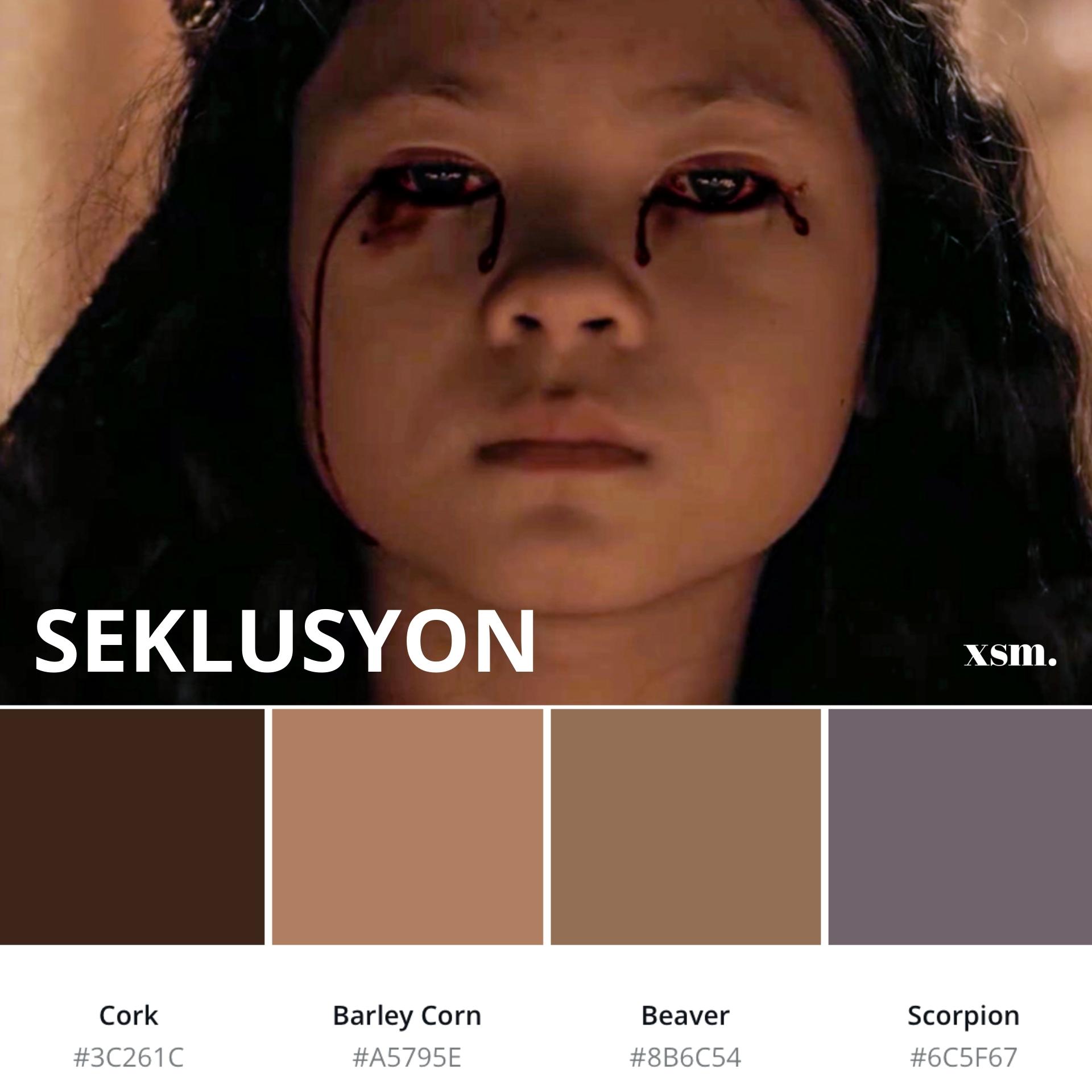
You can create a night shot during the day or an indoor day shot during the night depending on how the footage is lit, set in camera or graded in post-production. You can even present a 17th century time period that was shot just hours ago.
Some may say it is magic but it is just color grading.


Color Grading Catches the Viewers Attention
Have you ever scanned Youtube and stumbled upon something that caught your attention? Or maybe hovered in on Netflix and a particular thumbnail glistened right before your eye.
The vast majority of trailers are initially viewed as they speed past the countless scrolling that clogs social media or as tiny thumbnails in video galleries. In these circumstances, perfect mood coloring and faultless exposure do matters.
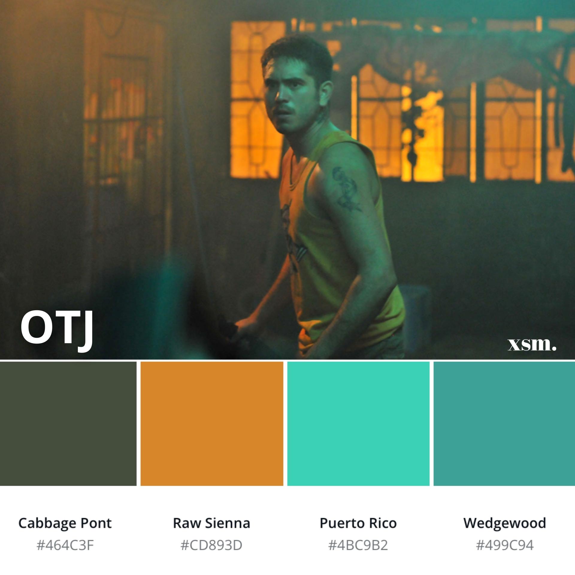
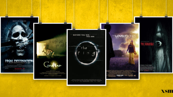
Some may categorize the certain genre of a film just by looking at its whole atmospheric color filter: dark lit with green or blue mid tones may indicate a suspense horror thriller, warm and bright might be an inspirational movie or a chick flick/romantic comedy, pastels may indicate a period film, warm and light blue in high contrast might be post-apocalyptic, emerald with warm tone mixtures in high gamma may be categorized as steam punk and the list goes on.
As common knowledge, a viewer is compelled to pause and play a film trailer that appeals to them, so make it worth their while.

As a colorist, you should learn how to grade your scenes in such a manner that it should capture the viewer’s attention in a fraction of a second amidst the digital age’s chaotic cacophony.

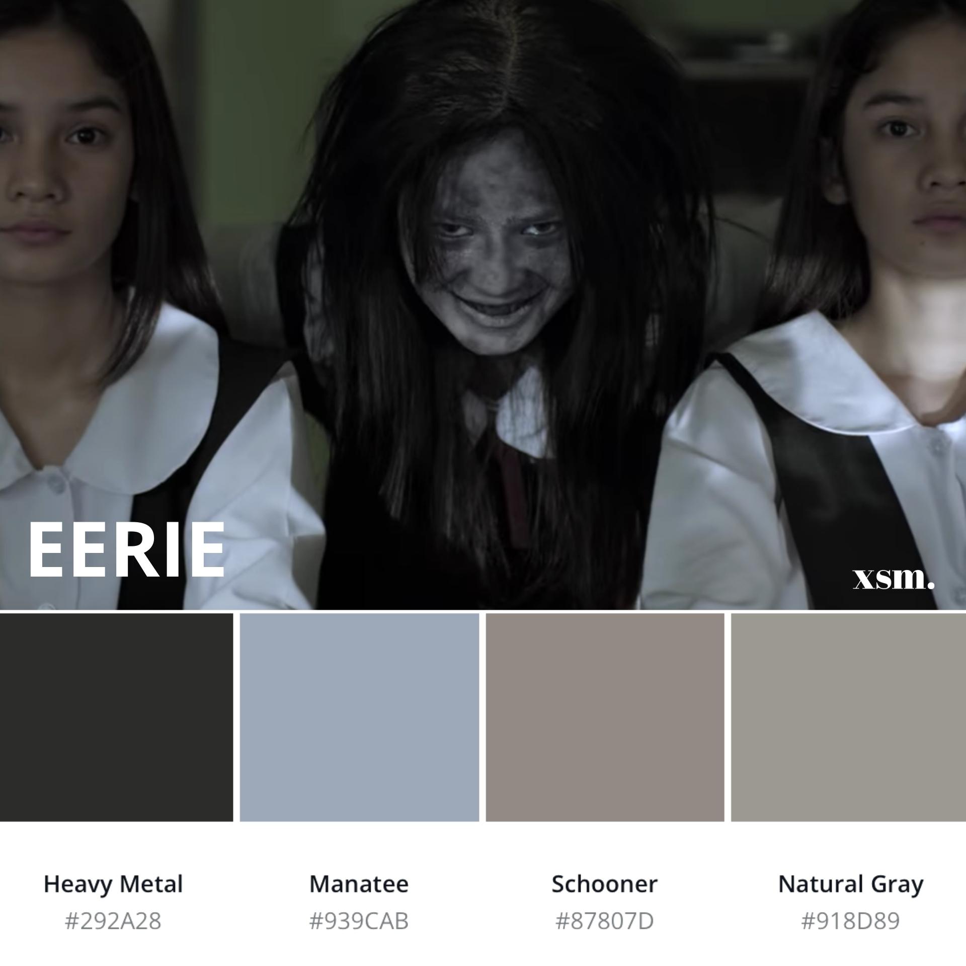
It is important that color grading should be applied consistently and flawlessly so that any A.I. platform that would show a random clip from your film would automatically convey what it is all about.
Film color helps to tell the story right away, sets the mood, creates the time period and triggers an emotional bond with the viewer.
Color Grading Immensely Helps the Scene’s Whole Mood
The grading of a scene may enhance or even entirely alter the feeling of the environment and the characters. A visual frame without grading may seem bland or uninteresting.
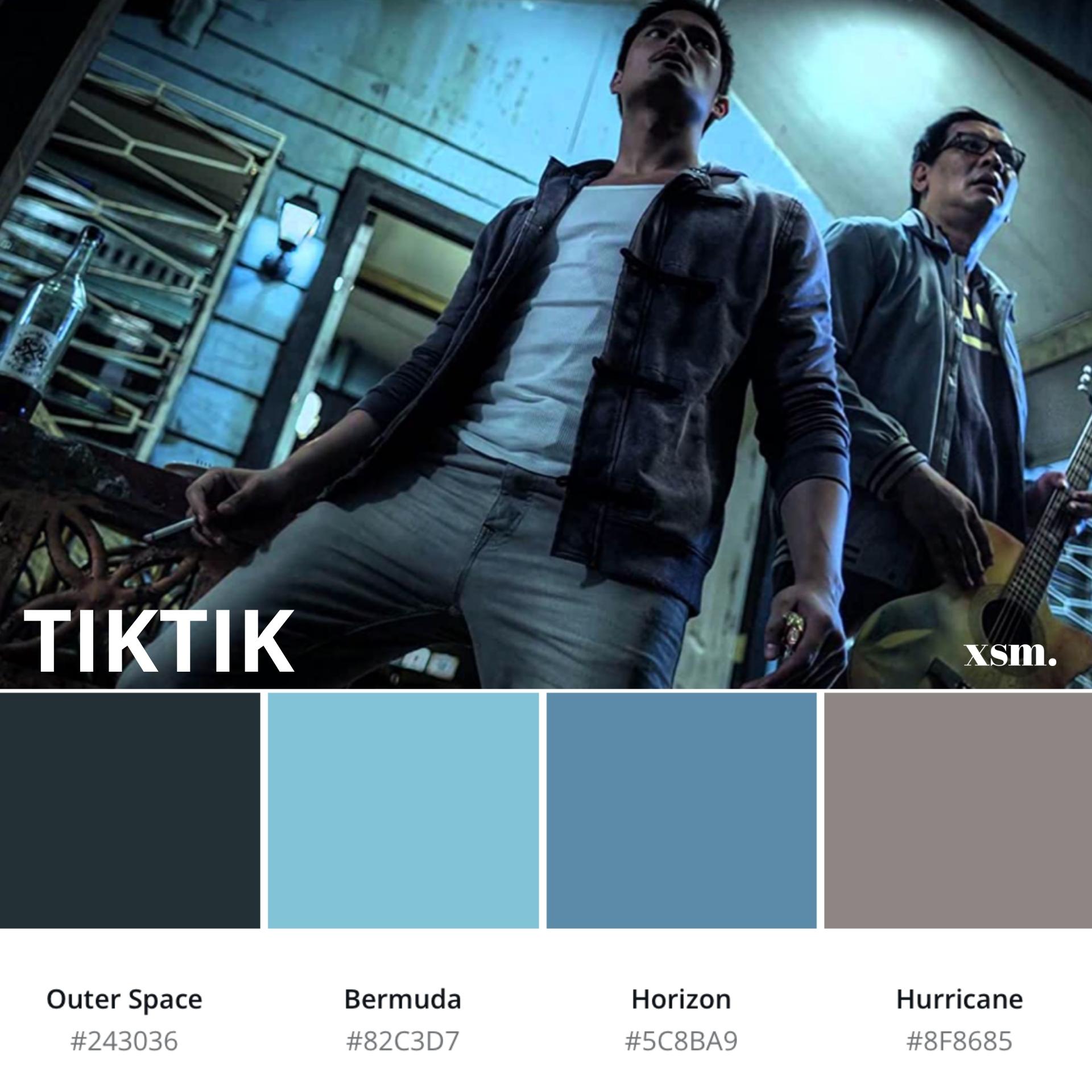
Through the use of proper color mixes and tone, what seems to be a bland-looking frame can transform into a flash of cinematic beauty. This is mixed with the plot, audio bed, dialogue and ambient sound to give the viewer the whole cinematic experience. One of the most powerful skills a colorist possess is communicating emotions with each sequence.
The subtlety of producing such outcome only proves how a film’s color greatly impacts the whole visual narrative of the film.


Your Own Style and Technique
Just like any other software or application, the resourcefulness of skill and talent only comes from the end user. There are two types of editor: a colorist who knows how to use twenty color grading software with complete plugins using the fastest machines yet produces mediocre outputs and an editor who knows how to use 1 or 2 color grading software but delivers the best output that can be as par with Hollywood films.
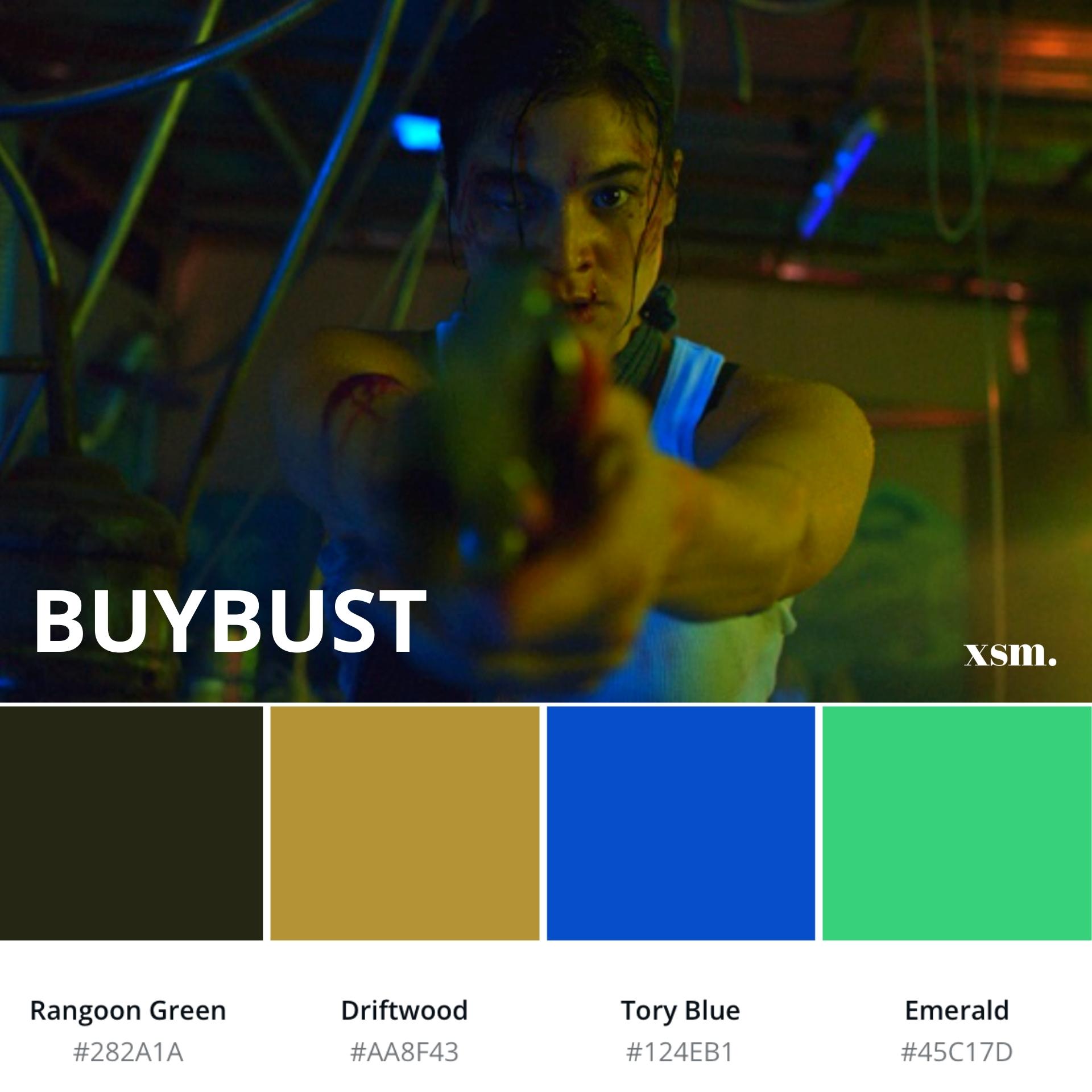
If you are the director or the network executive, who would you choose to hire? As a colorist/editor, you should start to develop a distinct style that can serve as a trademark of your work.


Creating a visual style that people can identify at a glance may have a considerable effect on a colorist’s professional career. Filmmakers and production outfits will often approach you with a diverse variety of projects to work with by establishing a consistent color grading technique.
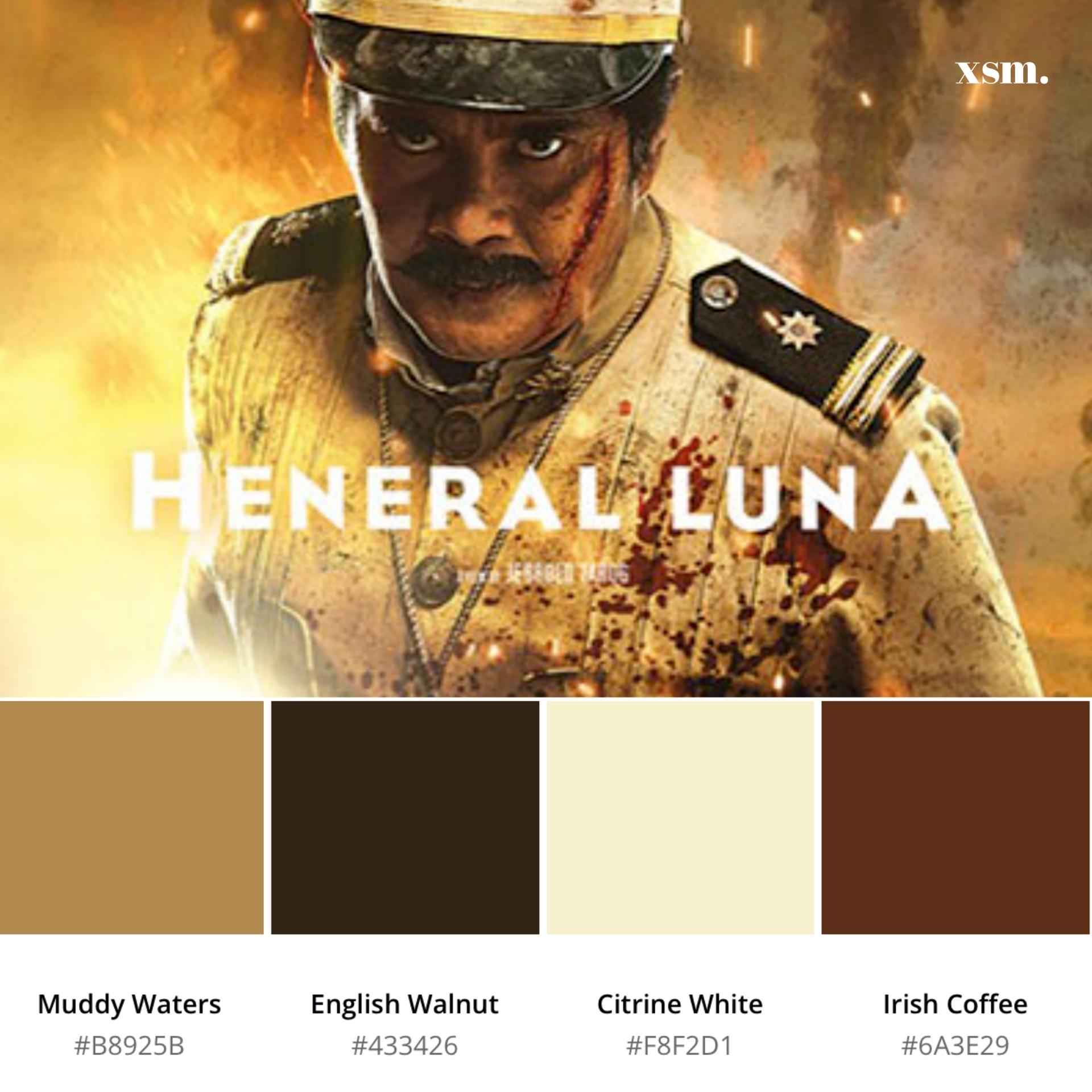
With developing the right style, you can tie everything together into a coherent visual that not only reflects well on you but also creates a distinct value that no one else can provide.
A great example of this is American filmmaker, Wes Anderson. His charming color aesthetic includes deep rich colors on white people’s skin paired with monochromatic pastel tones that is consistently coherent all throughout the film.
Anderson’s palette is so well known and original that the industry is associating his name to a unique set of color usage. It’s like a functioning brand of its own. His technique doesn’t just include colors but rather symmetry, blocking and staging to achieve his naturally quirky universe.

Studio Binder Mood Board
Tips to Start Your Color Grading Journey
- Watch a wide selection of movies. If you grew up having an affinity to watch interesting films then this may come in handy. Use this as your reference to determine the basics of light structure, environment builds, chiaroscuro, the foreground elements and the negative spaces. Taste level will always come to play but 300, Wizard Of Oz, Schindler’s List, A Clockwork Orange, Gone Girl, The Grand Budapest Hotel, Stanley Kubrick Films, Fight Club, Ghost in the Shell, Sucker Punch can be a great start.
- Learn the difference between color grading and color correction.
- Get rid of those pre-conceived notion of imitating other films that serve solely to replace your personal artistic direction. Having style inspirations are definitely good but being original yet adherently listening to the director’s vision is a good step to create incredible outputs that will benefit you in the long run.
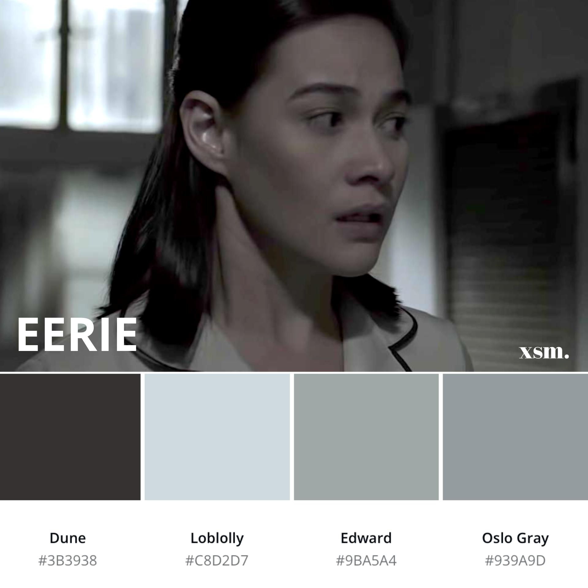
- Develop a good eye for color. Know the basics, like differentiating plum from vermilion, or emerald from green or fifty shades of grey.
- Invest some time in studying color theory from a nuanced art perspective and understanding basic color grading capabilities inside popular software before you contemplate buying costly color grading plugins.
- Da Vinci Resolve 16, Adobe Premiere Pro, Red Giant Magic Bullet Colorista IV, Final Cut Pro X, Color Finale, Vegas Pro and Lightworks are some of the software and plugins we recommend for you to use professionally. You don’t have to learn all of it, just stick to one or two, master it religiously and you’ll become a pro in no time.
- Have fun and stop overthinking a single frame. Get to a point that you can create magic with just essential curves tool and some fine tuning in HLS.

Red Giant Colorista via Adobe Premiere Pro I Source: filmora.wondershare.com
- Have a color variation technique. Change your perspective on series of effects that you cycle through, try some other actions or effects and check whether it suits your style. In that way, your competency level increases developing a fast turnaround time with your projects.
- A good eye is extremely important and make sure that you always have a pre-visualized image direction in mind. With that being said, an excellent color graded material is a conscious choice made between the director and the colorist to suit the artistic requirements of the scene.
- Collaboration is key. Collaboration is necessary. Instead of relying on luck to perfect the appropriate color filter for your scene, be the kind of editor that controls their process intuitively.
- Never stop learning and be open minded to possibilities that will make your output look perfect.
Wrap up
As a colorist, you may think that your only concern are colors but always remember these three words: curate, convey, coordinate.
A carefully curated color palette in film will always go a long way. Convey emotions through colors to set the mood for you to tell a proper narrative. Coordinate consistently using your mastered tools, your good eye, knowledge and skill set.
Always remember that in pre and post-production, color grading shouldn’t be left until the last minute. Instead, it should be one of the considerable driving forces behind the whole development of the film.
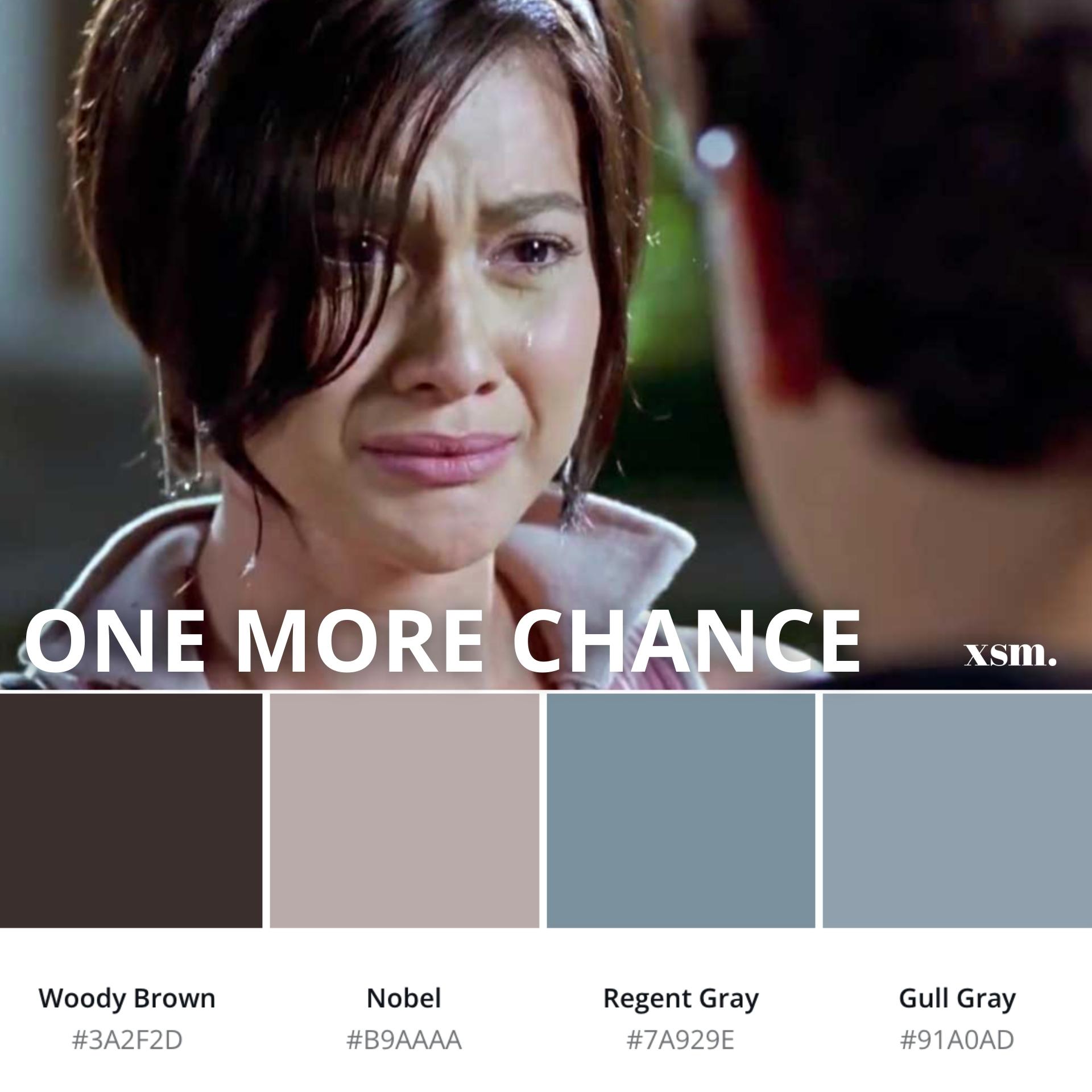
Whatever color grading software you choose, harness it and use it as your weapon of choice.
All these being said, we hope that you may produce the finest possible frames to captivate various audiences and become the next best talent this industry is looking for.
You read this article long enough. You might as well get a reward from it.
Download our FREE Cinematic Beach Luts for Adobe Premiere Pro and After Effects here.


