


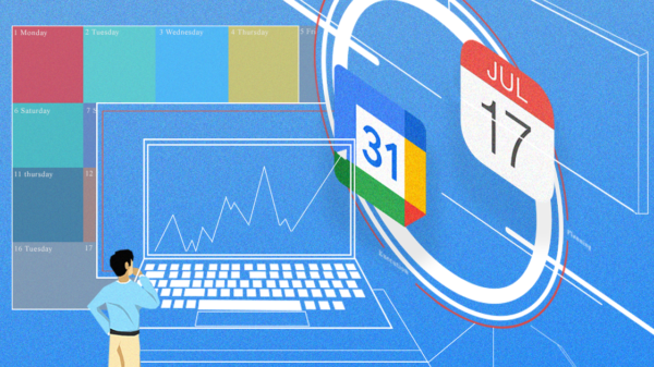


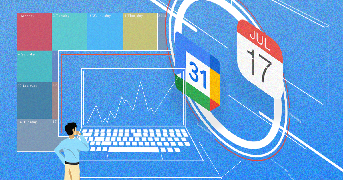
Planning is key with our all-around schedule of multitasking because believe it or not, we are a bunch of multitaskers. Whether you’re a planner person or leaning to a more digital one, Google Calendar and Apple Calendar are here to sum up and make you the most productive person ever.
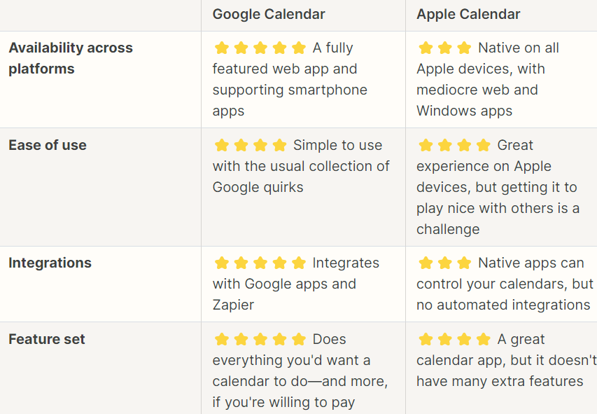
These two market leaders offer a wealth of features that make them a popular choice, in addition to the convenience factor, whether you need a calendar that is best for sharing or one that you can customize to make it completely your own. Two of the most well-known calendar apps that are frequently found pre-installed on respective devices are Apple Calendar and Google Calendar. Services like Google Calendar and Apple Calendar are surprisingly intricate. Both calendars have a backend that syncs everything in addition to a variety of native and web apps. Even more confusing, you can manage your Google Calendars using the Apple Calendar app on your iPhone (and many people do), but you cannot do the opposite. Due to all of this, it is challenging to draw clear distinctions because there are numerous odd overlaps and edge cases.
A SHORT COMPARISON
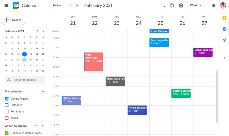
Launched in 2006, Google Calendar is a free online calendar application. Users of the app can easily create, manage, and share events, tasks, and appointments with others. Google Calendar is accessible through web browsers or iOS and Android mobile apps.
Users of Google Calendar can set up different calendars within their accounts to keep track of things like work and personal events separately. You can visualize your schedule by using these distinct calendars, which can be color-coded and have particular reminders and notifications. Agenda view, day view, week view, and month view are some examples of calendar views. The app manages all the data associated with your events and schedule by being seamlessly integrated with all Google products, including Maps, Gmail, Meet, and Drive.

Apple Calendar is a free calendar application developed by Apple. The calendar is available on all Apple devices from Mac to Apple Watch. The app lets users schedule and manage events, appointments, and reminders and sync them across all Apple devices using iCloud.
In addition to managing multiple calendars, setting reminders, inviting and sharing events with other Apple users (more on this later), and integrating with other Apple apps like Maps and Siri (more on Siri later! ), Apple Calendar has a wide range of features. Apple users who need to manage their calendars on the go can do so with the help of Apple Calendar. To keep all of your scheduled events in one place, Apple Calendar can sync with other calendar applications.
Also, you can see in this notable and weigh at your very best:
Screenshot from Zapier
DESIGN COMPARISON
Apple and Google represent two very different approaches to design, and their competing calendar apps highlight the differences.
Color
Compared to Apple, Google Calendar uses color in a much more overt manner. At first glance, you might assume that Google uses more color, but that isn’t the case. Just that Apple prefers pastel shades and more subdued shades of grey when using color. It is very simple to find the current date and the controls to switch to a different view thanks to the two objects’ solid backgrounds, which contrast with the other colors. The three items in the bottom bar, the button group at the top, the search bar, and the “+” in the top right are the exceptions to the rule when it comes to Apple Calendar’s use of bright red.
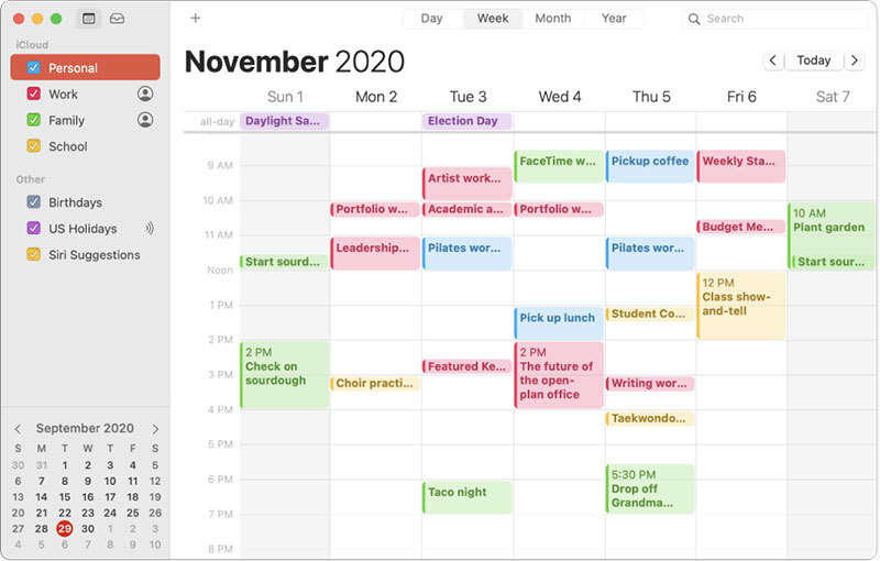
We could say that Apple Calendar uses color in a way that is more utilitarian, emphasizing the aspects of the app that are important for using it. Contrastingly, Google Calendar has a ton of bigger, more vibrant color blocks that really make the objects stand out on the page.
Illustration
Illustration plays a vital role with productivity. We’re easily distracted and at the same time entertained with everything we see around.
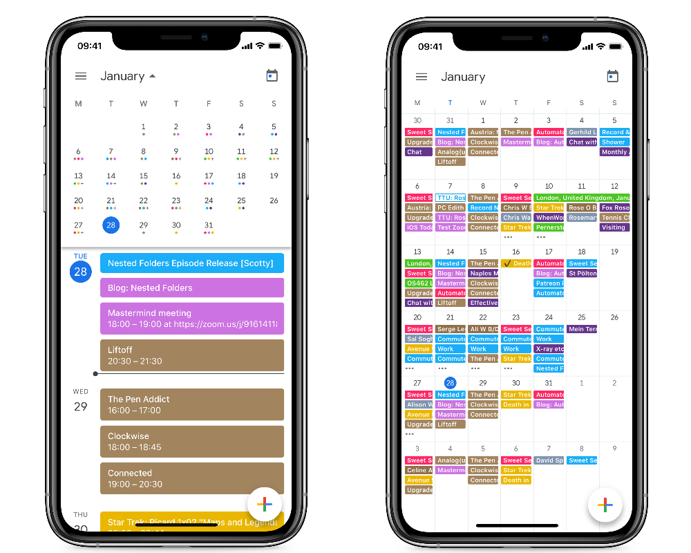
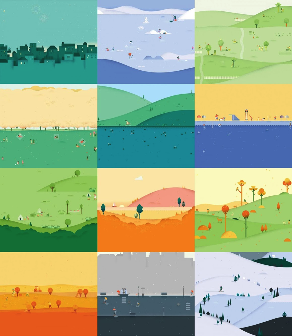
In general, Apple Calendar sticks to a grey and red color scheme with plain text, using red for clickable elements like the month view. There are no frills, few icons, or illustrations. To help us concentrate on the text of the events, Apple uses a minimalist design approach that eliminates as many visual distractions as possible. In contrast, Google Calendar dynamically pulls in a variety of illustrations based on keyword searches to accompany the calendar events. For instance, “drinks with Sarah” features an illustration of a few cocktails, “lunch with Brad” features a table setting, and “meet with Blake” pulls up a Google Map preview with a picture of Philadelphia for my rematch. There are a number of additional images created specifically for this use, each one tailored to activate on specific keywords. Quite cute, am I right?
However, there are a few real-world drawbacks to this. Events on Google Calendar have text that is more challenging to read than the images. For instance, the contrast between the text “Meet with Blake” and the background image is very low. When you use of these apps, you will discover that the Apple Calendar view is much simpler to scan even though it is less interesting. Also, because of the background images, Google Calendar takes up a lot more space for each event.
Fun fact: Google Calendar’s month illustrations excite every user most especially designers. It’s just so pleasing to the eyes and it brings a total sense of comfort to every user.
CONCLUSION
See the pattern? Google’s design focuses on personality and vibrancy, while Apple’s design emphasizes minimalism and utility. Although both platforms strive for simplicity, minimalism is consistently more of a theme in Apple’s design than Google’s. This is undoubtedly reflective of Jony Ive’s remarks in the documentary Objectified that good design should be “inconspicuous” and feel “almost undesigned.”
Remember that both are functional and have attractive designs. Despite the additional visuals, Google Calendar isn’t overly challenging to use, and the Apple Calendar doesn’t look bad either. However, they both tend to lean in different directions.