There are various web designs that you come across on the internet. There were only few options in the beginning, remember the marquee effect on your Friendster page? Or P-align center with textured patterns on your Myspace account?
Yes, those were the good old days we are talking about.
What’s important is that we endured and sealed all those traumatic experiences where designing websites were more difficult than memorizing the ‘up down up down left right left right 60 lives combination’ of the game, Contra.
As the world is progressing, there are over thousands of different web design styles out there that you can use for your projects. Here is a rundown:
Parallax
The first one is the widely used Parallax animation. It is when a user sees close elements moving faster than distant objects (or background). Using Parallax animation for your next project will turn your screen into a stunning realm. The Parallax animation will surely enhance the quality of your project. It is slightly more complex than a simple web design but it is definitely easy to learn with the use of some plug-ins and some few clicks. You can definitely sustain more website visitors when you use this type of interface.
Parallax adds that 3D effect finish on your website. People are more inclined to websites with added oomph factor and this type of web design just gives that. It offers an added delightful experience to its users.
Colors


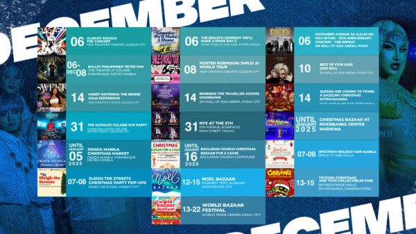
Colors matter the most in any web design. The more you are playful with the colors, the more your work will be attractive to website visitors. Playful doesn’t mean you use the whole spectrum of the 64 crayons. It just simply means that you use the colors intelligently.
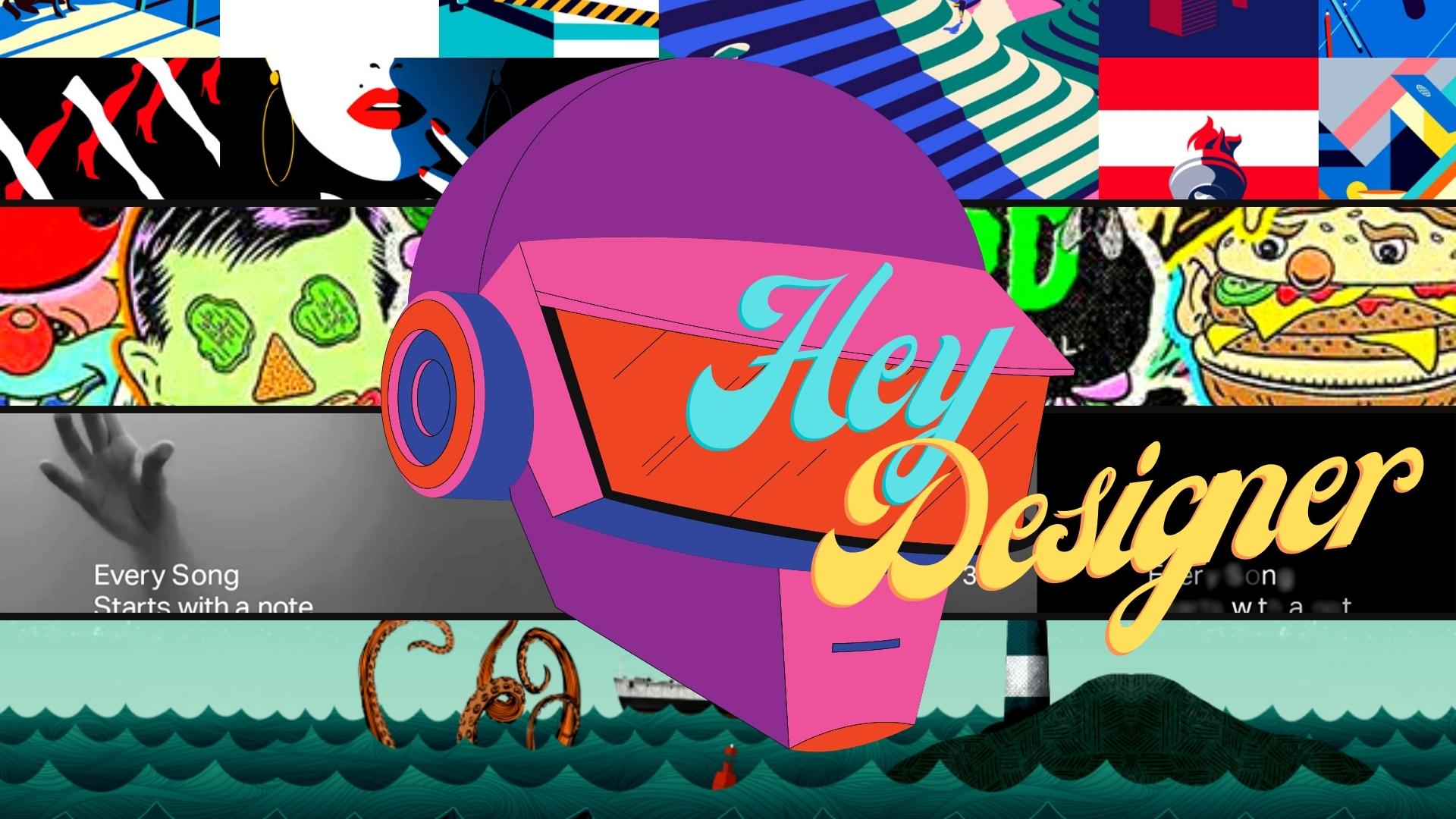
Custom Illustrations


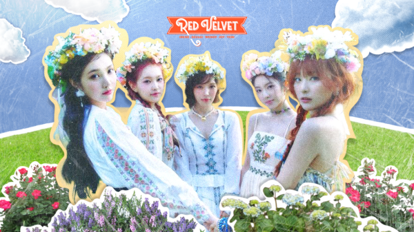
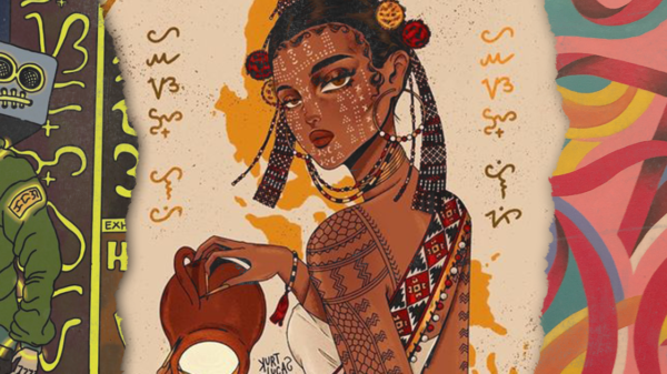
Custom illustrations never go out of style. Just by saying the word ‘custom’, it added atleast 40% of creative factor to your work. There can be various selections of stock elements over the internet but no one can definitely beat sheer talent and imagination.
Gaussian Blur


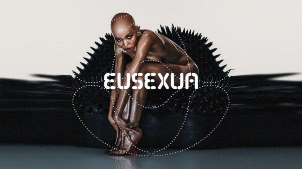
Gaussian Blur is not new in web designing. This term isn’t even used in web design as it is normally used in photoshop. But what the heck? Adding this to the roster will add dimension to your website. It navigates the users to pay attention to the focal point of your site that will result into a better user experience.
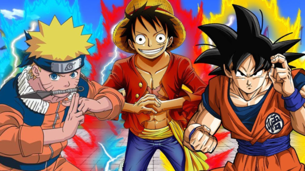
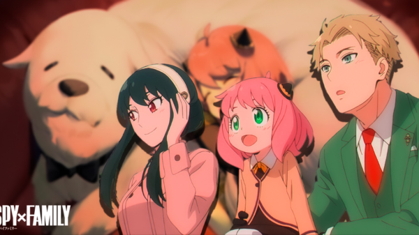
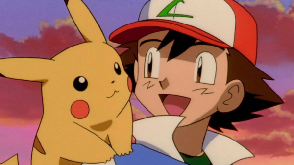
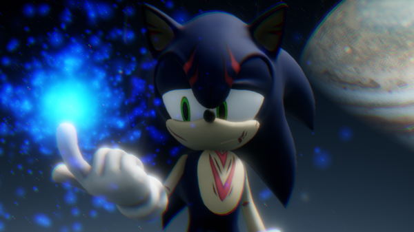
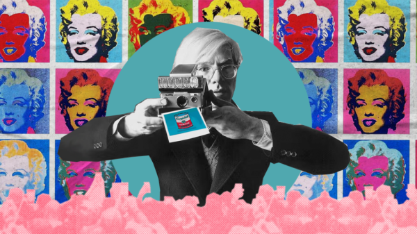
Cartoon Style Concept


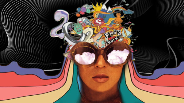
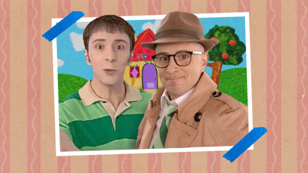
The comeback of all comebacks. Cartoon style concept depicts a more human approach to your website. In the age where most designs look mechanical, this style creates a sense of organic aesthetic. There are countless sub genre for this style. You can experiment on Pop Art, 2d, 3D and vectors. What we like about this style is that it is adaptable to any brand.


