Throughout the years, design has always been there as part of our network as human beings and in society. With the growing capacity of technology and the advancement of the digital world, no wonder designs nowadays are truly remarkable, eye-catching, and successful.
DESIGN IN MOVIE POSTERS
In order for films to sell, you should market it in a way the visuals are appealing regardless of resources. People from the 1920’s up to present are innovative enough and the results are the living of how things changed over time.

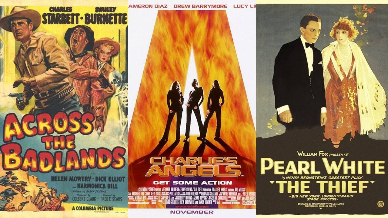
1920’s to 1930’s
In the late 19th century, film grew just like that. Film posters from the 1920’s and the 1930’s focused on the characters. The style started from a simple advertising to art form. Film posters were being hand-drawn over stills and was focused on the characters. There was also a shift towards bolder typographic of designs.

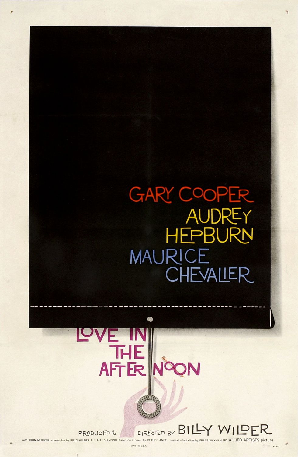
1940’s to 1950’s
In here, the backgrounds shifted into solid colors. Because of the Great Depression that took place, the budget to create were also cut back. The topics changed from war to science fiction, and comedy. Posters began to take on a more conceptual approach with less characters.
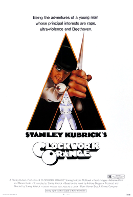
1960’s to 1970’s
The style in this era grew by matching. Posters with contents inside the movie became the main strategy. This era also used painting as subject to posters. Photography was also applied in the making of posters. With the concept of photography in film posters, the movements of change became fast.
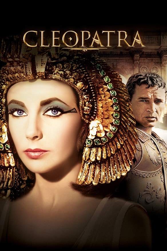
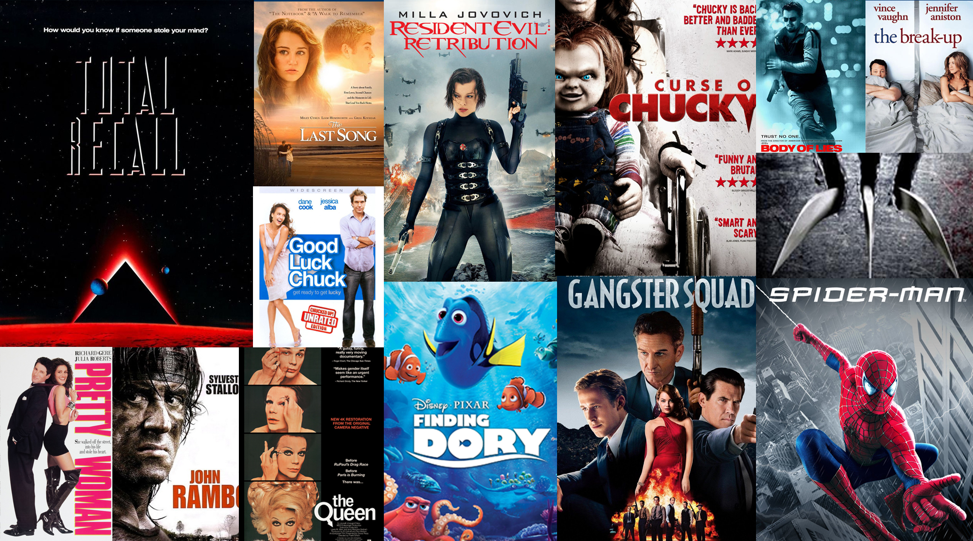
1980’s to 1990’s
This was the era that was synonymous to what we see today. This was where development started when it comes to the introduction of effects—posters began featuring images with creatures and locations. They were also headlining and used slogans as elements.
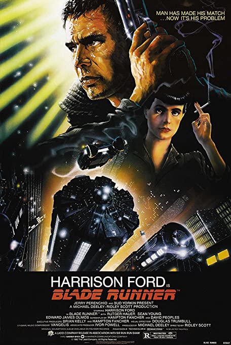
2000’s to present
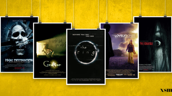
As design continues to evolve, the beginning of 2000’s was also the beginning of improvement in sleek typography. Time passed and there were some concepts of putting limited characters or styles in minimalism. The layout was noticeably the same but the photography and subjects inside the posters were balanced and winning.

CONCLUSION
Looking back, this industry will never come up with the recent trends and types of style without all these nonstop learning and innovation. People might tag this as trial and error era but it worked effectively over time. The rise of technology was really gold when it comes to developing software, having people to study it, and artists improving themselves. This is just a manifestation of how beautiful and impactful transitions and designs are in general that we people get to explore and enjoy.


