Who wouldn’t want a feed with a certain theme that is eye-catching and gorgeous?
In today’s time, content is everything—your followers might be wondering, what’s inside that mind for you to come up with a specific content that can match your personality?
People have different target audiences on Facebook, Twitter, Snapchat, Reddit, and Instagram. And from all those, you also build different personas on how people will perceive you based on your craft and the stuff that you do.
Aside from that, this pandemic has taught us to maximize our time and materials available and not compromising quality. As a person who works where social media is one of the bases that can be the definition of creative, you might want to level up the game and improve the basics.
Here are some cool feed ideas from aesthetically-pleasing accounts where you can get inspiration to:
@asheleighsutlive
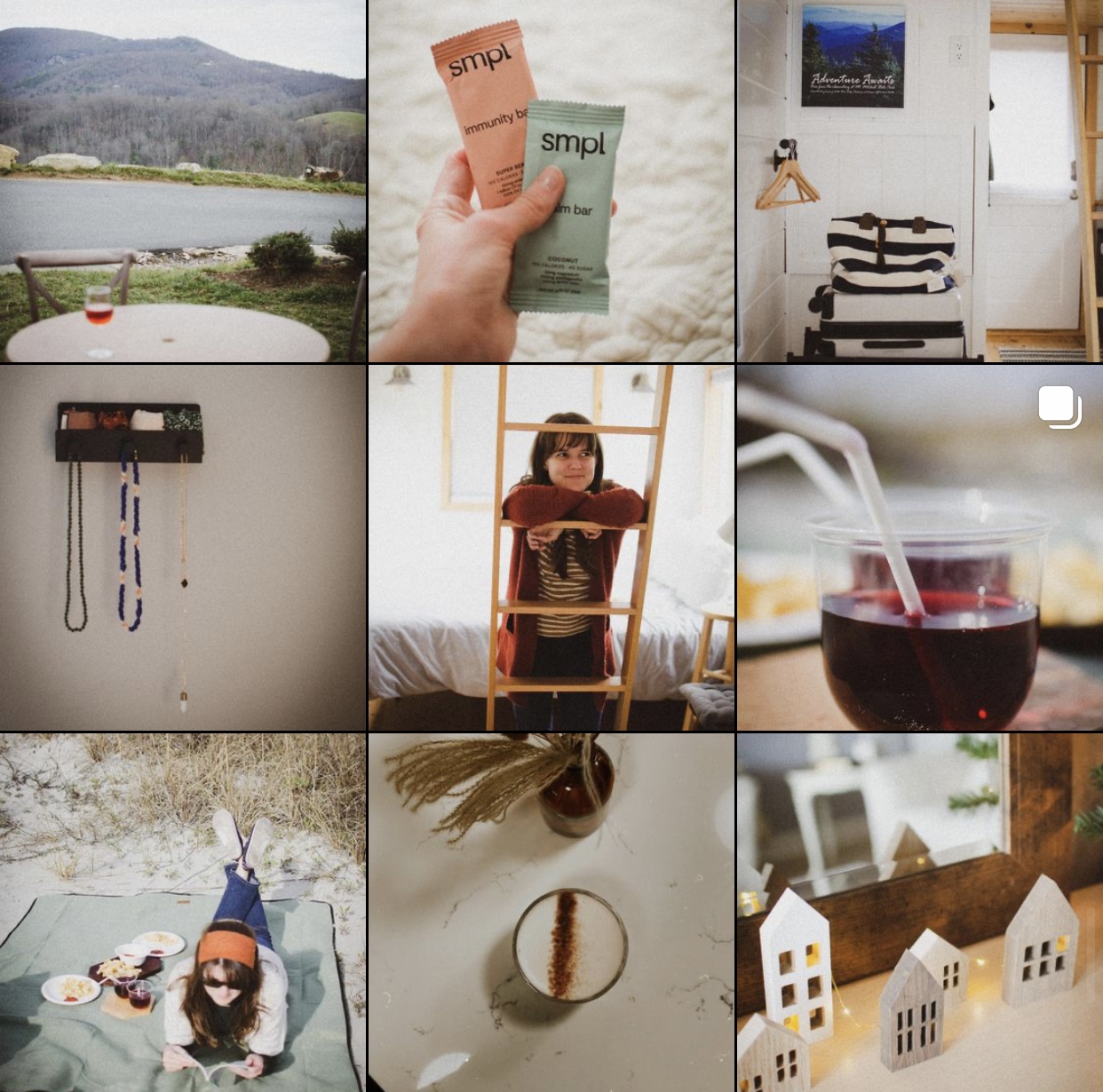
This IG account will give you comforting vibes from grid to grid as the overall look was just warm and calming. The theme relies more on the soft and muted photos that it would want to make you travel right now.
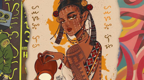
@juniperoats
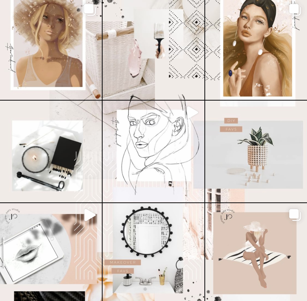
If you’re a digital artist or hobbyist, this can be your build-up inspiration to pursue that level on your Instagram feed. This well-planned feed is such an inspiration to anyone pursuing the arts craft.
@dreamermagazine
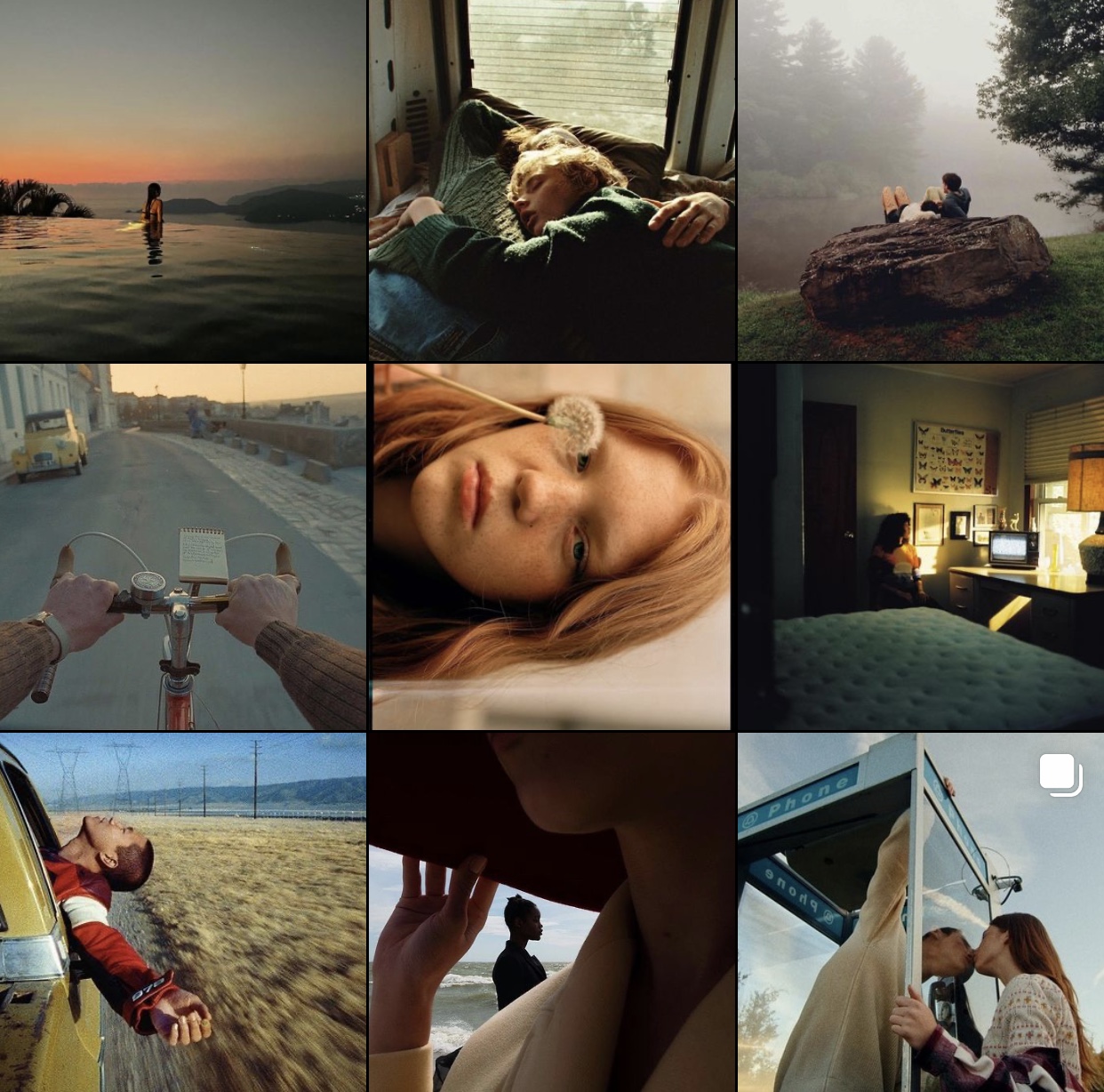
For the people who shoots different subjects depending on the location, check this out. The catch would be, your photos are all on the contrast, dark tone. The mood will be setup like that for you to establish a particular vibe that is dreamy and hip.
@monaris_
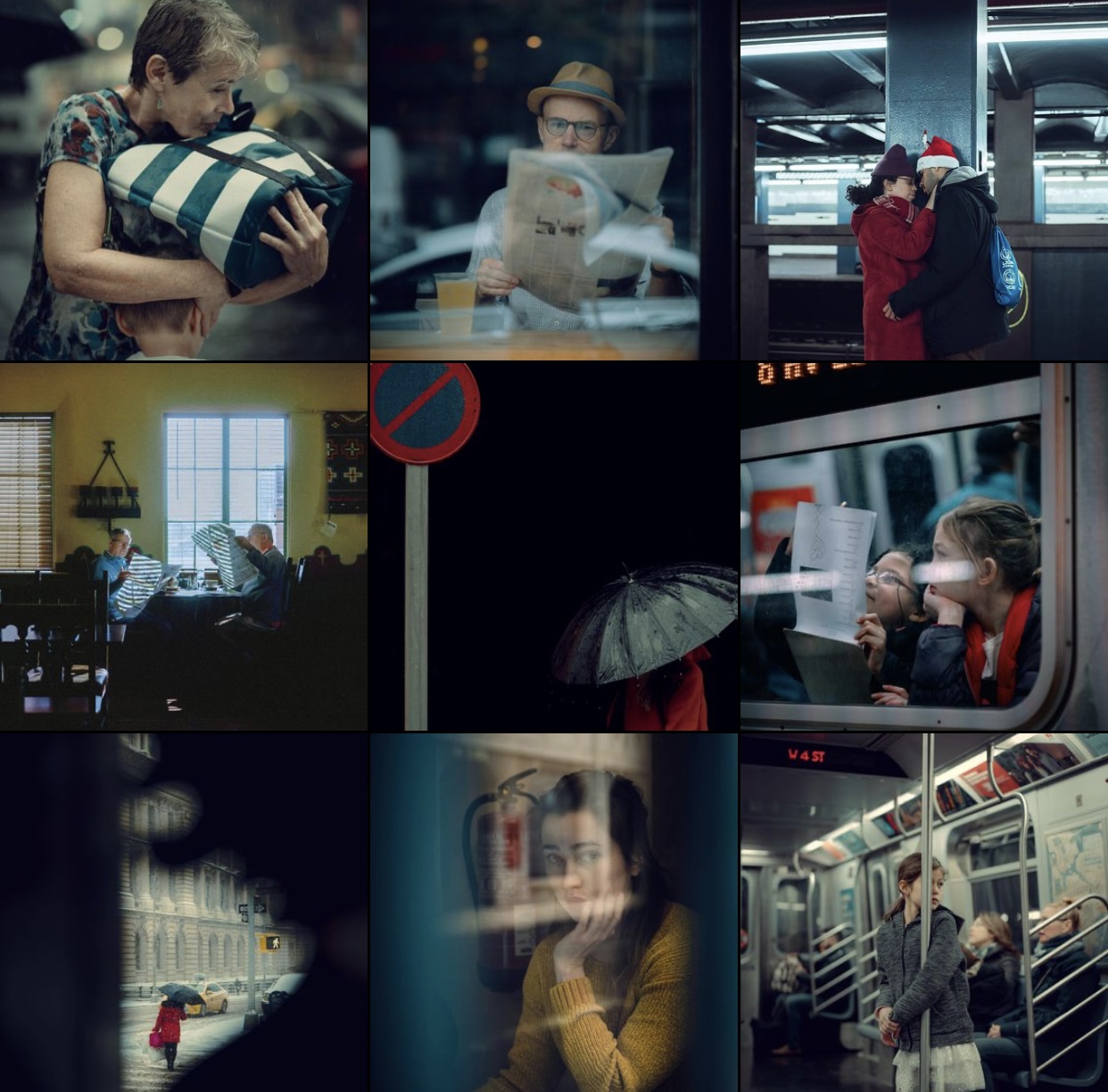
This cool account is a perfect inspiration for film enthusiast or city enthusiast who want to capture anything mundane on streets. The black borders will serve as your personality while the mood of the color should be in uniform that it would let your followers think it’s a snippet from a movie.
@shortstache
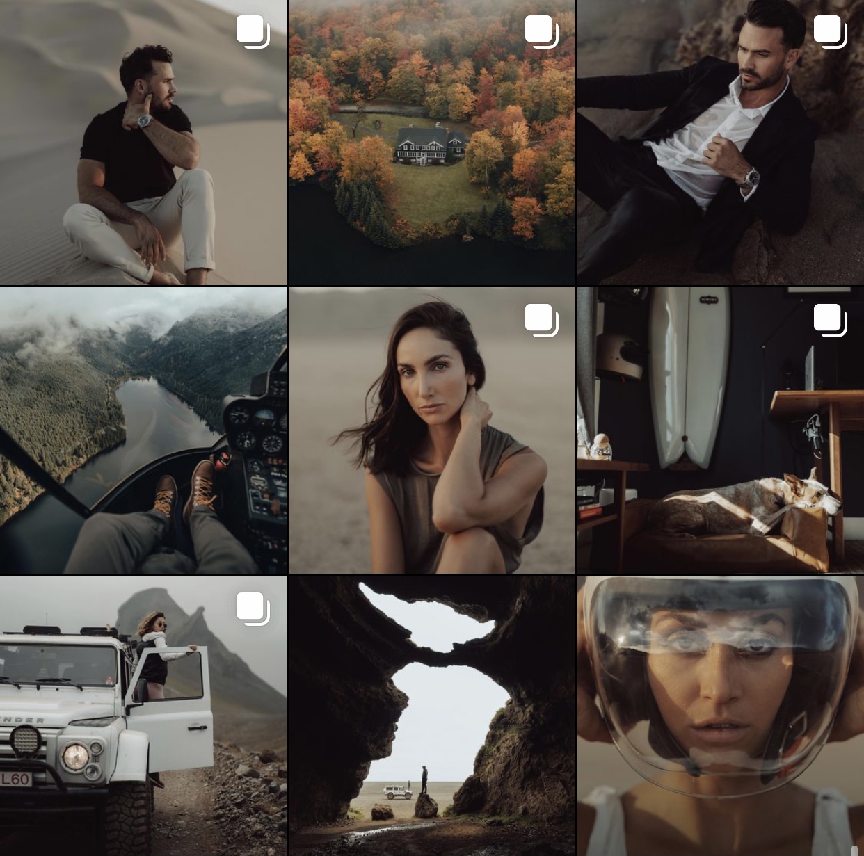
Absolutely stunning idea for Instagram content creators who wants a plain impression of their feed leaning on to the darkest side. There is no specific color grade or highlight so that not even one photo will stand out—breaking the pattern. The theme would be in the middle: assessing that it’s not too dark, but it’s not to light either.
@kylejengman

For vertical and horizontal images that can be uploaded simultaneously, you may use this inspo to get a balance perspective on how well it could look like when you upload it. This creates spaces in all your photos and you’ll determine which stands out from the rest. The feels might give you a sense of belonging inside an art museum.


