You might come across Denis Villeneuve’s name earlier this year as he was making a noise being the director of the Oscar-contending film, Dune, which bagged 10 nominations this year. That was kind of lit.
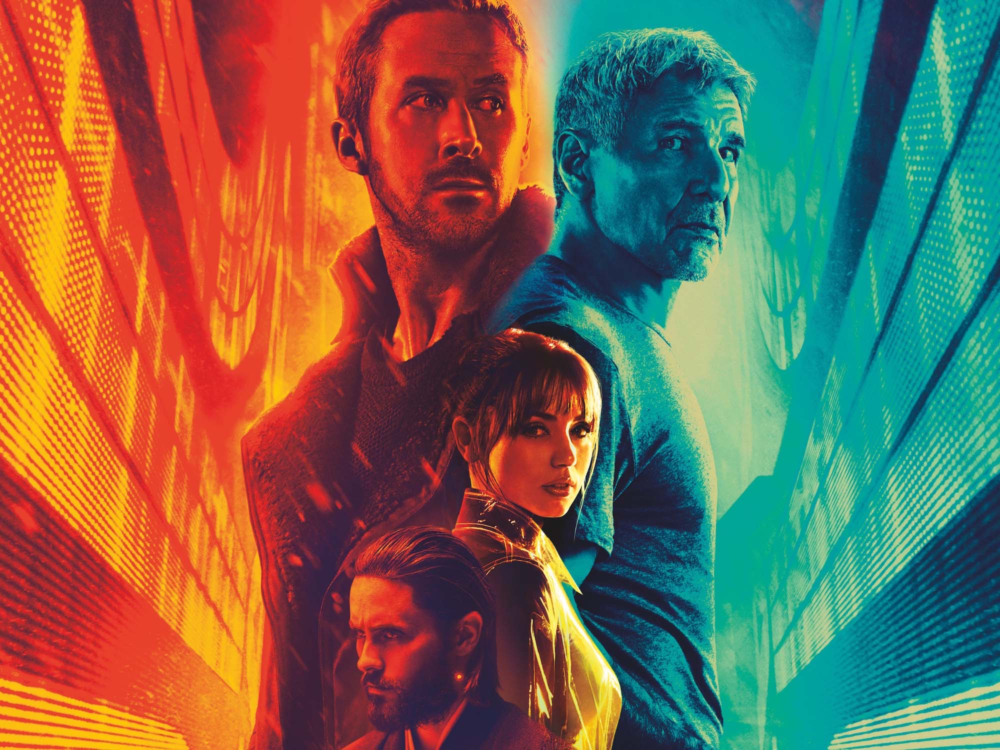
‘Blade Runner 2049’ is a 2017 American neo-noir science fiction film directed by Villeneuve and written by Hampton Fancher and Michael Green. It’s about the story of Officer K, played by Ryan Gosling, who exhumed a long-buried secret that has a potential to create chaos in society. Upon his discovery, it led him to a quest in finding Rick Deckard, played by Harrison Ford, a former blade runner who’s been missing for 30 years.
VISUALS
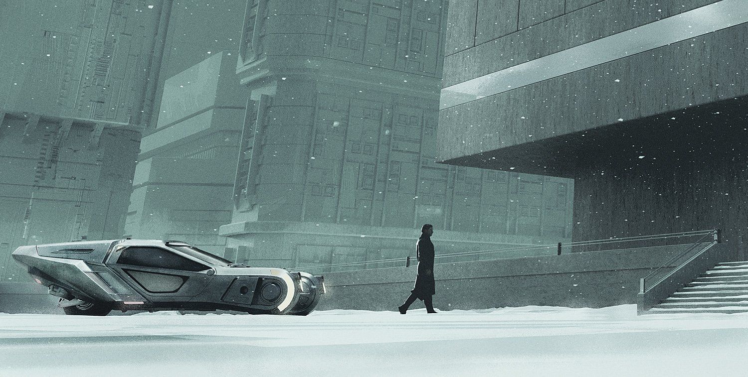
To be honest, this is one of the most beautiful sci-films ever created because of the visual appeal that will make your jaw drop. Imagine, the Villeneuve and Roger Deakins duo?
Cinematographer Roger Deakins mesmerizes us with a well-crafted cinematography and stunning details.

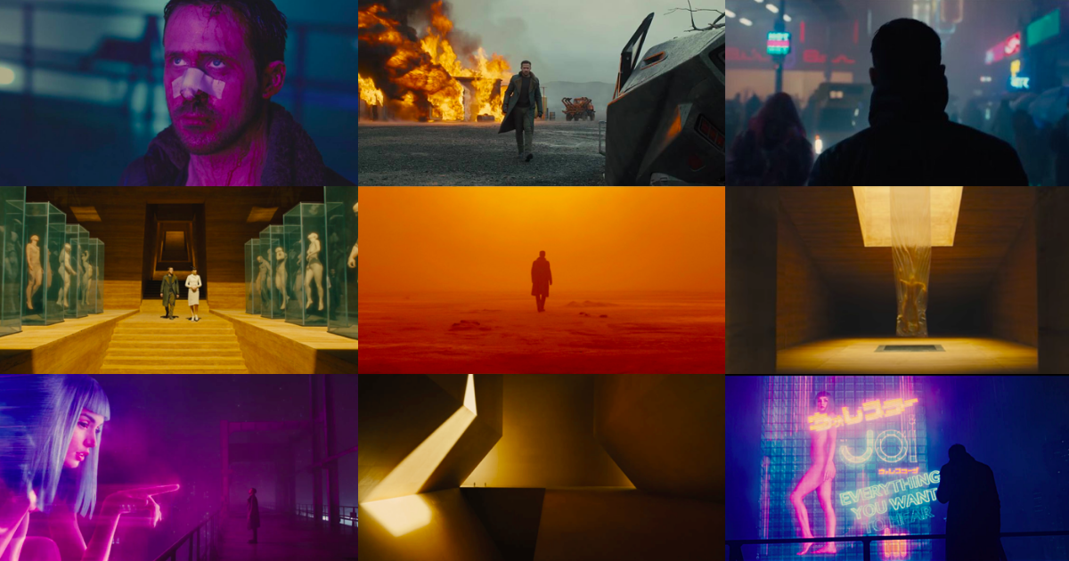
Half of Blade Runner 2049s cinematography is a mise-en-scene—the buildings are very sharp and geometric, the futuristic technology is on point, and the landscape is foreboding. Deakins pulled inspirations from locations such as Beijing, Sydney, Southern Spain, and Saudi Arabia.
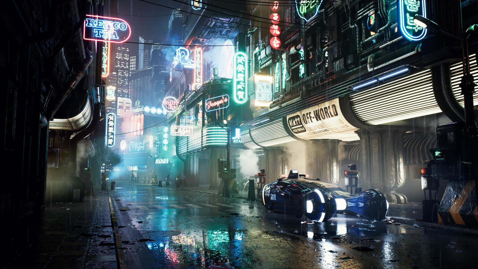
He matched and put the camera framing in its advantage within the frames. With the set designs, it allowed them to pull amazing wide shots allowing the viewers to see and feel the atmosphere in a science fiction world. Mise-en-scene is nothing without good lighting.
This film’s lighting is very much crucial to its color palette. Remember, Blade Runner 2049 is a dystopian techno-future and light is manmade. With all those movements, practical lighting is the key to success. Practical lighting could look as fake and moving water or a hologram for worse.
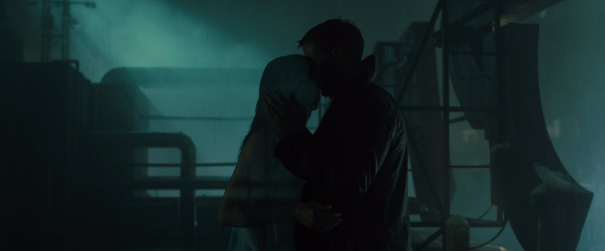
In order for Deakins to achieve the best lighting while still not losing the concept, a massive skilled crew was needed and a programmable LED light board can also do the justice.
COLORS
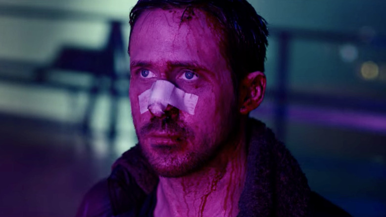
Color is a very powerful tool when it comes to film. ‘Blade Runner 2049’ high-key used colors to tell its story.
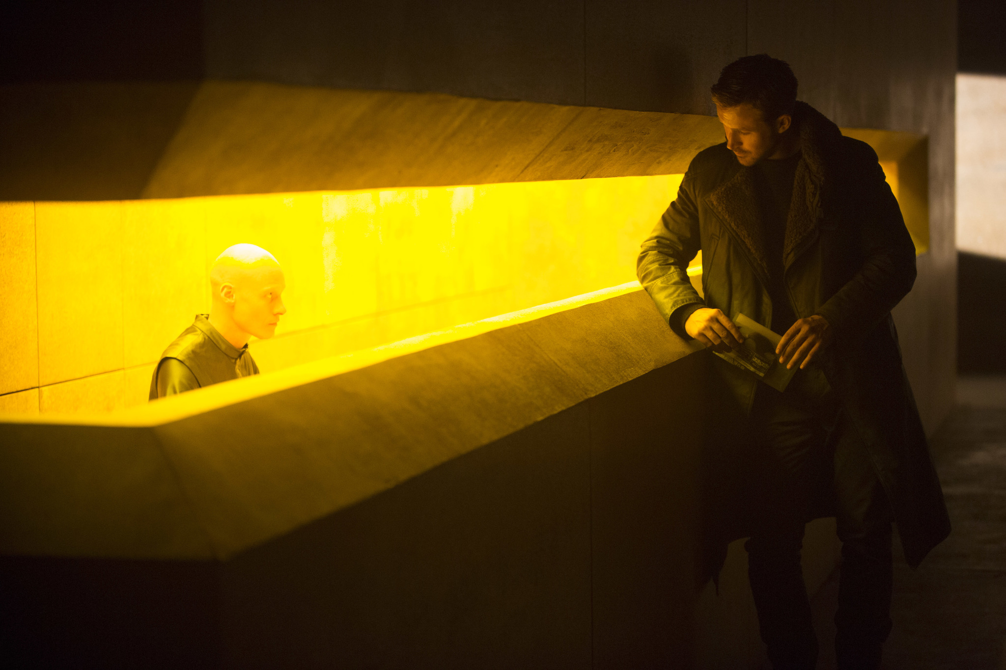
Denis Villeneuve uses the color ‘yellow’ as source of information and enlightenment. Any major changes and plot twists are in the yellow composition to act as a subconscious cue for viewers and the hero.

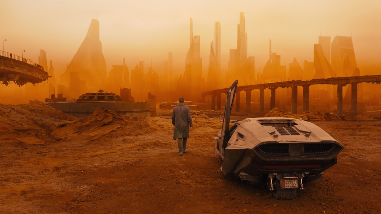
Orange: He uses the color ‘orange’ as a reminder and a warning. This color is the backdrop for this film’s caution scenes involving the protagonist. It is also concerned with transformation and transition.

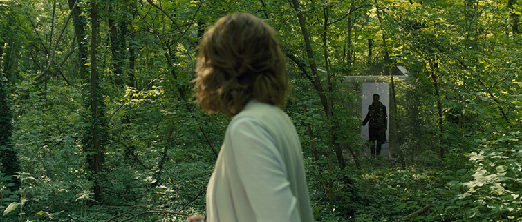
Green: You’ll see a wide range of ‘green’ every single time Officer K’s robotic companion is on screen. Green speaks of vibrance and conveys the move to discovery. This is also a strategy in contrast with having robots and tech-related inventions covered in green background which signifies real environment together with the artificial.

Pink and Purple: Most of times, these colors are very much associated with extravagance, ambiguity, innocence, and romance. This signals romance in every aspect available and also adds harmlessness throughout a particular scene. In this type of color setting, you can see how these hues will serve as realizations to each individual too.

White: ‘White’ declares honesty and information. In an event where Officer K is somewhere near in discovering his true identity, things around him are bathed in white. It also includes powerful contributing factors like the snow and the building that is actually white in color.

