Clients are very keen when it comes to the results of the design they wanted to have and designers are there to hear their thoughts out. Their choice of colors varies from a lot of different shades, oftentimes changing, but one thing is for sure—designers should have a knack to master them and get things done. They are the guiding light in one’s dreamy ambition of achieving an output that is perfect to the eyes.
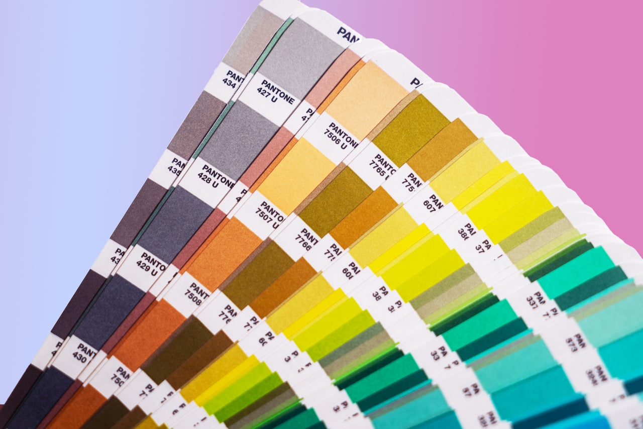
Pantone is now used universally and recognized as the world’s authority in color. It is the color standardization system that assists in color matching and identification—comprised of 1,867 solid colors.
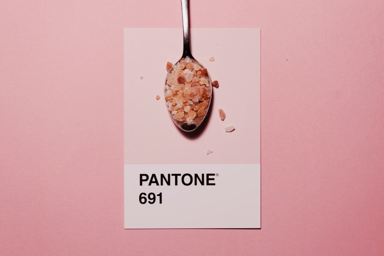
Pantone is actually a great help in the business industry, most especially thriving in the design, animation, advertising, and marketing materials. Pantone’s color language supports all color conscious industries; textiles, apparel, beauty, interiors, architectural and industrial design, encompassing over 10,000 color standards across multiple materials including printing, textiles, plastics, pigments, and coatings.
Again, why is Pantone needed in design?
The importance of Pantone lies not only to make an ‘effective’ color strategy but also the information it provides about market trends. Choosing the right color is the riskiest decision one designer makes. It allows the designers to color match specific colors when they have designs that are entering the production stage.
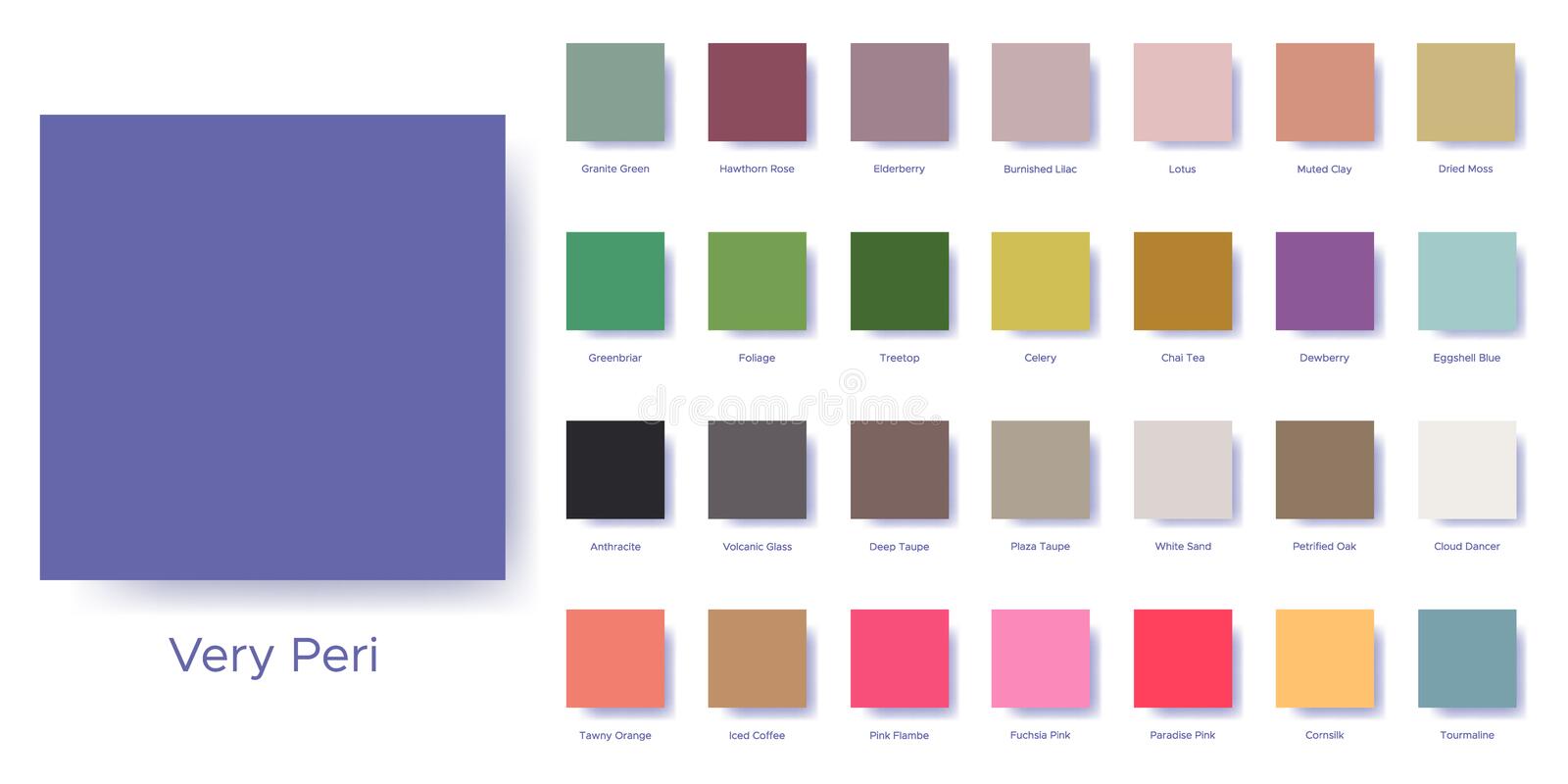
Pantone colors have been developed to introduce a greater level of precision to manufacturing, design, and textile production. It provides a wide range of Color Guides to allow you to browse colors specifically tailored for the industry you are working or for with.
The beauty about having Color Guides is that, when you invest on it, it will lead you specifically to a match expanding on the industry you are working on.
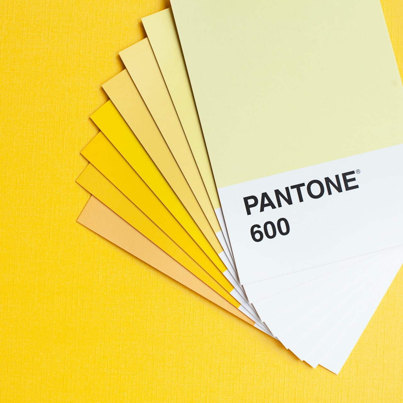
This year’s Pantone Color of the year is PANTONE 156-1546 LIVING CORAL. Having this ‘Color of the Year’ is an effort that has been led by the Pantone Color Institute and it’s an initiative that proposes a certain type of color from Pantone’s color palette based on the analysis of market trends. This is highly-considered and is put to action for all sectors including architecture, fashion, and graphic design. It will bring influences that are business-related and that it affects branding, product development, and packaging design.
CONCLUSION
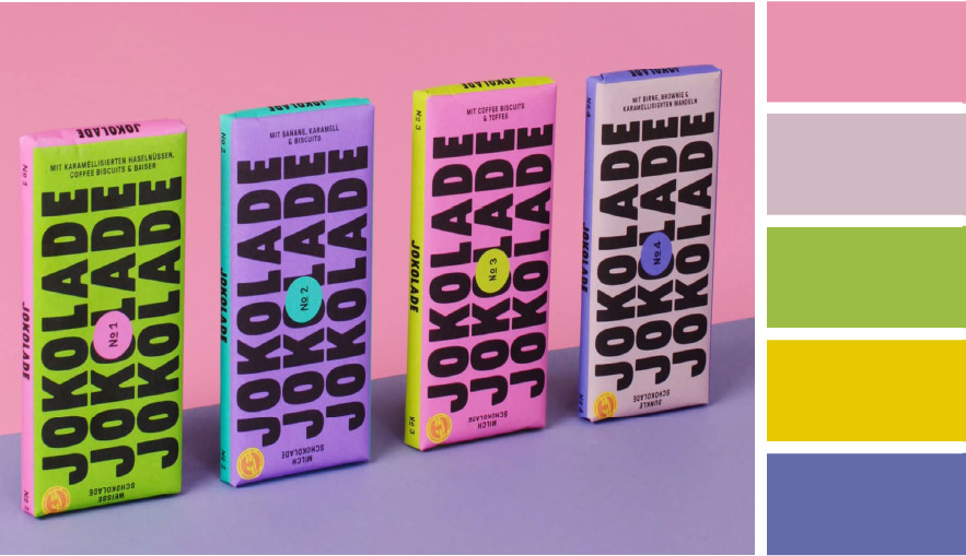
Colors signify brands. It’s the first thing people see when people are looking. You are not very limited in design just because of Pantone. It can also be used in photography—you use color palettes to determine your shot in stylizing food, landscapes, and product shoots. It helps you maintain your harmony while shooting. In creating templates, it is one of the most effective style to incorporate a social media post, illustrations, decorative prints, and merchandising products. Pantone is a recognized brand that provides security to designers for consistency from the beginning, production, up to manufacturing and bringing their designs to life.


