Do you find yourself wondering why customers buy that product instead of yours? You have researched and verified your ingredient claims. You have amazing customer experiences to share. Yet, your target customer still chooses another product.
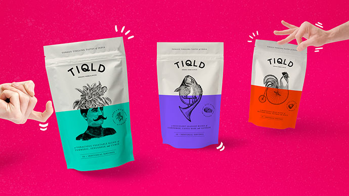
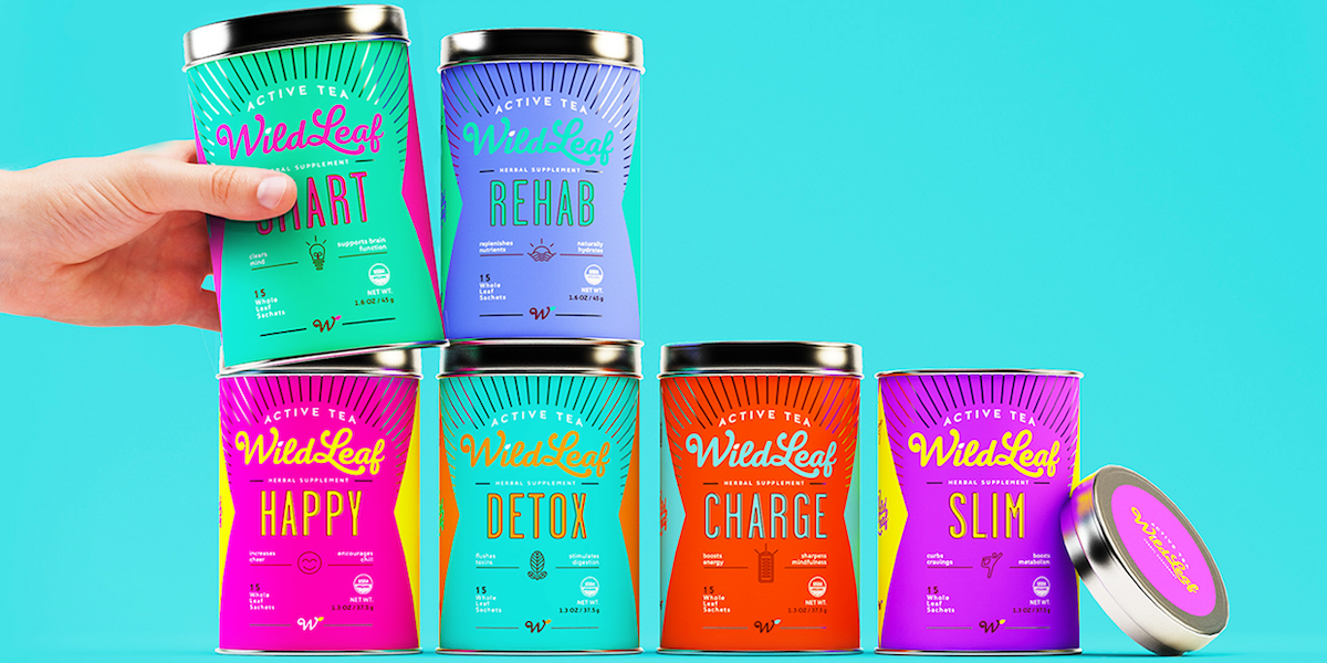
People conduct research and gather data before they buy, but at the end of the day they buy based on emotion. Colors make such impact for they are visible from a greater distance than other elements such as copy, shape and graphics. Color is vital to packaging.
THE WHITE PACKAGING
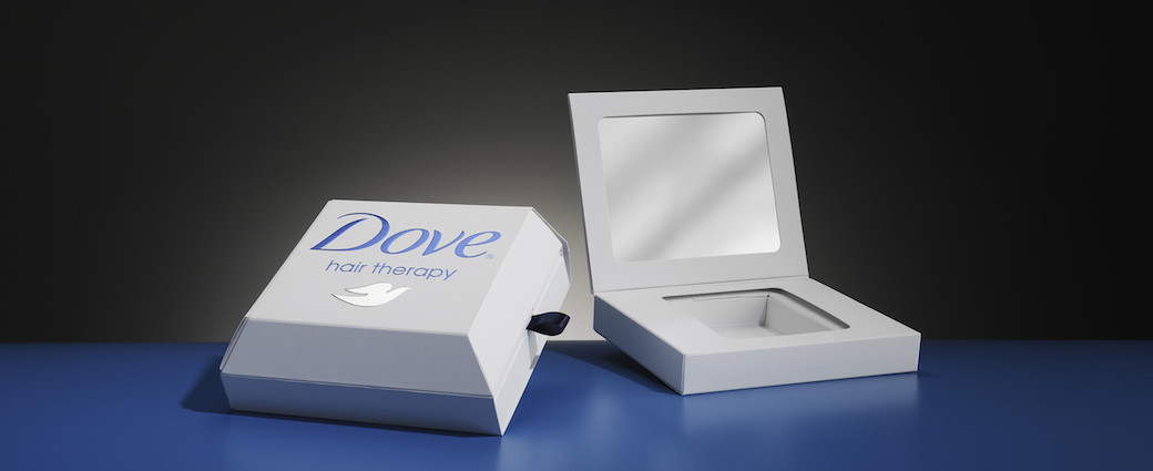
In color psychology, white is considered the blank canvas. It communicates innocence, equality and new beginnings. As a packaging color, white is safe, simple, unadventurous and conservative, but a good choice where you want to create a look that signifies cleanliness, purity, efficiency or simplicity.
THE BLACK PACKAGING
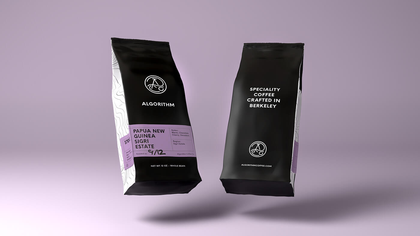
Black is a powerful color, signifying control and authority. When used as a packaging color, black tends to stand out and make products appear heavier, higher end and communicate an enhanced perceived value. It evokes mystery, class and elegance.
THE BLUE PACKAGING
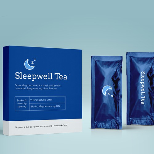
Color psychology links blue to honesty and dependability, strength and harmony. When used in your packaging colors, it corresponds to the product’s effectiveness and reliability. The darker the blue packaging, the more professional, serious and conservative the product will be perceived to be. The lighter the blue packaging, the softer and more creative the product will be perceived to be.
THE RED PACKAGING
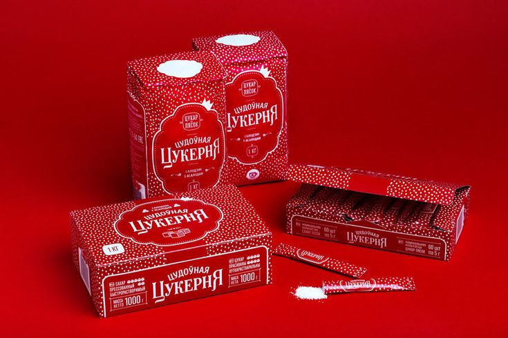
Red draws attention to your product, stimulates the senses and excites the potential purchaser because red signifies liveliness, action, passion, enthusiasm and strength. Dark reds are perceived as professional and luxurious, while bright reds are more exciting and energetic and generally of lower perceived value than dark reds. Adding gold or silver for the printing or decoration of your red packaging increases the perceived value.
THE GREEN PACKAGING
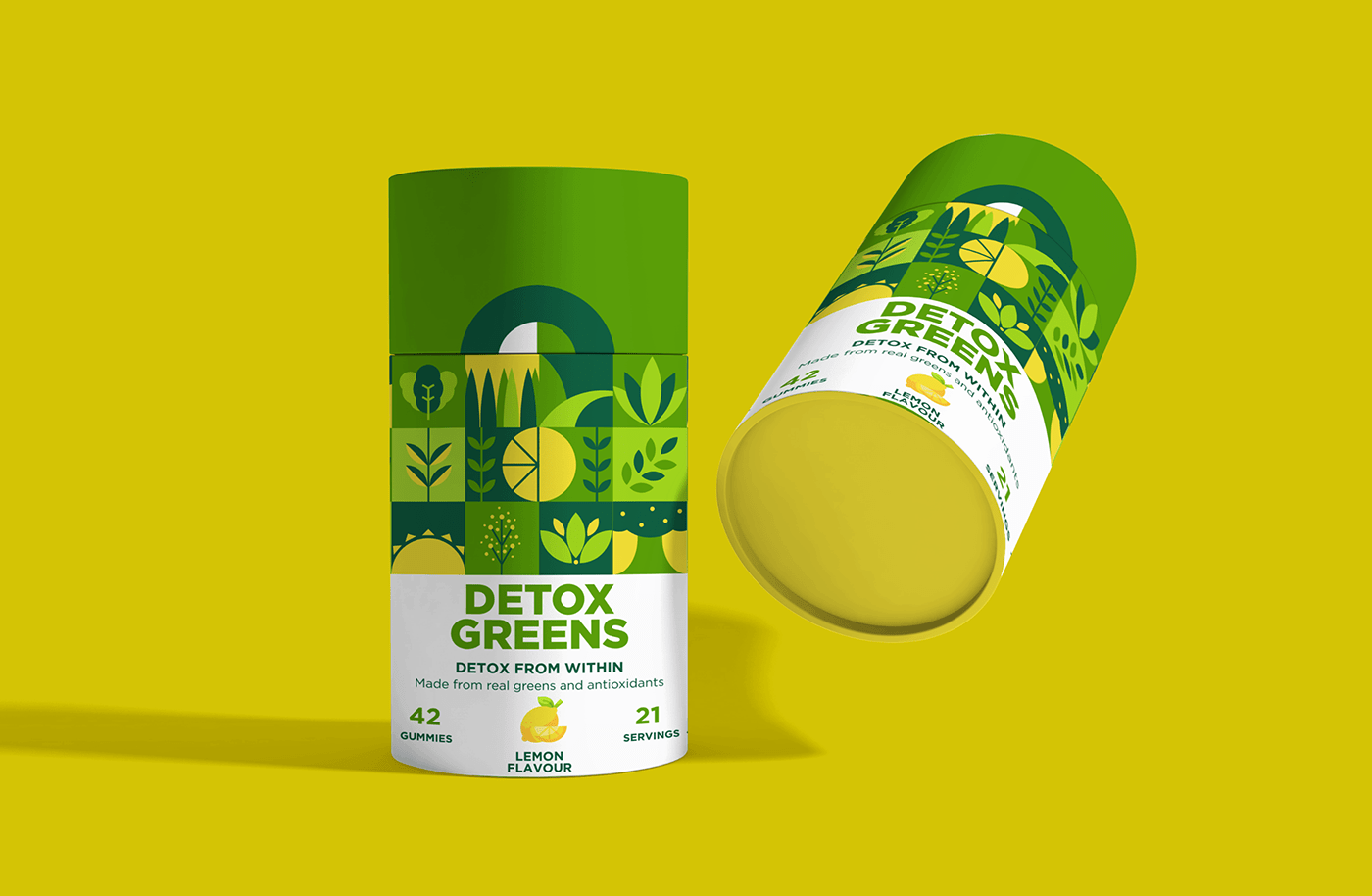
Green is linked to security, wealth and growth. Always a great choice for nutraceuticals, eco-friendly or natural products, green suggests natural, organic and healthy items. Dark green implies wealth, luxury and professional quality, while light or muted greens suggest environmentally safe and nutritious.
THE ORANGE PACKAGING
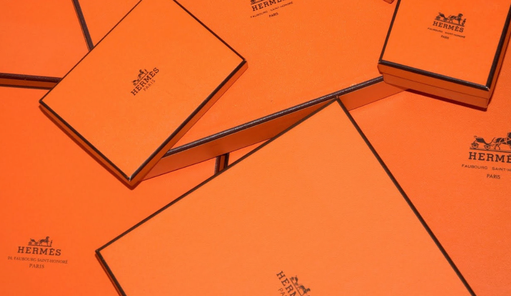
In color psychology, orange means exploration, optimism, self-confidence and friendliness. It is passionate, extroverted and outgoing. Orange packaging suggests cost effectiveness, fun and adventure. There is almost a gamble involved in buying a product in orange packaging. It suggests something different, a journey, or an affordable price.
THE YELLOW PACKAGING
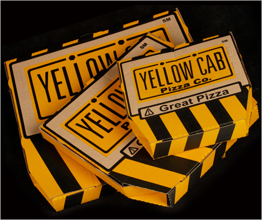
In packaging colors, yellow suggests either something original and innovative or a cheap, fun product. With its positive and happy energy, it attracts children and young adolescents. Yellow packaging would be a great fit for products that aim to lift the spirits or bring joy.
THE PURPLE PACKAGING
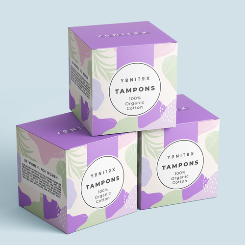
Using purple in your packaging colors suggests luxury, indulgence, exceptional quality or exclusivity, particularly if used with gold or silver printing or decoration. It attracts the female and youth market more so than males, although it is slowly becoming more accepted.
THE PINK PACKAGING
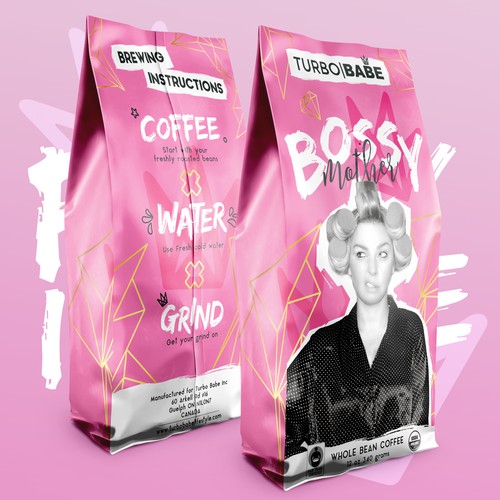
Pink packaging is calming and non-threatening. It is generally most appropriate for products relating to the female market such as cosmetics, fashion, beauty and romance because pink is inspirational, sincere, empathetic and soothing.
CONCLUSION
While color is certainly an important factor in total product design, compelling packaging stimulates the consumer’s five senses. Especially in the absence of information about product differences, people will choose a product based on the attractiveness of the packaging. Brand and logo recognition are enhanced 80% simply by adding color.


