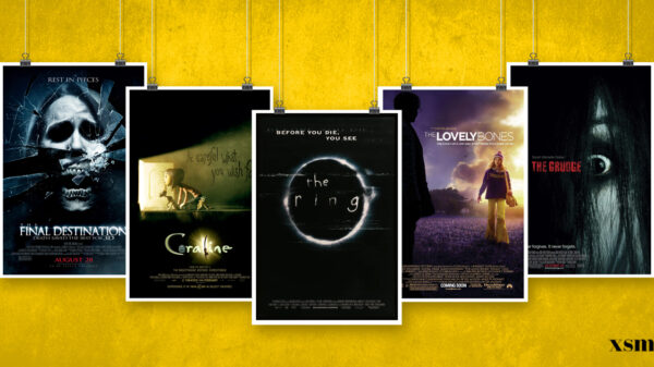
The world of cinema has always been rather exciting. Filmmakers immerse us into these different dimensions almost, giving us life lessons and knowledge to use in our own lives. However, certain directors can make this job even easier for the audience.
So, with that said, XSM came up with a list of the most stylish working directors—proving that their art, is indeed a spectacular masterpiece.
Wes Anderson
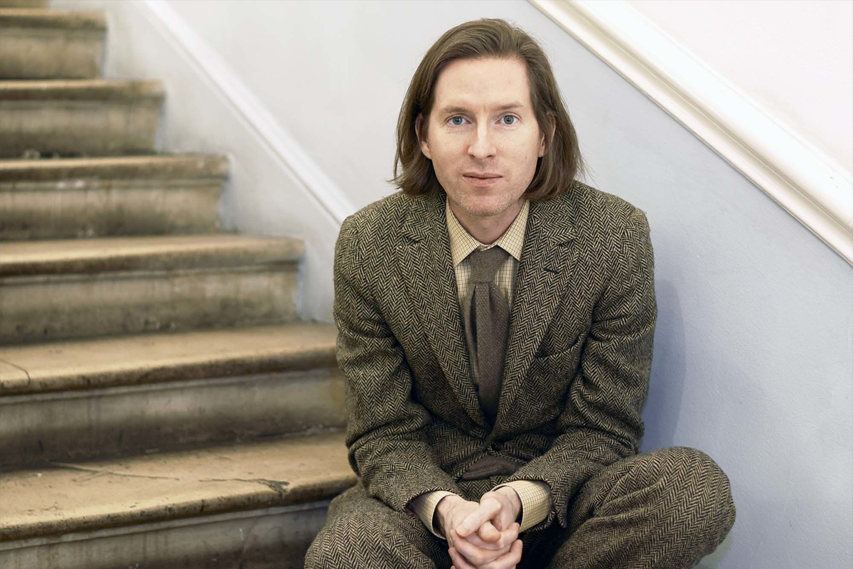
The Wes Anderson aesthetic is much more deliberate. It seems simple, but it’s actually complex. The viewer gets to enjoy a sophisticated film that spoon-feeds information. His stories are undeniably fun, and he is one of the only working directors who can pull off massive tonal shifts. The Wes Anderson style is Wes Anderson himself. A hard working, thoughtful human who is focused on his imagination. His visuals an extension of his own psychology. His style? Something you recognize in a crowded room.
David Lynch
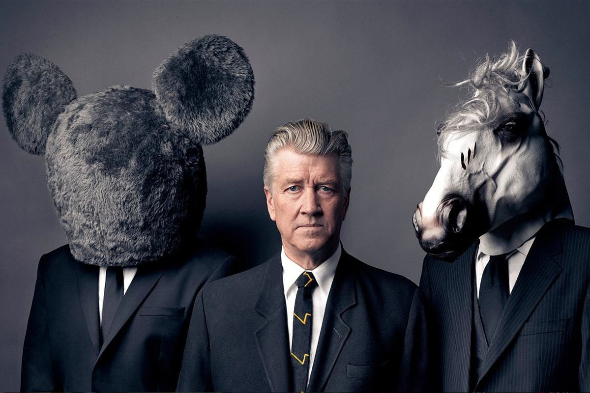
The Mulholland Drive director has a cinematic and narrative style all his own, which pushes boundaries and creates imaginative, otherworldly images that stay with audiences long after the screen goes black. There’s plenty to say about the literary and visual aesthetics of a Lynch film. It can also be used to describe places, clothing, a feeling, even an entertainer’s performance. It’s a tone, a sense, an atmosphere, or experience that you fully understand, but can’t quite describe.
Tim Burton
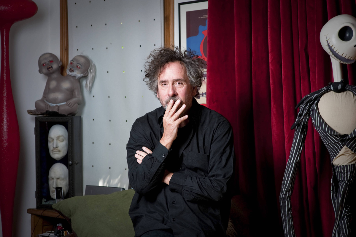
Tim Burton is a filmmaker with a style so unique that we’ve come to regard his works — and those who replicate them — as Burtonesque.
In the easy words combined together: It’s gothic, it’s grotesque, it’s probably unsuitable for children but nobody cares. That’s right, it’s a Tim Burton film. Tim Burton’s cinema explodes with personality. Much of Burton’s work has been an attempt to recreate the dreamscapes of his favorite childhood movies, which mostly involved monsters of one sort or another. From Edward Scissorhands and The Nightmare Before Christmas to Charlie and The Chocolate Factory and Big Fish, Burton has reveled in giving cinematic life to the realm of the unconscious – bringing a complex range of emotions to the surface in the process.
Pedro Almodovar
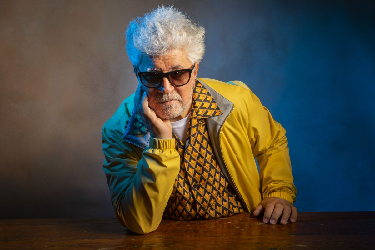
The look of a Pedro Almodóvar film is many things: campy, vibrant, obsessive, outrageous. But it is not subtle. You notice it. Almodóvar’s approach to design is total. It takes hold of everything from the smallest object to the most meaningful centerpiece, saturating everything from the costumes to the set design and lighting. In other words, it’ very distinct still—colorful yet stately and very controlled cinematography.
Gaspar Noe
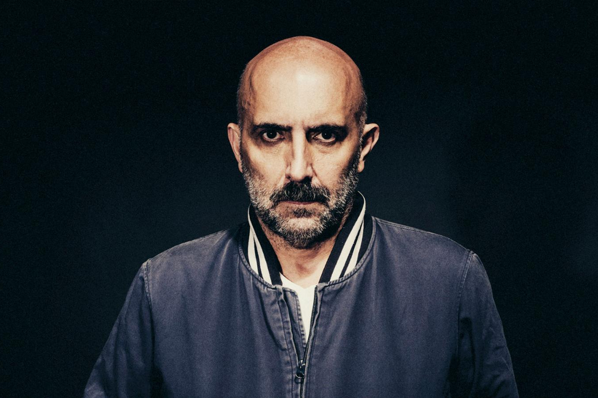
Gaspar Noe who has crafted a filmography characterized by vibrant colors, electric soundtracks and visuals that make you sweat with anxiety. Both in form and content, Noe has no interest in keeping within the boundaries of ‘acceptable cinema’, pushing the craft to embody something far more profound.
In his films, Noe often uses haptic images and sound reversing to interrogate the existence and to express a clear and abject visually to expose the flesh.
Stanley Kubrick
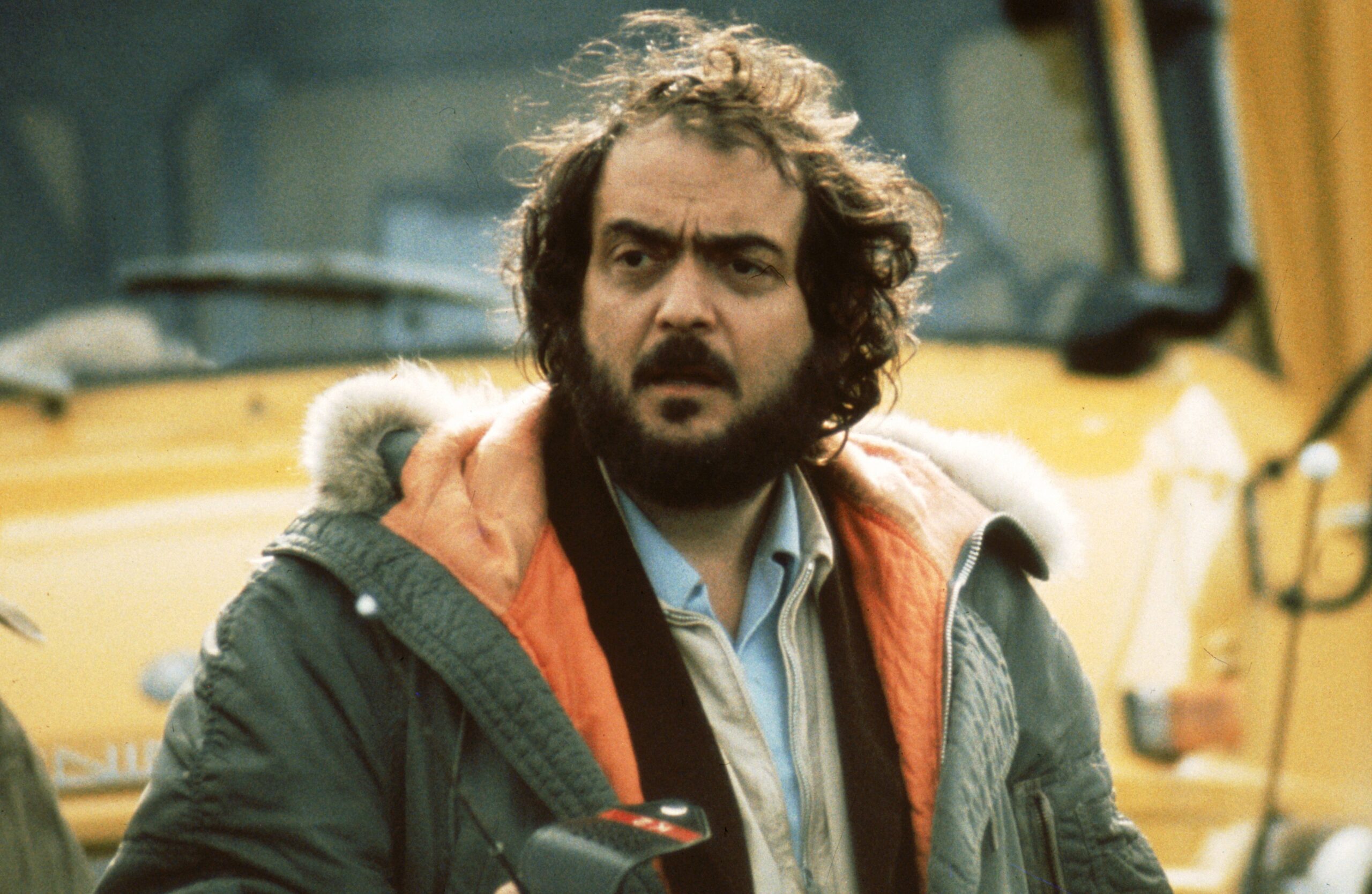
From “Clockwork Orange” to “The Shining” to “Full Metal Jacket,” all of Kubrick’s films have two standard opening devices: silence and melody.
Stanley Kubrick was interested in how people’s morals would hold up when confronted with misfortune and tragedy. He used fiction to show how this conflict might play out. Instead of following the standard technique of tailoring the plot to the protagonist, Kubrick often invented or reworked a personality in order to pursue a story that was outside of the protagonist’s purview. Both works depict a society in disarray and ruin, but they do it in their own unique way.


