A person measures a good film through the visuals itself. Part of it involves the poster design and a good poster design is how you first engage your viewers to bring them on the table.
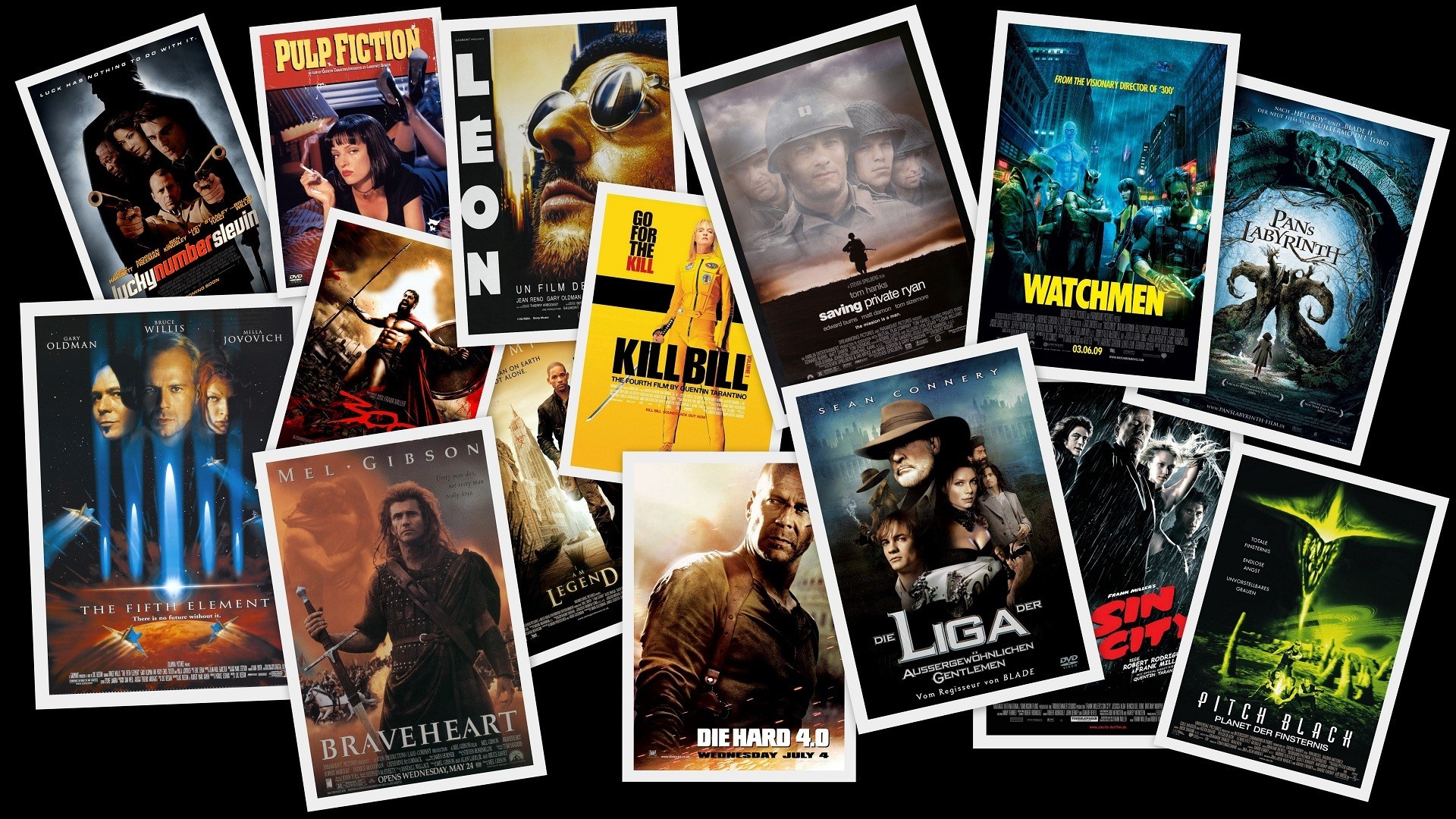
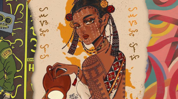
Filipino movies really strive to have better visuals to achieve a certain goal in promoting their film. Designs have the ability to provoke us on what to feel about a certain subject and it gives us a cinematic experience just by looking at it.
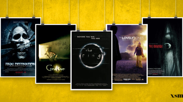
A powerful poster brings a lot of power on different dimensions. It plays an important role in information communication as well as the visual imagery it presents to the people or to the audience. Aside from that, design in posters builds your brand. If you’re going to look at posters back then, it just present viewers what they want to see.
If we’re going to look back on how Filipino poster designs were constructed before, we see everything as it is: a design perfectly fit on that era, packed with characters and lights that are also part of the aesthetic.
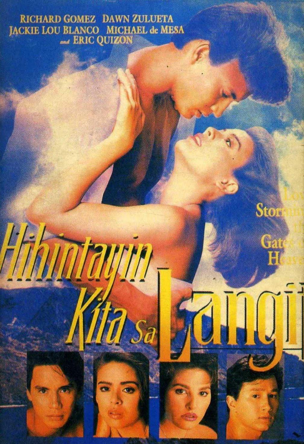


One can identify how a poster evolved through the years. Designers get on with the trends most especially pertaining to balance and visual identity.
The most important element in the poster is the main visual. Designers must take into account the type of audience the poster is supposed to target, the purpose of the poster, and whether or not to use a photograph, an illustration, or both. The next element that must be considered is the typography that will be used. The text should be easy to read and help draw the eye to the poster. Knowing all the powerful basics, then you’re good to go.

Back in the day, Filipino movie posters were bound to have striking colorful visuals to get hop on the norm. People love to see designs in colorful schemes, designs where it has an enormous font strong enough for audiences to see it, and posters where there’s overflowing characters on it. Up to the early 2000s, movie posters were also bound to have a ‘What You See Is What You Get’ notion– over exaggerated visuals and feeding people of what they want to see inside a movie poster itself.
As time evolves, people get a good grasp about the evolution of poster designs in the Filipino film setting. It grows in a way that it also affects the improvement of ‘teleserye’ posters to Filipino TV series posters up to the films, which is considered a topnotch upgrade.

It’s such a humbling effect, a bragging right, and a powerful tool to get mind-blowing impact on the improvement. Nowadays, designers are stepping up their game on another level in producing high-quality Filipino posters. Why? Because it sells.
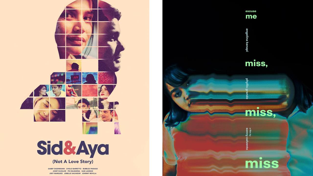
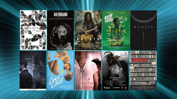
Some Filipino film posters from today aren’t only limited to what mainstream media and film can offer. On the other hand, indie films are taking poster designs and visual aesthetics seriously and this is how designers roll in the present times.
Some first-rate movie posters we notice gaining attention and trends include:
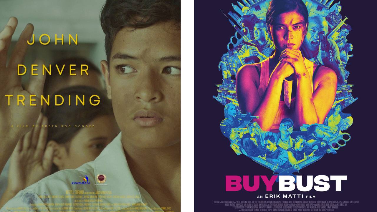
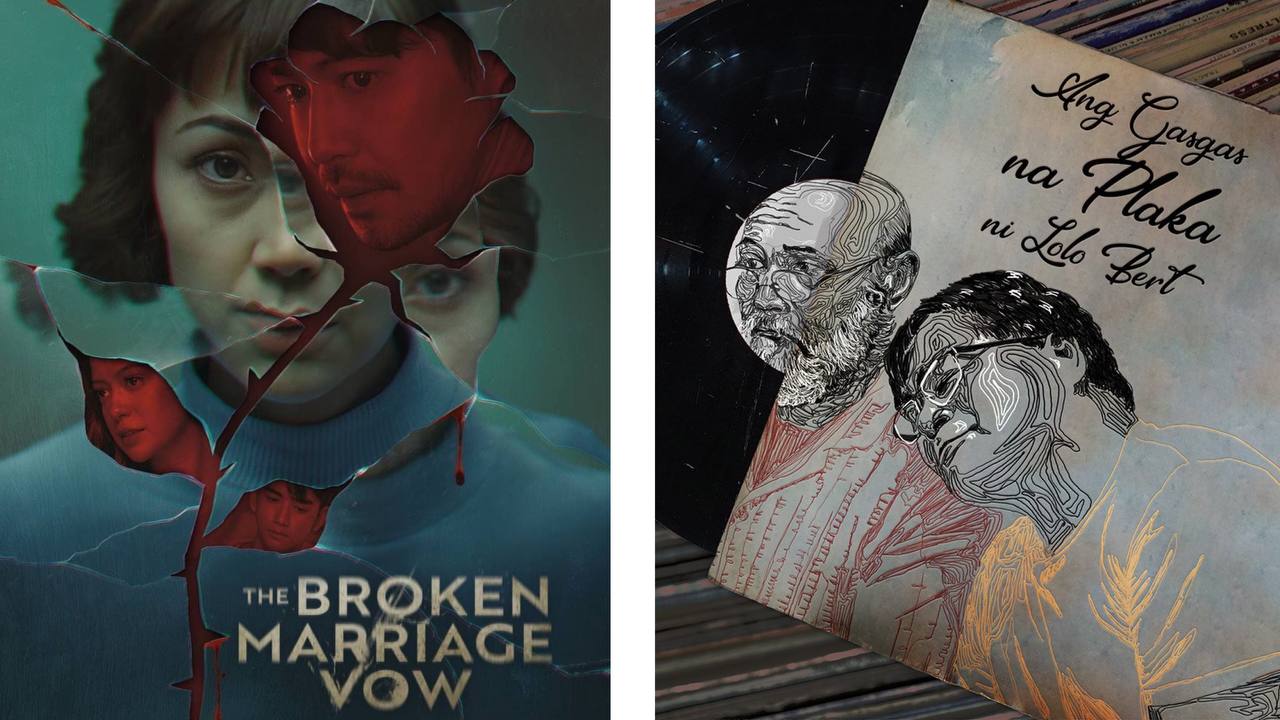
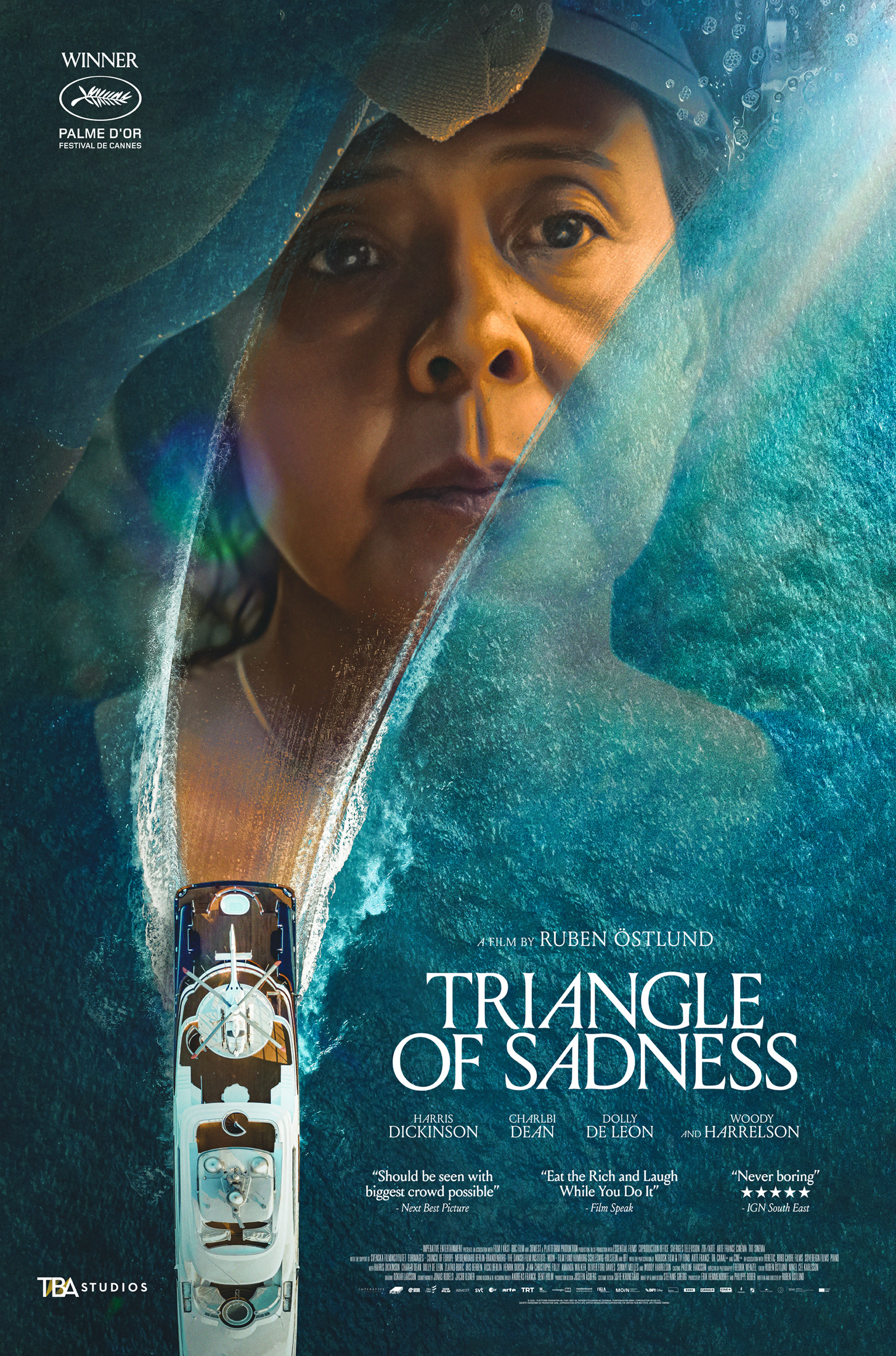
CONCLUSION
You capture your moving audience through a good poster design. Designing it carefully and crafting it in a way it fits today’s standards along with creative freedom, gives you a superb outcome that is relevant and unique. Furthermore, the present visual standard of a film poster design in the Philippines is truly outstanding. It’s a craft molded on generation to generation, trend by trend, one evolution to another.

Furthermore, the present visual standard of a film poster design in the Philippines is truly outstanding. It’s a craft molded on generation to generation, trend by trend, one evolution to another.


