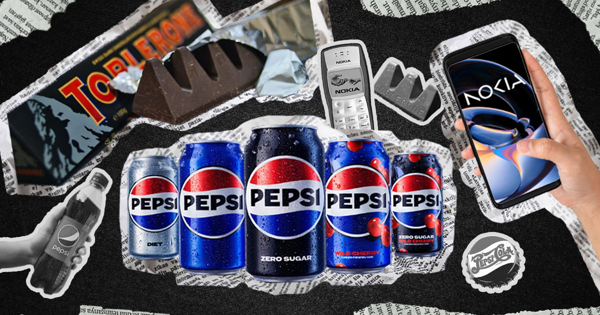
New look, new things in store for these brands. Well, it’s up to the community to decide.
Have you ever caught yourself marveling at the transformation of a brand’s identity? It’s a rare feat to have never witnessed a rebrand, especially given the flurry of changes that happened just last year – think of Burger King, Maya, and Baskin Robbins. One thing is for sure, change is constant and it is seen through people, might as well be applied to brands.
It’s impossible that one hasn’t witnessed a rebrand. Just last year, brands such as Burger King, Maya, and Baskin Robbins announced their own. Why rebrands can do in business? Want to know the purpose behind rebranding?
As we step into a new era of design and marketing, companies are taking the opportunity to refresh their image and stay ahead of the curve. The year 2023 has seen some groundbreaking rebrands that are set to shake up the industry. Take a look at the top rebrands you need to see. The business world is a never-ending race and staying in the game requires constant adaptation to changing market conditions and shifting consumer preferences.
To keep up with the pace, companies often resort to rebranding, a process that involves transforming a brand’s identity, from its name, logo, and messaging, to visual design, to reflect its current values and goals better. After all, in the dynamic landscape of the industry, a brand that refuses to evolve is at risk of becoming a fragment of the past.
There are countless reasons why a company might decide to undergo a rebranding process. Sometimes, a business needs to update its image to appeal to a new audience, differentiate itself from competitors, or align its brand identity with current design trends. A brand is like a living entity, constantly evolving and adapting to the changing world around it. Just like individuals, companies can rebrand for a variety of reasons. Perhaps they want to reach a new demographic, stand out from the crowd, or adjust their branding to match their new business strategies. In some cases, a company may want to move away from past negative associations or mistakes and start fresh with a new identity.
Whatever the reason behind it, a well-executed rebrand can breathe new life into a company and its image. It can help the business stay relevant in a constantly evolving market and set it up for future success. Whether it’s a small update or a complete overhaul, a rebranding process is a powerful tool for businesses looking to make a change.
Let’s put 2023 Rebrands to the test.
PEPSI
Pepsi has unveiled a new logo, marking the first time the company has rebranded in 14 years. The goal of the redesign, according to PepsiCo’s chief design officer Mauro Porcini, is to create a visual identity that connects with future generations while honoring the brand’s heritage. Porcini believes the new look will be current and undeniably Pepsi.
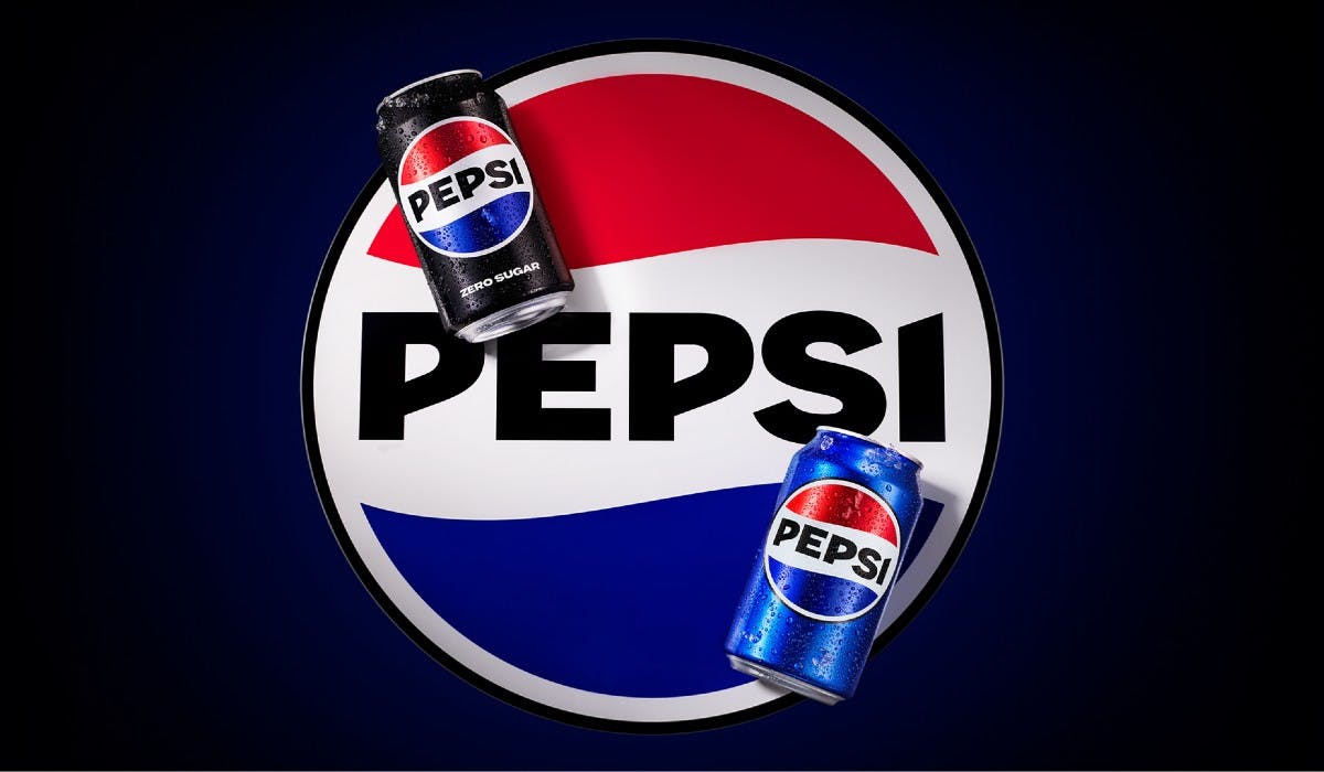
Todd Kaplan, Chief Marketing Officer at Pepsi, notes that the brand has always been a pop culture staple and has disrupted the category for the past 125 years. He expresses excitement for this new era of Pepsi and believes that the modernized logo will drive brand distinction, enabling people to enjoy the things they love unapologetically. The redesign incorporates the best of Pepsi’s rich heritage while also taking a giant leap forward to set it up for success in the increasingly digital world – Web 3.
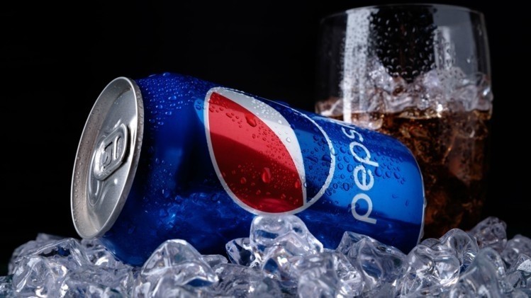
The rebranding includes:
- The Pepsi globe and wordmark unite to fit into a variety of settings and emphasize the distinctive Pepsi branding.
- An updated color palette introduces electric blue and black to bring contrast, vibrancy, and a contemporary edge to the classic Pepsi color scheme. Given the brand’s continued focus on Pepsi Zero Sugar, the design brings in the color black, further showing the brand’s commitment to Pepsi Zero Sugar in the future.
- A new visually distinct can silhouette, which heroes the iconic Pepsi can as an accessible brand for all.
- A modern, custom typeface reflects the brand’s confidence and unapologetic mindset.
- The signature Pepsi pulse evokes the “ripple, pop and fizz” of Pepsi-Cola with movement. It also brings the rhythm and energy of music, an important and continuing part of the Pepsi legacy.
The new Pepsi logo and visual identity will debut this fall in North America, followed by a global rollout in 2024. Through this, we can assume that the reason for Pepsi’s rebrand is to modernize the brand and to shift a brand identity that is bold and a representation of pop culture.
NOKIA
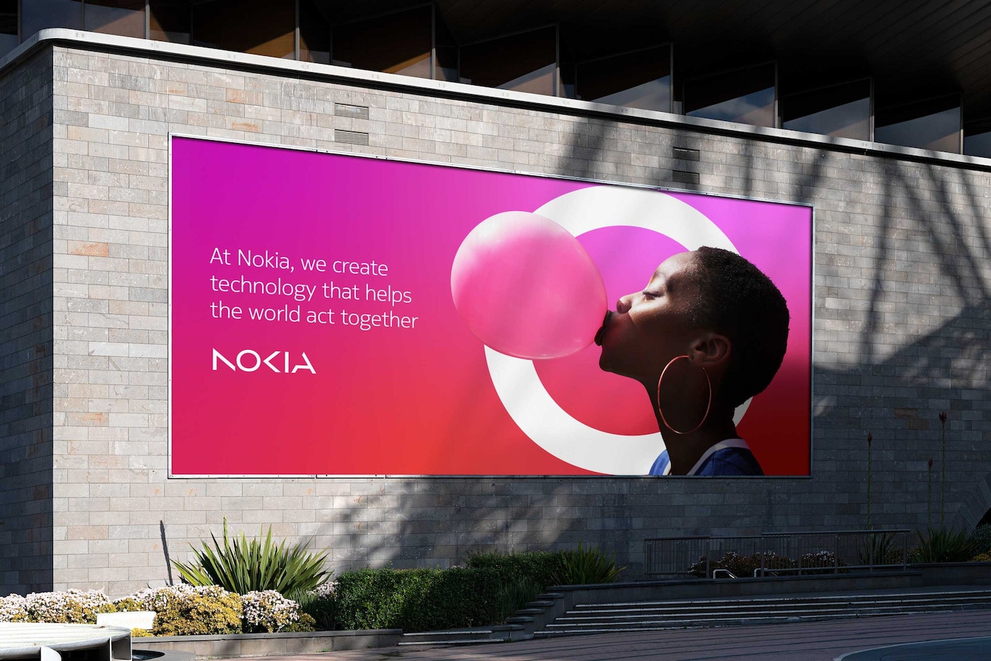
Nokia’s CEO, Pekka Lundmark, says the company is no longer just a successful mobile phone brand. Instead, Nokia is focusing on networks and industrial digitalization, marking a shift from its legacy in mobile phones.
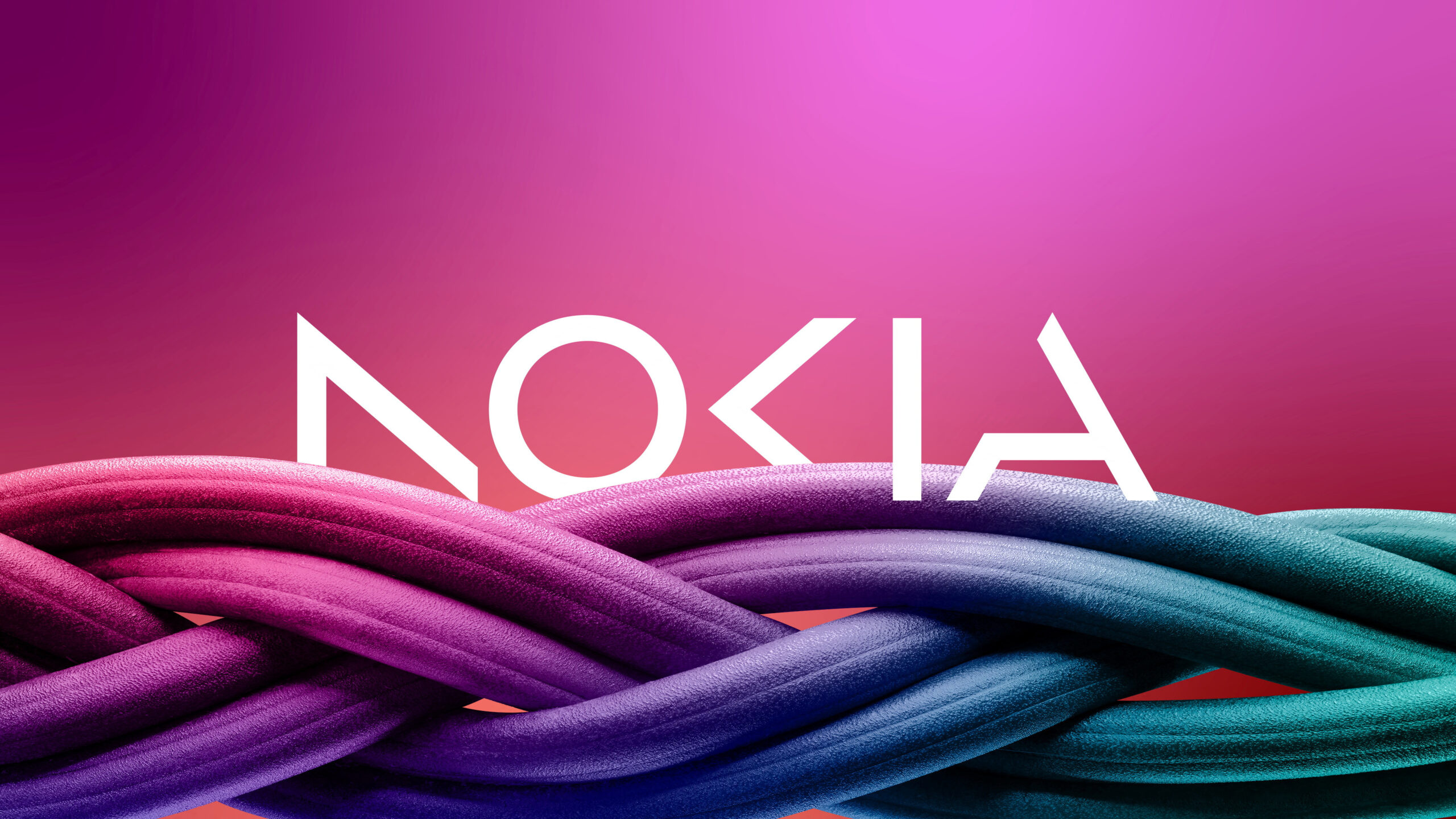
The new brand reflects Nokia’s commitment to innovation and leadership in the digital age, with a new logo that embodies its renewed energy and dedication to digital transformation. Lundmark believes that the new logo captures Nokia as they are today, reflecting the company’s evolving identity. This logo has been utilized since 1973 to 2023.
The rebranding includes:
- The new logo features a bright shade of blue and sharp uppercase lettering
- Bars of the “N,” “K,” and “A” are missing, while the “O” and “I” have complete contours
- The logo has a unique and edgy look, with clean lines and an unfinished story concept
- The distinctive geometry and bold color make Nokia stand out among its competitors.
Nokia’s rebranding was to adjust its branding to new and innovative business strategies. At the same time align the brand with current design trends.
Toblerone
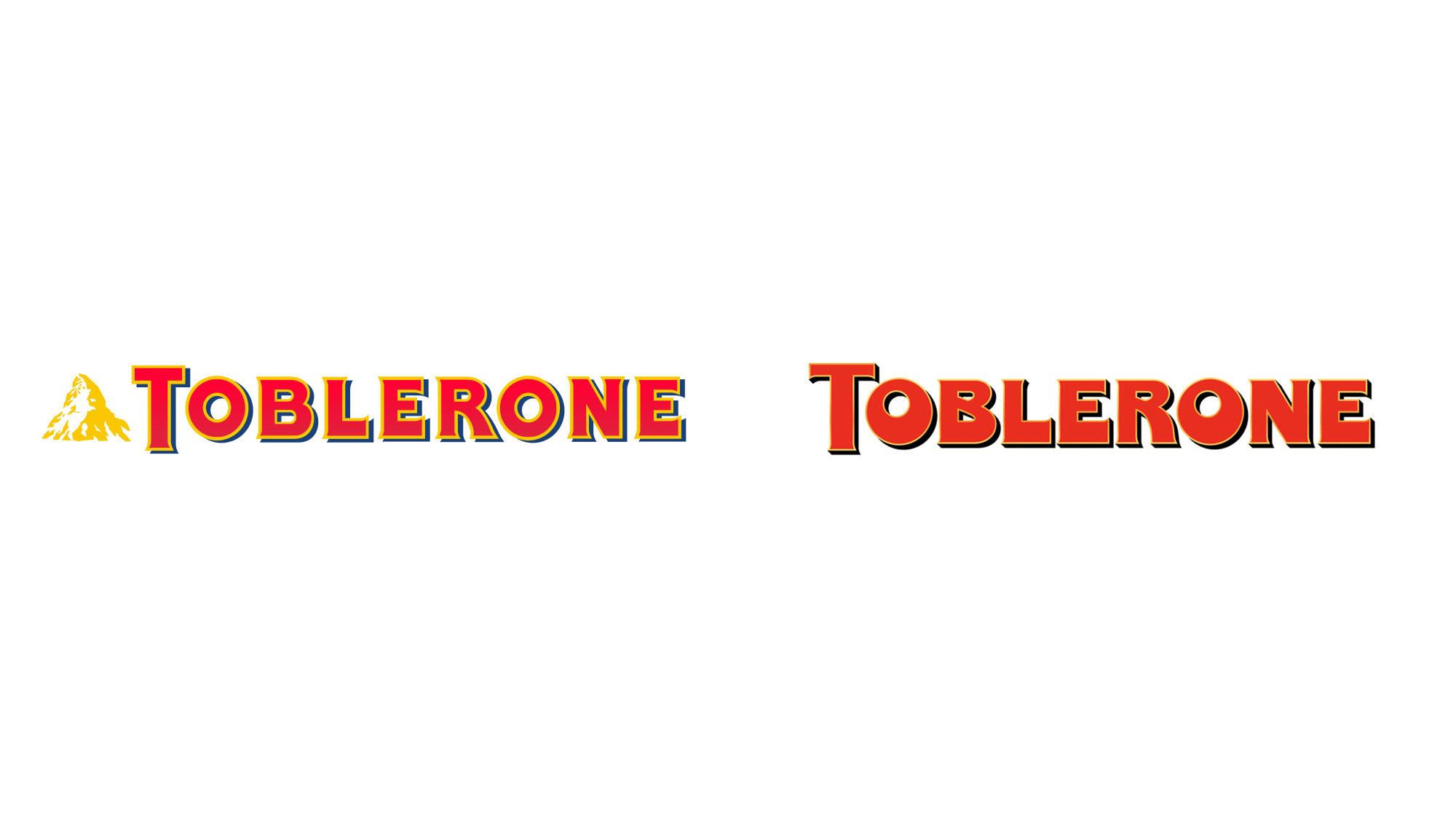
Big news in the world of chocolate as Toblerone is set to move part of its production facility to Slovakia later this year. However, this means the beloved Matterhorn logo, a symbol of Switzerland, will have to be removed due to the Swiss legislation enacted in 2017. This law was put in place to prevent the sale of counterfeit products and preserve the integrity of Swiss-made goods in a global market.
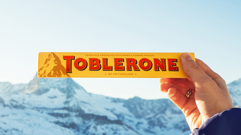
Toblerone has no choice but to comply with these regulations, stating that changes to their manufacturing necessitate a packaging adjustment. Though it’s sad to see the iconic logo go, we’re excited to see what the future holds for this delicious chocolate brand.
The rebranding includes:
- Toblerone’s new packaging includes a signature of Tobler, representing the brand’s tradition and quality
- Teal, orange, and magenta colors are used to convey modernity and change
- The typography extends beyond the edge of the packaging, highlighting Toblerone’s uniqueness and message
- The brand’s message is defined by its borders.
Toblerone’s rebranding is done to comply with laws resulting from a shift in its brand identity.
 FINAL SAY
While rebranding can be a powerful tool for companies looking to revitalize their image and reconnect with customers, it can also be risky. Changing a company’s brand identity can alienate existing customers, confuse potential customers, and damage the company’s reputation if not executed carefully. For this reason, companies need to have a clear understanding of why they want to rebrand and to carefully consider the potential risks and rewards of doing so.
In conclusion, rebranding is a common strategy for companies looking to stay relevant in today’s rapidly evolving business environment. While there are many reasons why a company might choose to rebrand, it’s important to carefully consider the potential risks and rewards of doing so. With the right strategy and execution, however, rebranding can be a powerful tool for companies looking to revitalize their image and reconnect with customers.


