A graphic designer uses a variety of technological tools to produce usable, relevant, and practical graphics. The work is mostly determined by the requirements of a customer or business; however, typical designer duties could include creating visual materials to aid a marketing effort, creating an image to go with social media posts, formalizing a print ad campaign’s layout, making logos for companies, and editing images for digital signage. But in order to create full-blast content, working with a web designer can also be beneficial. The design and layout of a website or web page are the work of a web designer. It also refers to creating a new website or making updates to an existing one.
As we move in the industry, we also learn what to put or not put in terms of design. Here are some of the people we look up to in the industry and the great stuff we can learn from them:
DAN MATUTINA
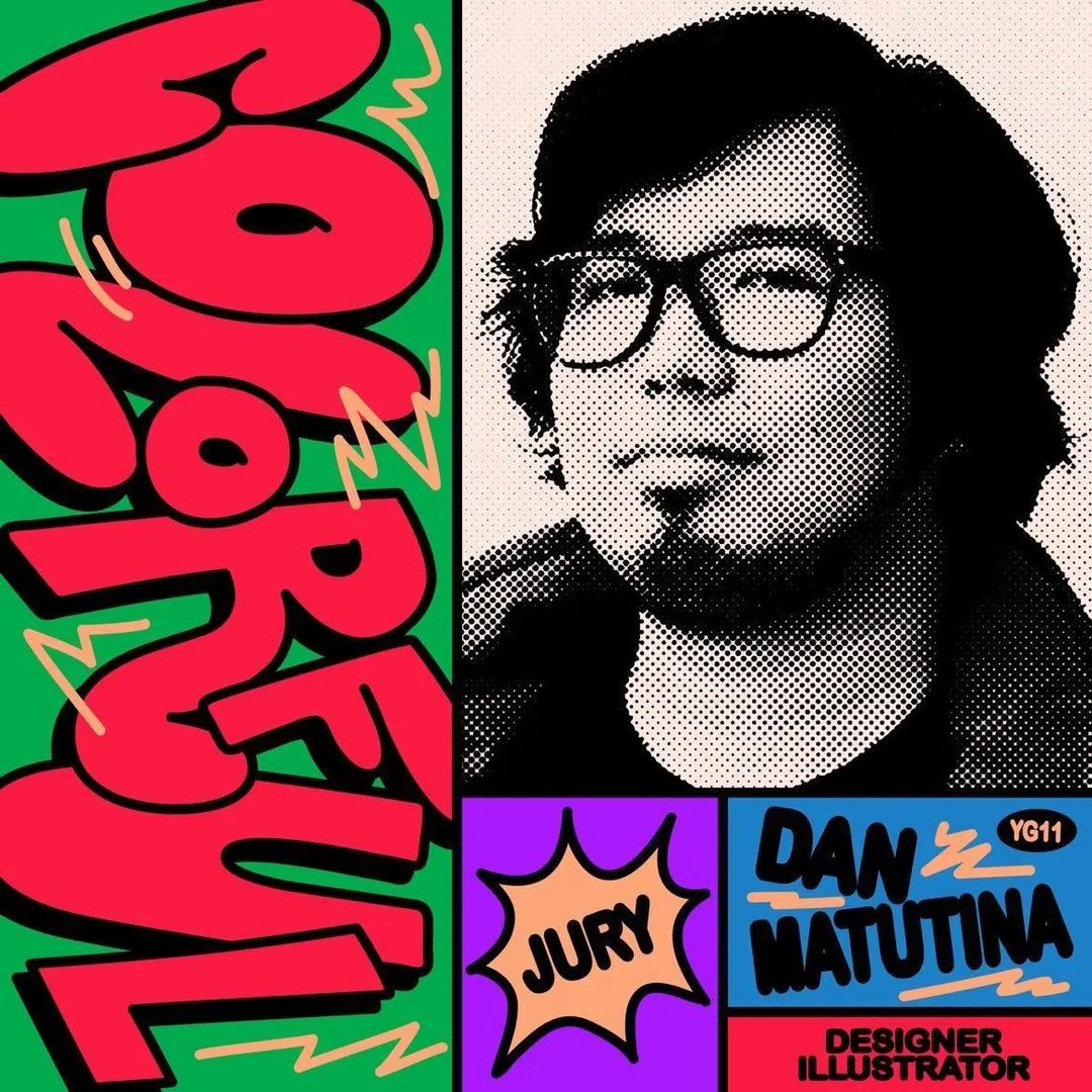
Dan Matutina is a Philippines-based designer, a co-founder of Plus63, and part of the multi-headed design company Hydra. These companies are some of the primary designers in Manila. He really made a name for himself in this industry with his modern aesthetic. His portfolio is loaded with different brands like Google, The Wall Street Journal, Coca-Cola, Pinterest, AirBnB, WIRED magazine, Samsung, Uniqlo, Havaianas, Heineken, and The Guardian. His style is known for combining hand-painted textures with angular, geometric designs, which showcases how elegant design plays a key role in the process.

At Plus63, he designs identity systems for the brands. The scope of his work in the company includes creating prototypes for furniture design pieces and custom objects for retail experiences, business models, and product rebranding. Dan Matutina is one of the leading designers in the Metro today. He is known for his angular style, mix of old and modern aesthetics, and creative use of basic shapes. In one of his interviews, he said that a well-planned brand is everything, which is why research is very important.
JOWEE ALVIAR
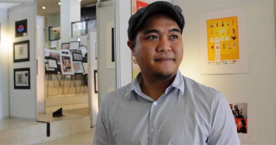
Who ever forgets about Team Manila? Team Manila’s growing popularity over the years is just a manifestation of the influences a design can make. Co-founder Jowee Alviar attributes Team Manila’s success to the long tradition of graphic design in the Philippines, which has helped the country become one of the forerunners and flagbearers of global design. We are bombarded by designs from different cultures, and we’re just stepping up our game on that. Alviar incorporated more Filipino designs to make it as OURS. According to research, he began by studying the gold jewelry made by the Pintados and other pre-colonial Filipinos.
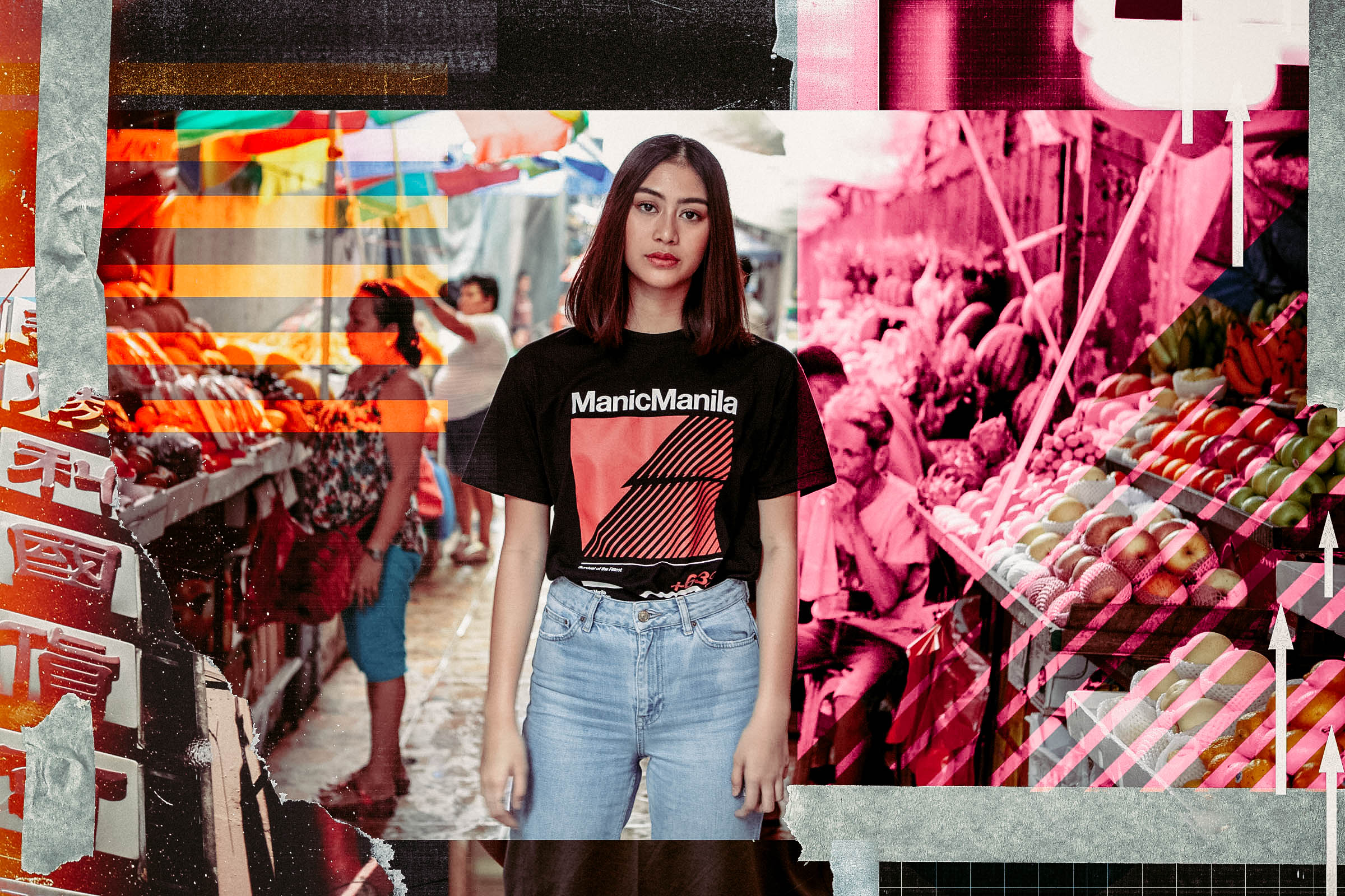
The Baybayin, an early example of design that is now considered to be typography, originated from Sanskrit, an Eastern language and style of letters. One of the few items and examples of this writing style that have withstood the test of time and the elements is the renowned copper plate of Laguna, which features the Baybayin script. Alviar explored the methods used by companies to produce and design their product packaging. He said that contemporary and modern graphic design in the Philippines has been greatly inspired by these works. Although they are a mix of contemporary and other influences, their content is uniquely Filipino. He made sure that he studied all this stuff because this is what he envisioned—a Filipino narrative in design.
GIAN CARLO WONG

Manila-based designer Gian Wong uses a lot of contrasting colors and a loud typeface for his design. He combines a combination of bold type, expressive writing, and vibrant color to tell stories while conveying messages with just the right mix of humor and emotion. While looking at the bigger picture of his portfolio, we see that humor isn’t a definition of bad design. It actually balances the reality of being playful while still redefining brand and keeping up with trends.
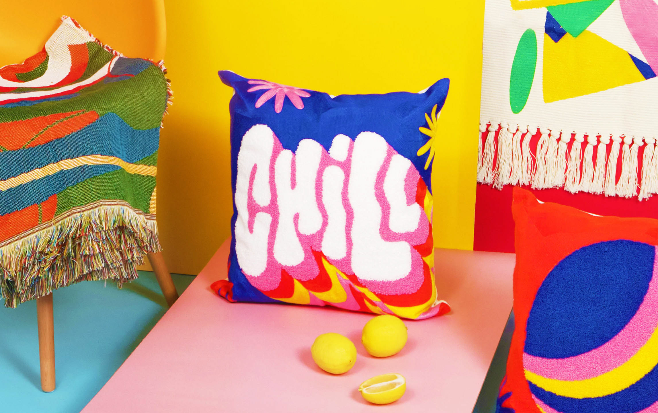
In one of his interviews, he said that his work mostly focuses on expressive calligraphy and vibrant colors combined with dynamic typography. His work began with research to understand what the client wanted, and solutions came after. He also said that using a mood board or stylescape is a step in his research process that helps him determine whether the client’s desired look and feel is being achieved.
LETA SOBIERAJSKI
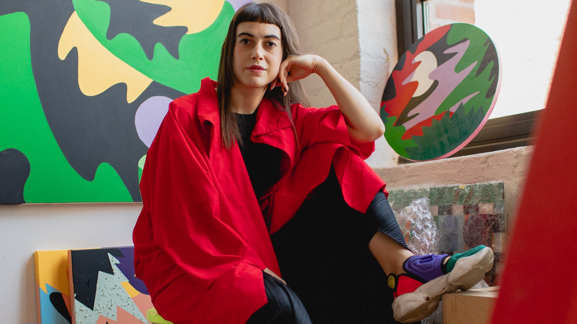
Leta Sobierajski is an artist from New York whose art ranges from conventional identities to brilliantly bizarre compositions. In one of her interviews, she said that she really grew up in the world of design. She mentioned that there was this one lesson in college called ‘Theories of Color, where she acquired that particular skill. She began to comprehend how the brain interprets color and what feelings we experience when we combine various hues. For her, it was like trying to decode a new language. She also said that the peak of her career started during her internship, where she developed camera and lighting setup skills.
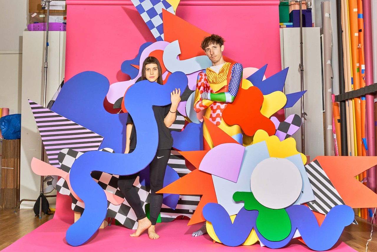
Additionally, she also constructed equipment for shooting magazine covers, brand-related advertisements, and even branding identity infrastructure. Leta Sobierajski isn’t afraid to step outside the conventional. Her method of working is hands-on and active; she appreciates the pleasure of moving around and having fun in the studio. She refers to this philosophy as “design as performance.”
JESSICA WALSH
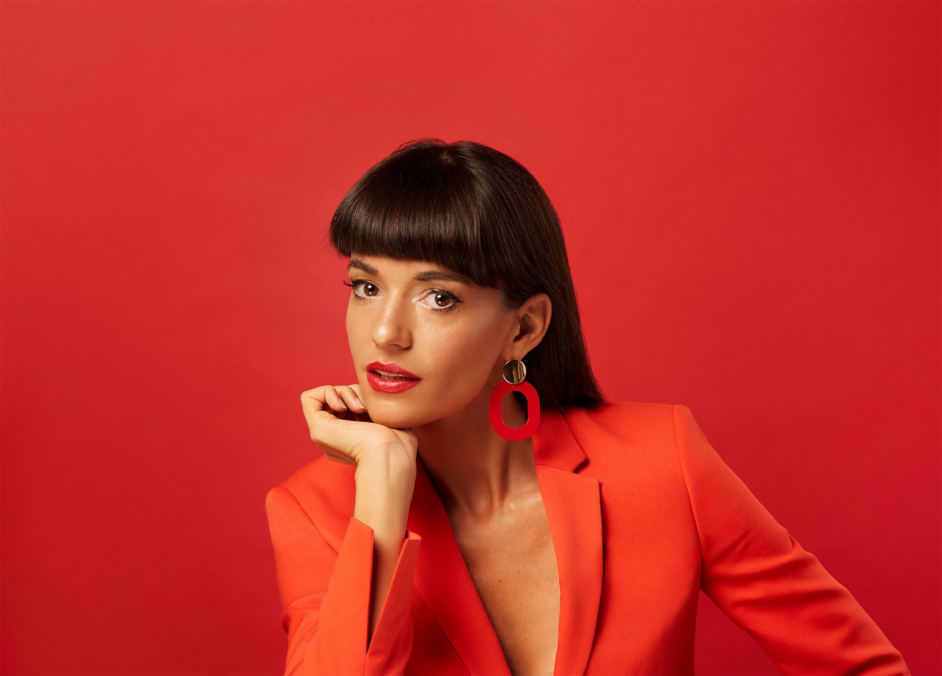
Jessica Walsh is a more modern designer. In an interview, she mentioned that she attributes much of her ambition to the influence her mom had on her. Her mother, who was also an entrepreneur, instilled in her that “life doesn’t always come easy”. The secret is perseverance and hard work, not just intelligence or talent. As she has grown in the industry, she has always been passionate about branding identities.
“I love conceptualizing how a mark and the visual language we create can work holistically across multiple mediums: print, digital, and television. It’s an accumulation of many things I love doing: coming up with conceptual ideas, creative and art direction, design, project management, and client management,” she said.
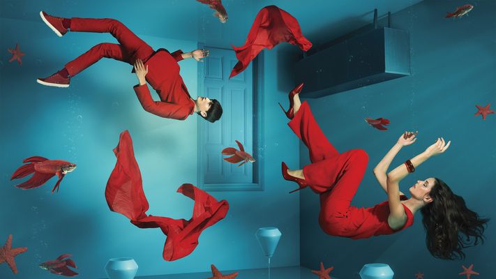
Walsh worked with a lot of agencies back then. She started creating the cover and interior artwork for the magazine herself and developed a colorful, handcrafted design style. She also experimented with techniques that she had not seen done before in the design world, like body painting or 3D sets where she’d paint objects, typography, and people to create illustrations. After many years of doing this, the colorful photo illustration style caught on and started to become very popular. Aside from co-founding a studio, she also takes on freelance work, but she also has the privilege of working with really big clients such as Apple, Converse, Snapchat, Netflix, and Twitch.


