Good design in brand packaging is essential for capturing attention, conveying brand identity, and creating a positive impression on consumers. It plays a crucial role in the environment, as it can also be considered the deciding factor for people to decide if the product is worth their time and liking as well.

Why is good packaging important?
Attention
Packaging serves as a visual representation of a brand and its products. Eye-catching and unique packaging designs help products stand out on store shelves or in online marketplaces, capturing the attention of potential customers.
Differentiation
In crowded markets, where numerous similar products compete for consumers’ attention, packaging helps differentiate one brand from another. It enables brands to communicate their unique value proposition, personality, and positioning effectively.
Brand Identity
Packaging acts as a tangible representation of a brand’s identity. It reflects the brand’s values, mission, and personality. Consistent and well-executed packaging helps build brand recognition and reinforces the brand’s image in the minds of consumers. Through design elements, colors, logos, and typography, packaging helps create a cohesive brand identity that resonates with the target audience.
Communication and Information
Packaging serves as a communication channel between the brand and the consumer. It provides essential product information such as ingredients, usage instructions, nutritional facts, and safety warnings. Clear and informative packaging enhances transparency, educates consumers, and helps them make informed purchasing decisions.
Marketing and Promotion
Packaging is an effective marketing tool. It offers an opportunity to communicate promotional messages, special offers, or product features directly to consumers. Eye-catching packaging can spark curiosity and drive impulse purchases. It also serves as a mobile advertisement, as consumers often carry branded packages with them, creating exposure and brand visibility.
Here are some example of brands with stunning packaging:
DON PAPA RUM

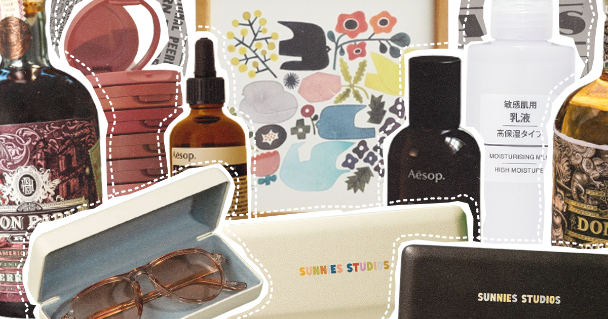
Don Papa Rum is a premium-aged single island rum from the Philippines crafted on the foothills of Mt. Kanlaon, where the finest blades of sugarcane are expertly milled to produce sweet, rich molasses. The first thing you’ll notice is the very elegant packaging, filled with great details. The original Don Papa label was created by New York design firm Stranger & Stranger to depict the history of Negros Occident, including Don Papa (based on Papa Isio) and the numerous wild animals found in the forests. The cheeky tarsier, a tiny monkey unique to a number of southern Philippine islands, is one of the label’s allegedly secret 50 creatures. Don Papa’s eye-catching labels won praise from the design community soon after their debut. Because of its ties to the art world, the company decided to partner with Art Fair Philippines to host a design competition in 2015 to honor regional artists. Special canister packaging that was distributed all over the world was created using the winning artwork.
SUNNIES
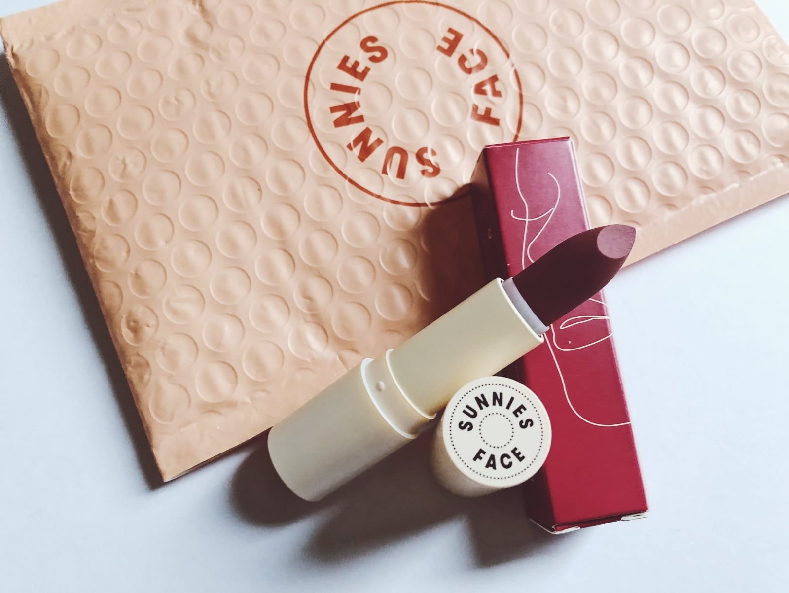
A lifestyle company with roots in the Philippines, Sunnies Studios originally produced sunglasses. Since its founding in 2013, Sunnies Studios has grown to offer prescription eyeglasses, as well as foraying into the makeup and culinary industries with Sunnies Face and Sunnies Cafe. The Sunnies ads are one of the brand’s strongest assets, and they’ve adopted the practice of bannering the low prices on high-end-looking ads. What makes Sunnies standout from the rest of the beauty brands is that it has the perfect choice of colors that people love. Its minimalistic and chic design makes it more and more appealing to people, which is why they continue to patronize this brand.
AESOP
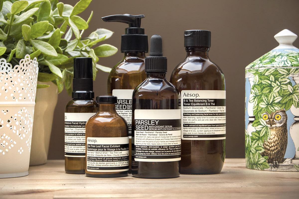
Aesop is an Australian luxury cosmetics brand that produces skincare, haircare, and fragrance products. What makes it so popular is their intelligent approach to skin and body care that combines high-quality ingredients with retro-inspired apothecary packaging. Aesop has a specific image that seamlessly integrates with all touch points of the brand. With the use of natural colors, unique packaging materials, and a cohesive online and store display, Aesop creates a natural, refined look with earthy tones and minimal styling. Aesop’s packaging and displays use a lot of soft, warm colors. The usage of a straightforward sans-serif typeface reminiscent of Aseop’s primary logo permits both readability and the continuation of design aesthetics.
Without the diversion of unnecessary color or adornment, these design aspects support Aesop’s reputation for producing high-quality items. Overall, this brand has a direct, no-frills approach to its brand identity while being clean in execution.
MUJI

Muji is a Japanese-based retail chain that sells a wide range of household goods, furniture, apparel, and food items. It is most well-known for its commitment to functional, high-quality design with a minimalist aesthetic that is supplied at competitive prices. The brand minimizes any additional ornamentation or embellishment in favor of focusing on the goods. “Less is more” permeates every aspect of the business, including the packaging, store design, and logo. Muji is also credited with setting the stage for the current “Marie Kondo” organizing and decluttering craze. To highlight the organic colors and shapes of its products while also preserving resources and lowering waste, Muji uses bulk, uniform packaging. The brand’s refillable dispensers for shampoo, soap, and lotion are one of Muji’s greatest design achievements. Muji discovered through an ethnographic study that cluttered bathrooms with visual clutter from numerous product packaging were a prevalent issue encountered by consumers. The refillable dispensers were created by utilizing these discoveries and their design capabilities.
LINDT

Lindt is a chocolate company known for its chocolate truffles and chocolate bars. Lindt is also known as one of the largest Swiss chocolate manufacturers in the industry.
What people don’t know is that Lindt always strives for the attractiveness of their design when it comes to their brand packaging. It does its job when it comes to sustainability. They used Cardbox Packaging, and it has replaced all plastics with the recyclable cardboard solution, which is based on the principle of renewable resources. This strategy gave the product many new options to communicate with consumers. Not only to focus on the sustainability concept but also to support sales with impressive printing options with new finishing techniques. Where quality standards permit, Lindt & Sprungli use recyclable, reusable, and biodegradable materials. This is also reflected in their commitment to making all their packaging 100% recyclable or reusable.
RARE BEAUTY

Rare Beauty is a makeup brand by Selena Gomez that breaks down unrealistic standards of perfection. It’s more than just a beauty brand because its goal is to make everyone feel beautiful and comfortable in their own skin. On Rare Beauty’s base products, liquid highlighters, and blushes, you’ll notice the sphere on top of the applicator. With this straightforward change, people with challenges can open and use the product. Similar to this, most of their other products’ packaging features distinctive curves to aid in grip. Their lip balms and lipsticks feature flat sides, preventing them from rolling off of a vanity. Despite not being specifically designed for those with cognitive challenges, the container unintentionally makes applying cosmetics easier for them. The universality of “rare beauty” leads to its appeal to every individual. Numerous shade ranges, marketing initiatives, and other things show it. But not many makeup companies create their products with physical capability in mind. At Rare Beauty, convenience for users comes first.


