Konnichiwa! Have you ever noticed those eye-catching characters, vibrant illustrations, and stylish logos that seem to come straight out of Japan? Japanese graphic design is like a magical portal that transports us to a land of imagination and artistic brilliance. From ukiyo-e to kawaii culture, it captured the hearts of people around the globe.
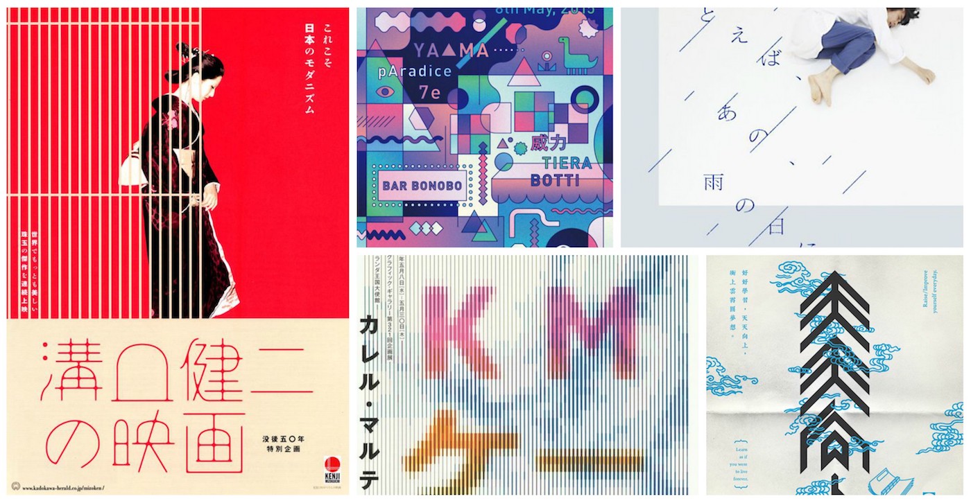
Their works pushed a dynamic spirit of experimentation that resulted in groundbreaking designs that have influenced the global design community, like the trend of minimalistic tattoos. Hence, Japanese graphic design has not only shaped the visual landscape within Japan but has also garnered international recognition.
JAPANESE DESIGN EVOLUTION
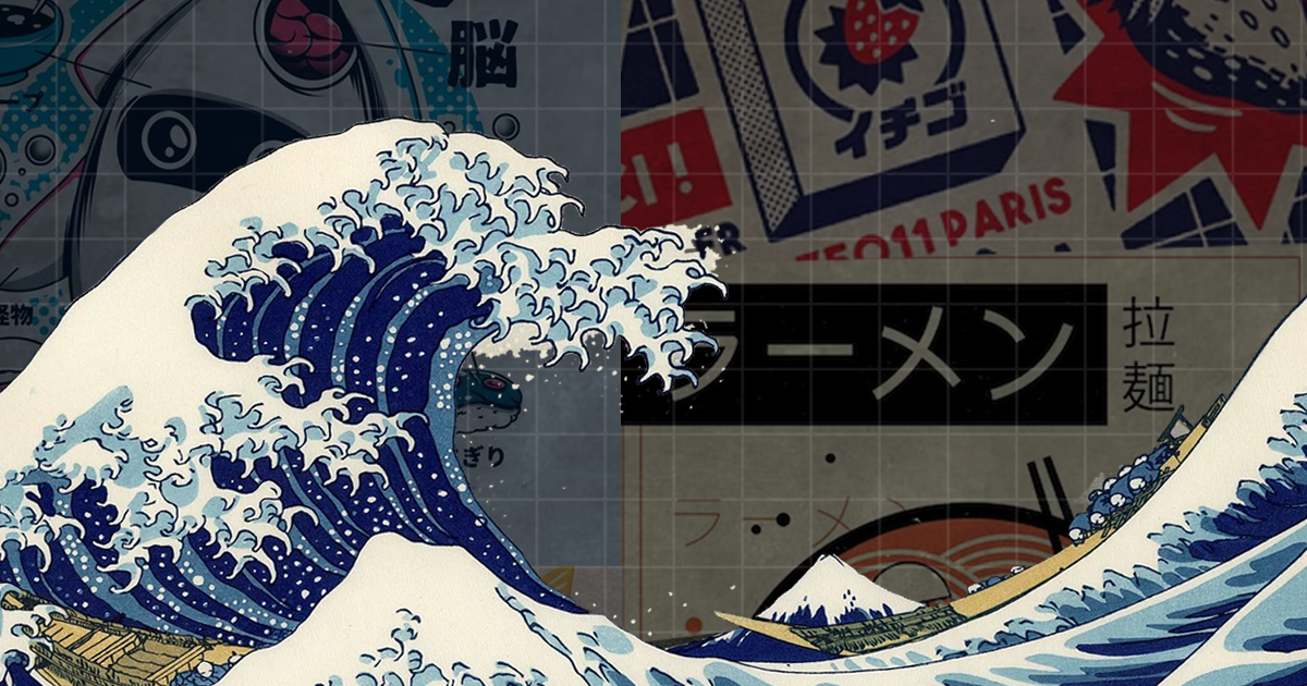
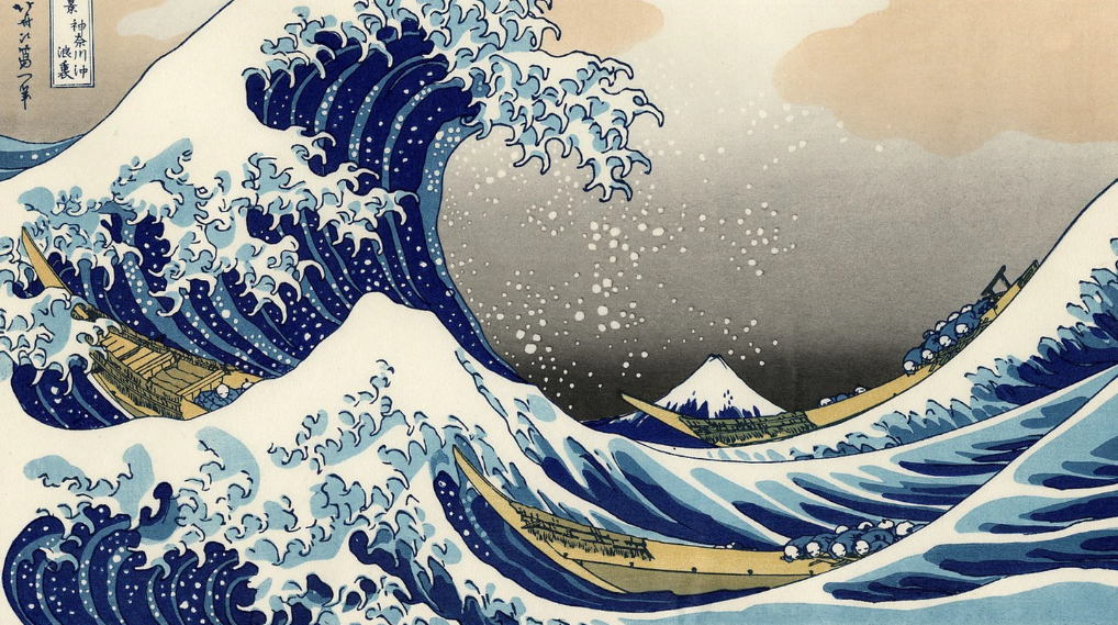
Looking back, Japan’s design legacy was formed through ukiyo-e, which is a type of Japanese woodblock print and painting from the Edo period. In particular, the greatest masterpiece from that era is called “Under the Wave off Kanagawa,” wherein you see Japan with only one glance of the art. When the country embraced Western culture, Japan’s design started blending traditional aesthetics with contemporary styles, leading to the concepts of “less is more” and “form follows function”. This greatly influenced the world with its simplicity, functionality, and balance.
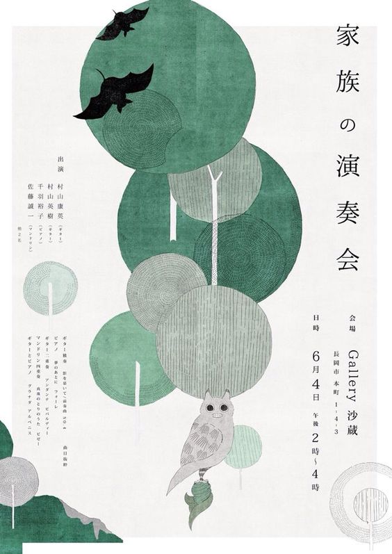
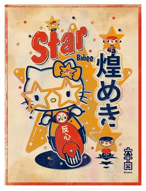
Moreover, these principles impacted the graphic design world so much that even with the evolution of kawaii culture, graphic design still has a sense of aesthetics and purpose. With Hello Kitty’s and Pokémon’s popularity, Japanese graphic design continues to evolve with the help of advanced and modern technology.
The global phenomenon of design in the country is a testament to the power of creativity and bridging the gaps between centuries, cultures, and hearts. Hence, today’s designers in Japan fearlessly embrace new techniques to push the boundaries of visual communication and expression in a myriad of creative outlets in the design industry: posters, films, anime, covers, logos, and many more.
COVERS AND POSTERS WITH A TOUCH OF JAPANESE FINESSE
When you add a touch of Japanese style to covers and posters, it works wonders! Do you have a grasp of the 1954 Godzilla film poster? It was centered on a monstrous creature wreaking havoc upon the city, and with bold typography and dramatic colors, it effectively conveys the film’s destructive mayhem.
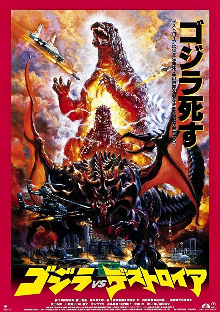
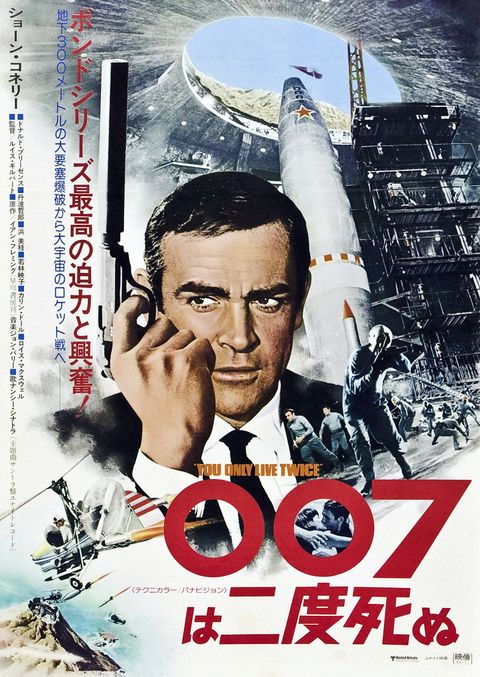
Japanese movie covers and posters stand in a league of their own. International movie posters often undergo significant design changes when entering the Japanese market, resulting in a truly distinct and unique aesthetic—the James Bond film is one example. American James Bond posters are designed with bold and exciting letters, showing the main actor using bright colors to grab your attention. On the other hand, Japanese James Bond posters have fancy letters and artistic pictures that create a special feeling.
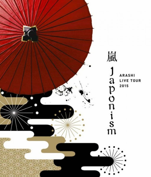
Well, it does not stop there. A famous J-Pop band held a concert with the theme of returning to the roots; the Arashi “Japonism” concert poster embodies the essence of traditional Japanese art and culture. It features intricate illustrations reminiscent of ukiyo-e prints and calligraphy-inspired typography, creating a visually captivating design that reflects the fusion of music and Japan’s artistic heritage. The concert poster itself brings you back to Arashi’s beginnings and evolution, which perfectly depicts his alignment with the audience.
In a business setting, what most designers don’t see are the multiple layers of formality in both messaging and design approaches. Major advertisements for tobacco and alcohol engage in fierce competition to capture the audience’s attention. In a nutshell, Japanese marketing does more than just sell you stuff. The posters often combine sleek and sophisticated visuals with subtle cultural references.
THE REALM OF JAPANESE ANIME AND MANGA
In a world where characters come alive, stories unfold, and creativity knows no bounds, the artistry of Japanese graphic design in anime and manga paints a picture worth a thousand words. Designers skillfully craft unique and expressive characters, paying attention to every detail, from their hairstyles and outfits to their facial expressions and body language. For instance, different companies that designed the heroes’ costumes in My Hero Academia showcased detailed designs and emotions. Meanwhile, the “same face syndrome” in Jujutsu Kaisen is not an issue as they each have a unique detail that is exclusive to the characters, such as the details in the hair and cosmetics.
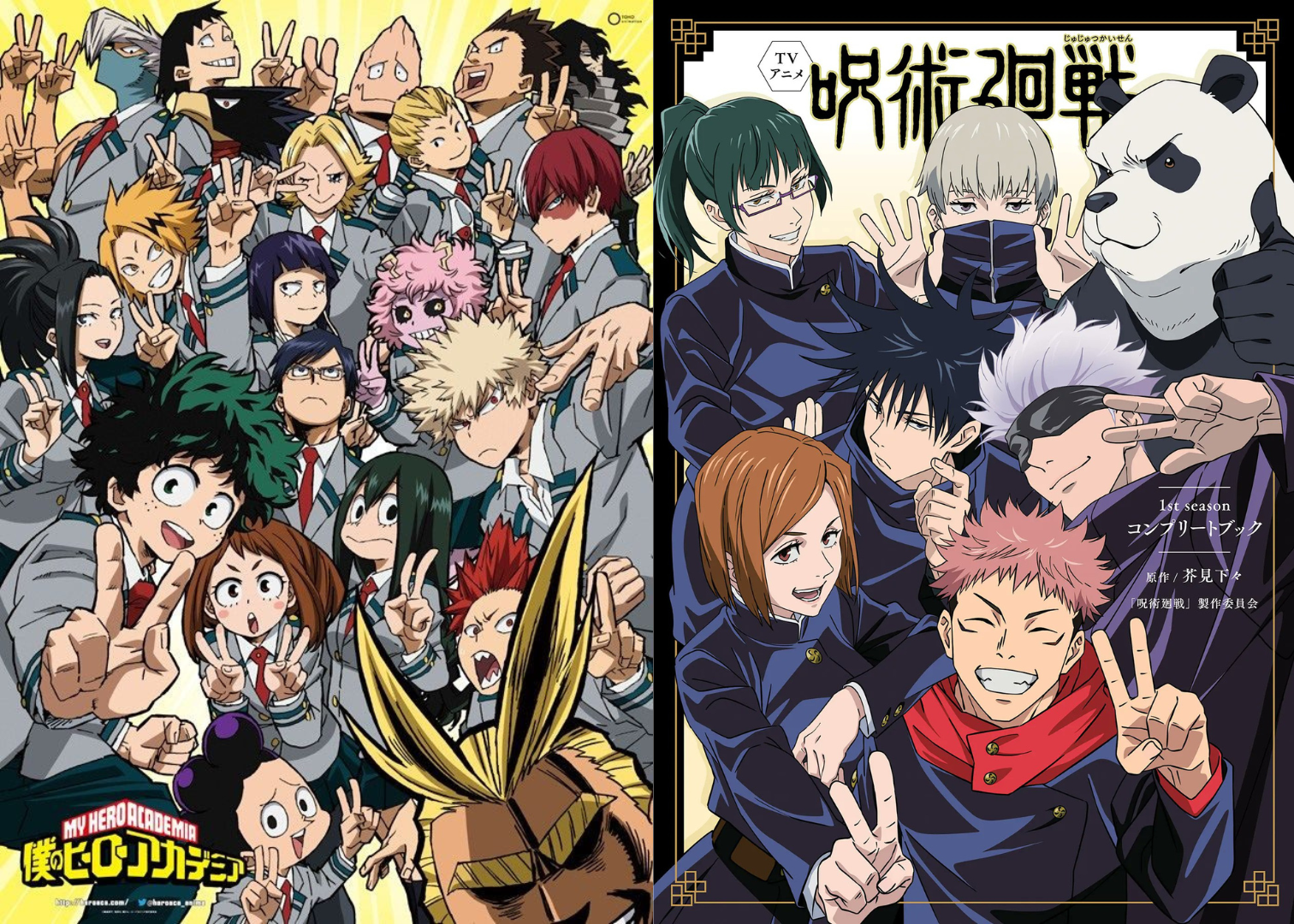
Anime and manga are two worlds intertwined. Yet the graphic visual designs set them apart in breathtaking ways. The only key difference lies in the dynamic animation and cinematic effects of anime compared to the static and panel-based storytelling of manga. What makes it different from other countries are its intricate narratives and the fact that it draws inspiration from Japanese culture. Take, for example, the difference in animation style between The Simpsons and Gintama, even though both have their own unique style of humor and are family-themed.
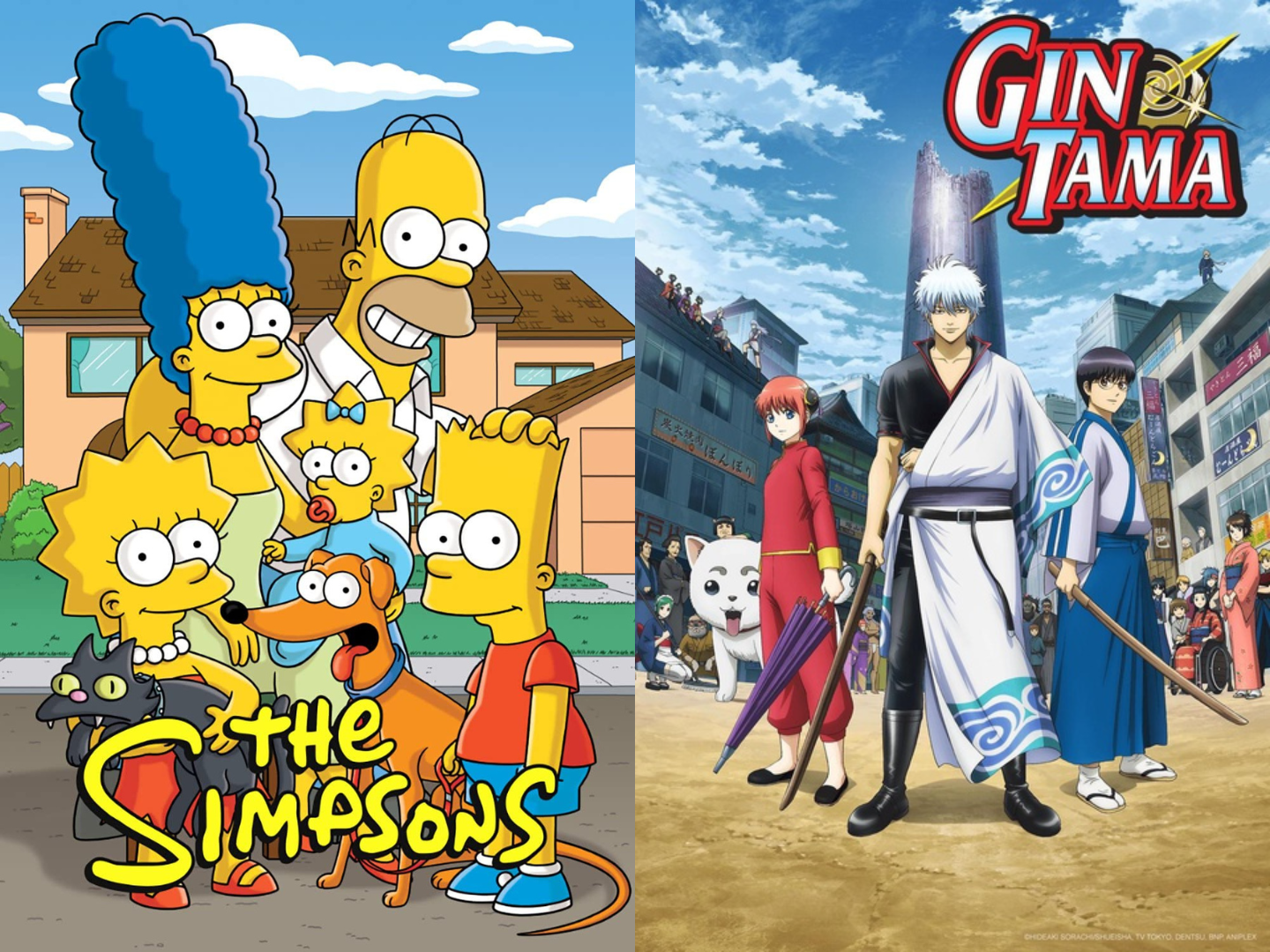
Are you familiar with the anime and manga Dragon Ball, Naruto, and One Piece? How about the worlds in Studio Ghibli films? Who wouldn’t be? These creative mediums have captured the hearts and imaginations of audiences worldwide. These mediums have not only entertained and captivated audiences but have also inspired countless adaptations and merchandise. The impact of Japanese anime and manga extends beyond entertainment. Sugoi!
BRAND IDENTITY EMBODIED IN JAPANESE LOGOS
Where simplicity meets symbolism and harmony dances with innovation. Logos become more than just brand identities; they are masterpieces that evoke emotion, tell stories, and leave an indelible mark on our visual landscape. Japanese logos embody the power of “less is more”, leaving a lasting impact with their refined aesthetics. It unlocks the secret of symbols speaking louder than words, forging a deep connection between brands and consumers.
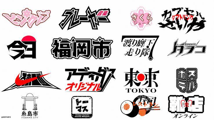
Did you know why Toyota has three overlapping ellipses? Because it represents the collaboration and unification of the customer, the product, and the company. The designers dwell in geometric arrangements that convey deep meaning and essence. Another example is Mitsubishi, which features three diamond-shaped elements, known as “mitsuba”, representing the three-leaf crest of the Tosa Clan, an ancient Japanese samurai family.
Aside from cars, Japan is known for electronic products. Company logos such as those of Sony and Nintendo are prime representations of Japanese graphic design principles. It features bold typography to embody the company’s focus on fun and imaginative experiences.
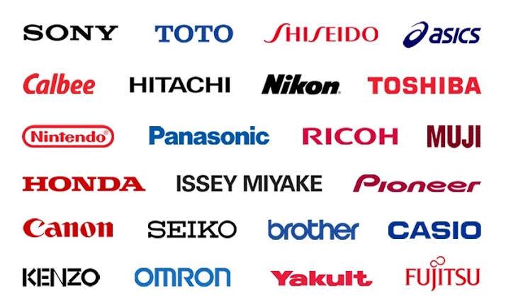
The emphasis on minimalism and clean lines in these logos creates visually appealing and timeless designs given for example Shiseido, Uniqlo, Muji, Nike, and many more. Therefore, minimalism in Japanese logos meets symbolism, leaving a lasting impression.
CONCLUSION
In the world of graphic design, Japan stands tall with its unique blend of tradition and innovation. Japanese designers have mastered the art of telling captivating stories through their beautiful and simple designs. But it doesn’t stop there! Japanese designers are also fearless innovators, constantly pushing creative boundaries. So next time you see a logo, poster, or advertisement that captures your attention and sparks your curiosity, remember the artistry of Japanese graphic design, creating a unique fusion of East and West.


