In the realm of games, graphic design plays a critical role in crafting immersive experiences for players. It involves using visual elements to convey information, establish visual identities, and enhance the game’s overall aesthetics. From creating captivating logos and branding elements to designing intuitive user interfaces (UI) and crafting visually stunning environments, graphic design in games encompasses various tasks. It also involves the creation of promotional materials that effectively communicate the game’s features and generate excitement. With its blend of artistic creativity and technical skills, graphic design brings life to the visual aspects of games, captivating players and enhancing their gaming experience.
But now, with a viable demand for graphic design skills across many industries, Whether you’re an aspiring graphic designer or simply want to enhance your visual communication abilities, there are various ways to improve your skills in graphic design. While traditional courses and tutorials are valuable resources, one innovative and engaging approach is through games. Yes, you read that right! Surprisingly, games can be fun and interactive ways to develop your graphic design skills. They offer hands-on experience, problem-solving challenges, and the opportunity to explore different design principles.
Aside from gaming, graphic design is vital in many other fields. Its powerful ability to communicate and captivate makes it an essential tool in advertising, branding, web design, and more. That is why the effective use of graphic design plays an important role in creating visual content to communicate messages. It employs typography, imagery, color, and layout techniques to connect with an audience.
Now let’s delve into some famous games that can help you to tone up your graphic design skills to the next level.
Kerntype
Kerntype is a game that introduces players to the art of kerning, an essential graphic design skill. It was created in the year 2000 by Tobias Frere-Jones, notably known for his Gotham Typeface. Kerning refers to the adjustment of space between characters in a typeface.
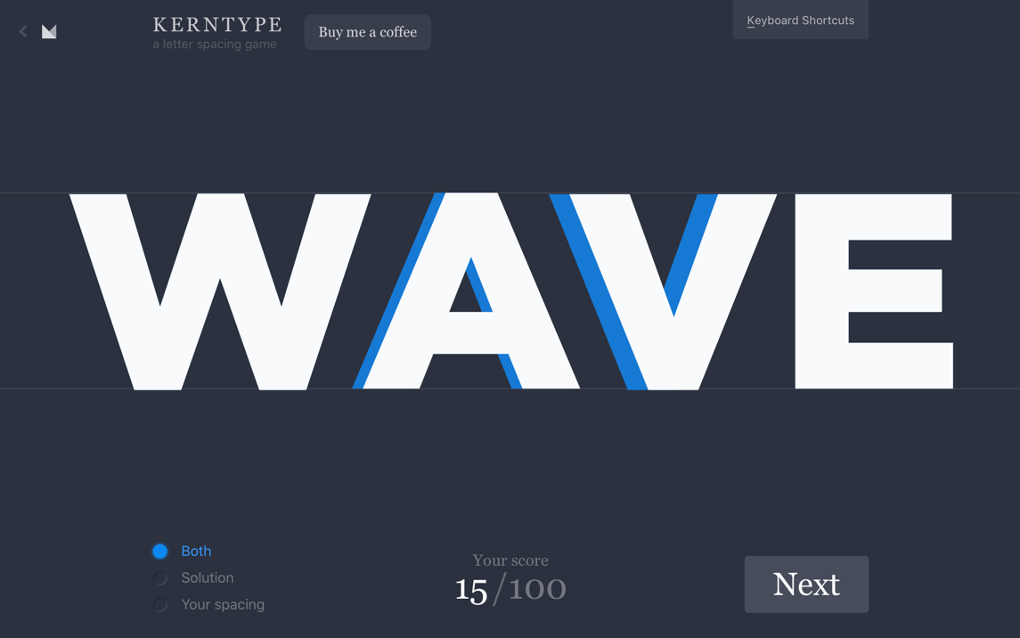
The game involves dragging letters and adjusting their spacing to improve readability and visual appeal. The player receives a word with incorrect letter spacing. The aim is simply to accurately slide the letters left and right to create suitable spacing throughout the word. After submitting your changes, you’ll see how close you were to the font’s ideal spacing.
By playing Kerntype, you’ll gain a better understanding of how letter spacing affects the overall design.
The Bezier Game
The Bezier Game is all about mastering the pen tool, a popular and vital instrument found in various graphic design software. The game was developed by Mark Mackay, who has a website dedicated to a variety of exciting tutorials and games that educate designers on becoming acquainted with Adobe tools. This game challenges players to trace various complex shapes with the minimum number of possible nodes. At first, you are shown the basics of using the tool and given three shapes to outline.

The true test comes once you have completed the first three stages that reacquaint you with the tool. Each level contains numerous outlined shapes, such as a car or a plane, that you must trace using the pen tool. When you finish the level, there is an overview showing how many nodes you used, how many you had remaining, and the ideal number of nodes that might be used to complete the level. The Bezier Game is an entertaining way to become proficient in using one of the most powerful tools to keep your skills sharp in Adobe Photoshop, Illustrator, and InDesign.
Color
Color is a color-matching game created by Mark MacKay with the assistance of Maria Munuera, a product manager at the Sketch app, for the Method of Action site. The game is a great way to test your eye as well as your color theory knowledge on the difficulty of using an interactive color wheel.
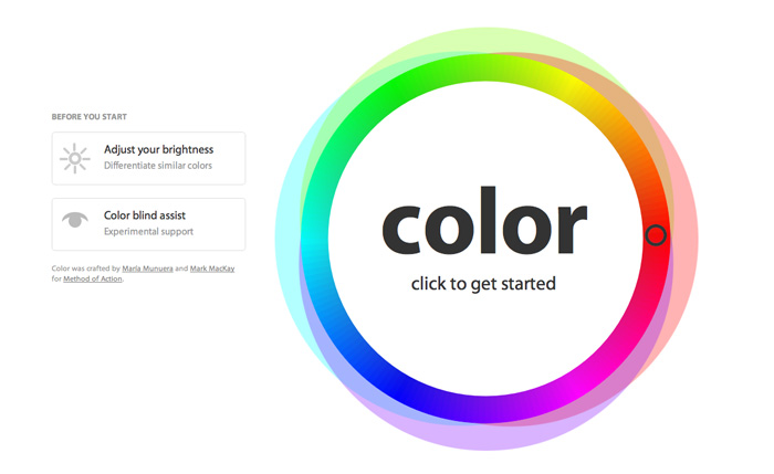
With this game, you start by matching a hue to your color wheel at a set time. After advancing through the first stage, your wheel encompasses the full color spectrum, and you are tasked with matching the saturation level of color. Matching the correct color becomes progressively more challenging as the four additional stages cover complementary, analogous, triadic, and tetradic color relationships. After completing all six levels, you receive a score out of 10 to share on Twitter or compete with your friends. By playing Color, you can learn how different hues combine and contrast to create various shades, a crucial skill for any developing graphic designer.
It’s Centred That
The next game is “It’s Centred That.” It was branded and designed by Supremo. This game tests your ability to center objects. Players are presented with various designs and must determine if they’re correctly centered.
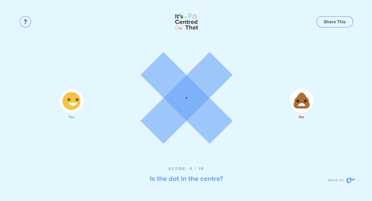
The game is straightforward, and there are levels created to test your design eye. Simply guess whether or not the dot is in the center of each shape by selecting the smiley emoji for yes or the poo for no. Guessing the correct answer will score you a point, progressing you to the next level. While getting the wrong answer ends the game with a splat, “It’s Centered That” is an excellent way to sharpen your eye for balance and symmetry in design.
Can’t Unsee
“Can’t Unsee” is a game that challenges players to spot design inconsistencies. The game tests your UX (user experience) knowledge by presenting you with two similar images and asking you to identify which one has a better user experience. It’s a fun way to learn about the importance of consistency and attention to detail in graphic design.
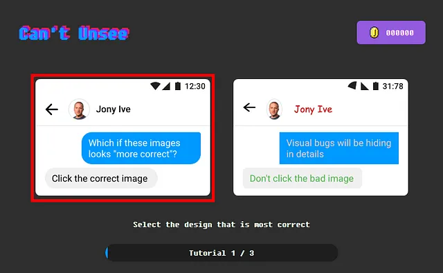
The game tests your UX (user experience) knowledge by presenting you with two similar images and asking you to identify which one has a better user experience. The mechanics of this game are pretty simple. All you have to do is pick one, and the challenge comes with deciding which choice to make. After a tutorial, the options are easy, but they get harder after three stages. Once a user learns if their decision was optimal, they see the differences and can compare the two again to fully understand the better design choice. The game is a fun way to learn about the importance of consistency and attention to detail in graphic design.
I Shot the Serif
‘I Shot the Serif’ is a UK-based game created by an agency called ToThePoint. The typographic game helps players differentiate between serif and sans-serif fonts. You’re presented with a flurry of letters that you have to quickly recognize the serif fonts and “shoot” while sparing the San-serifs.
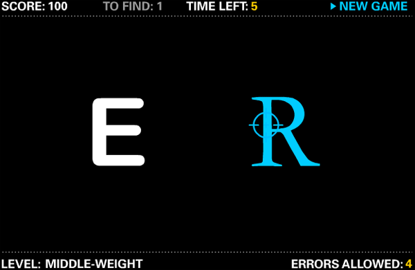
Typography uses serifs to break handwriting into different units for typewriters and typesetters. Serif typefaces have serifs. Sans serif, from French sans, means “without.” Sans-serif typefaces are called “Grotesque” or “Gothic,” and serif types are “Roman” in some typography sources. In this game, you can choose your designer level from junior to senior and try not to make too many errors! This game is an engaging introduction to typography, an essential aspect of graphic design.
Shape Type
In Shape Type, players fix the badly shaped letters using bezier handles, much like editing vector graphics in design software. It was created by web developer Mark Mackay, who also created Kern Type.
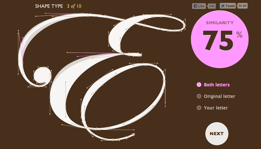
In order to play this game, you will need to quickly and accurately perfect the letterforms using a variety of font faces by dragging and adjusting tools, or “bezier handles”. Your score will improve in proportion to how closely you get to the correct letter. The shapes will become increasingly challenging as you advance through the game, and you must perfect the shape type faster to succeed. This game helps improve your understanding of typefaces and how subtle changes can significantly impact a design’s look and feel.
The Boolean Game
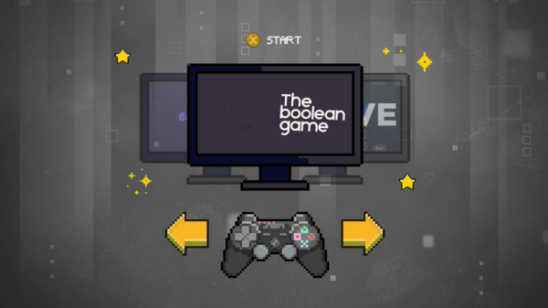
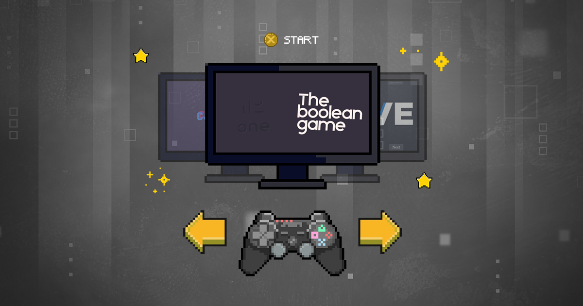
The last game is the Boolean Game, which teaches the concept of Boolean operations. Within design software, UI/UX designers can see how shapes can be combined and intersected to create complex forms. Mainly, it is used to create icons and symmetrical designs by uniting, subtracting, intersecting, and diffusing the basic shapes. This game’s first four sections teach creators how to employ each procedure in many stages. After the tutorial, you blend the four processes to create the level’s shape.

By the last level, the “expert” part, you must use all operations in different ways. The visual introduction to Boolean operations in this game is ideal for beginners. Later levels ensure you know all their uses. It’s an excellent tool for understanding how to manipulate shapes to create intelligent and beautiful designs, a fundamental skill in graphic design.
CONCLUSION
These games are an entertaining way to explore graphic design’s ability to tell a visual narrative that connects, communicates, and captivates. It teaches graphic design principles in a novel way, presenting a unique approach to mastering graphic design skills and breaking away from traditional learning structures. Also, it encourages us to enhance our critical thinking and problem-solving skills by simulating real-world design scenarios. The collaboration of gaming and graphic design in education provides a new, dynamic, interactive, and engaging learning environment. These games combine learning with fun, and they are for graphic designers of all levels and can help you create pixel-perfect designs.


