Design aficionados, eyes here, for we’re giving 2024 some colors and styles!
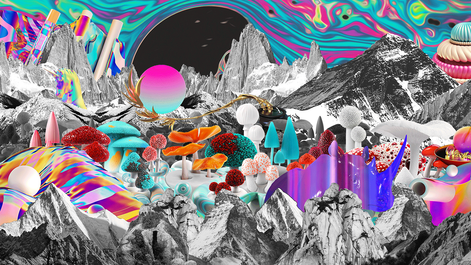
Design is often the silent force in business, a language that speaks in its intensity without uttering a word. It plays a critical role in elevating brands, products, and communications. Its strategic application ensures logos are memorable, websites are user-friendly, and campaigns are impactful.
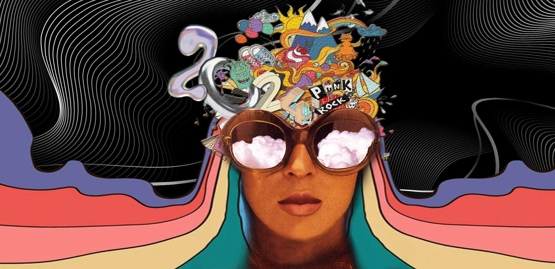
This 2024, this dynamic interplay between creativity and strategy will yield design trends that not only capture attention but also rewrite the rules of marketing engagement. Recognizing the power of visuals as a language that connects with audiences on a deeper level, design trends are increasingly focused on creating immersive pre-purchase experiences that fuel anticipation and leave lasting impressions. Gear up for a front-row seat to the captivating design trends meant to dominate 2024!
Well, what is a new step in the year without bringing back some of the touches from the past? This year’s designs are poised for retro nostalgia, embracing the technicolor and mind-bending world of the past with a modern swagger.
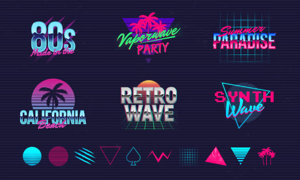
One notable design from the past is the Nostalgic 80s, a breath of fresh air that modern times need and a design that transcends generations even with the rapid changes in trends. Brands are catching on, tapping into the 80s fever to inject their marketing with retro adrenaline. From bold hues and typography, as well as a wink to 80s editorial flair like New Balance’s and Kim Kardashian’s Skims campaigns, this design isn’t just about reliving the past but about tapping into a core memory of the classics.
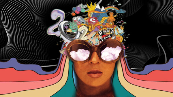
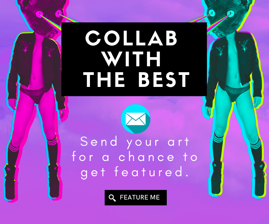
Another one from the time capsule is the Psychedelic 70s. No longer limited to vintage posters and album covers, this design trend is now seeping into our digital displays, retail spaces, crowd events, and even the packaging of our possessions. It seems we’re collectively craving the relaxed and carefree atmosphere of times past. Psychedelic design acts as the ultimate time-travel channel, and businesses are eagerly adopting its quirky charm to resonate with an audience that appreciates distinct vibes and adrenaline rush experiences.
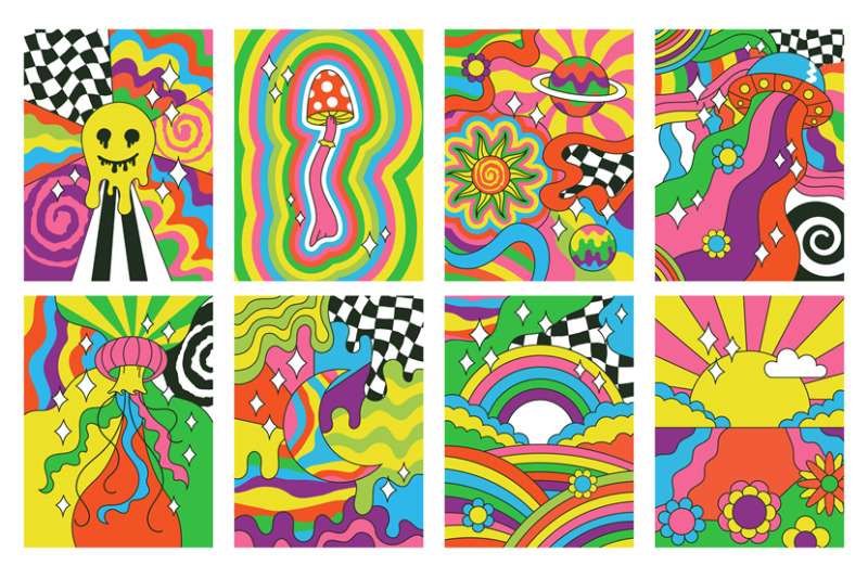
At the forefront of this movement are music and the arts. Events like Coachella provided audiences with a visual journey akin to an acid trip, boldly declaring, “Let loose!”. Meanwhile, Spotify is making waves by curating playlist covers that capture the essence of Woodstock, and their year-end summaries are like digital time capsules pulsating with colors reminiscent of a lava lamp. These recent scenes of psychedelia trace their roots back to music and soda brands, with Pepsi and 7UP’s trippy advertisements leading the way.
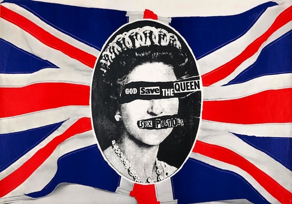
On a different kind of rebellion, get ready for some extra loudness on the design this year, as punk vibes are also about to make their comeback, bringing in the gritty energy to shake up modern marketing. Visualized in bands’ album covers and posters, the strong message transcends with its aggressive usage of distressed typography, bold textures, and aggressive graphics. Brands are picking up on this wild side, throwing in punk-inspired visuals from ads to product designs. Punk design is a statement that shouts for liberty for people who are tired of everything looking too perfect.
Our stroll down memory lane wouldn’t be complete without discussing the boom of Y2K in today’s generation. For instance, fashion brands such as Adidas have seamlessly integrated Y2K-inspired visuals into their advertising, celebrating the era’s bright colors and futuristic motifs. Similar is seen in the cosmetic brand RAD, bringing together the Y2K elements we all love and are known for. They fulfill the role of this design with its gradient designs and bold graphics on packaging. Even music festival Head in the Clouds is collecting Y2K aesthetics into their promotional materials, bridging the gap between the past and the present. The resurrection of iconic elements from the Y2K era is proving to be more than just a stylistic choice—it’s becoming an essential element in contemporary marketing.
This revival of past designs offers a strategic advantage. Its wilderness, aggressive statement, geometric shapes, vibrant palettes, or futuristic aspects slice through the digital noise, forging deeper connections with audiences across industries. It’s a utilization of the past in the packaging of these modern products. Brands that tap into this genuine nostalgia will not only stand out but will also spark connections that last.
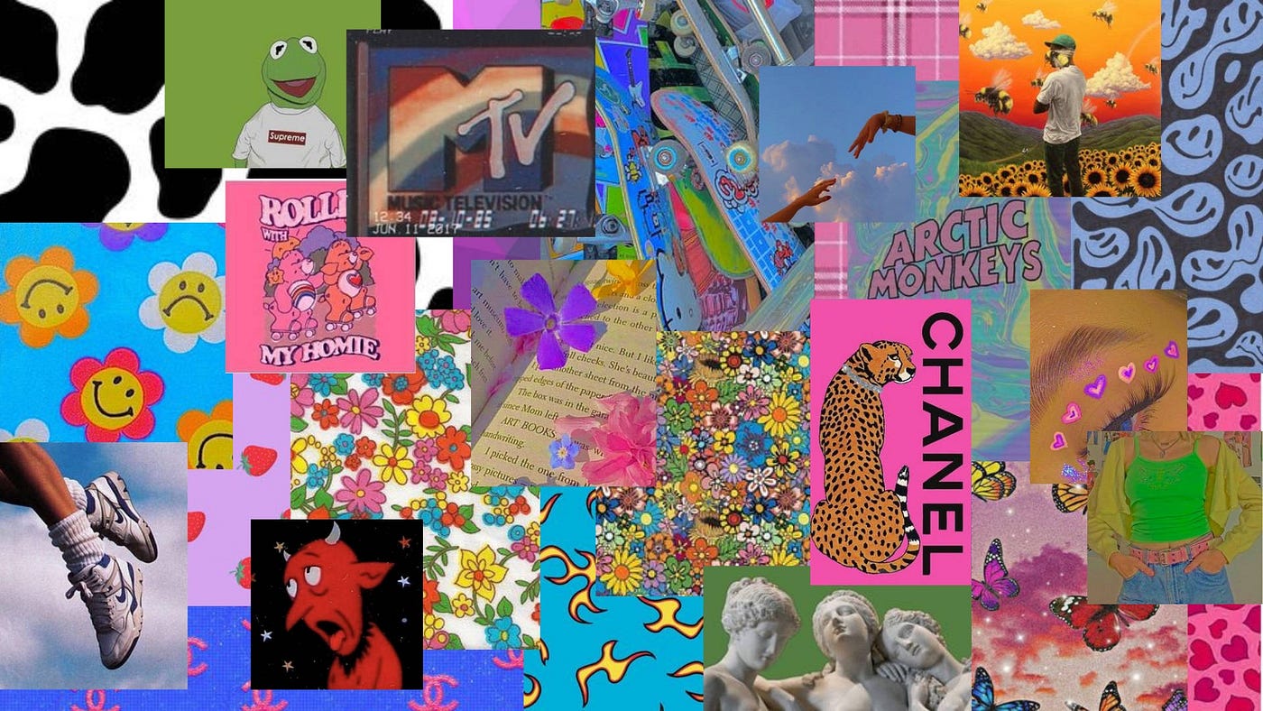
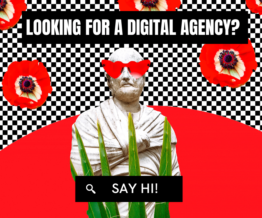
On the other hand, creativity will burst in 2024 as Modern Surrealism introduces some of the most thought-provoking realities and dreamscapes that will leave people in awe. Modern Surrealism is a marketing tool that will let our imagination go beyond the horizon. Usually, fashion incorporates this kind of design at its best, merely due to its flexibility in adapting quickly to recent trends—those fast fashion ones will fit the shoe. Even brand campaigns hop on this design trend as it allows engagement from its audience, an invitation to decipher hidden meanings and connect with brands on a deeper, emotional level. The beauty of modern surrealism lies in its versatility. It transcends industries, speaking to the universal human desire for the unexpected, the imaginative, and the downright awe-inspiring.
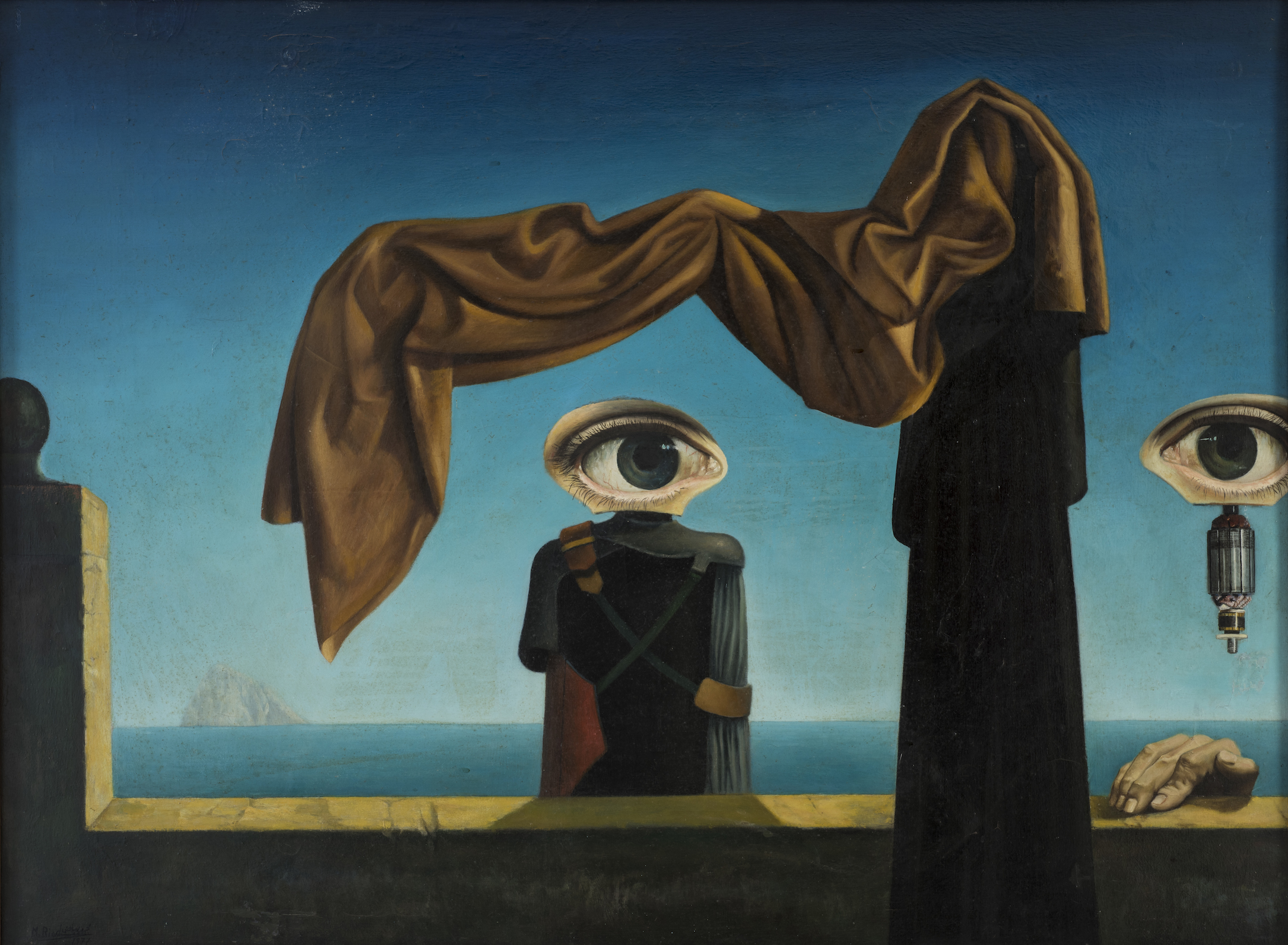
Let’s now plunge into the vortex of maximalist extravaganza, where design becomes a riot of colors, patterns, and textures. This isn’t just a visual indulgence but a bold marketing statement. Maximalism isn’t about holding back; it’s about being unapologetically, extravagantly, and uniquely loud—a true definition of “More is More.”.
In the realm of marketing, maximalism plays a crucial role in grabbing attention in a crowded space. Think about fashion houses and entertainment industries. Maximalism finds its home in spaces where boldness is celebrated. Luxury products, high-end fashion campaigns, and movie posters often embrace maximalist design to convey a sense of exclusivity, grandeur, and extravagance. Take the clothing brand The Sensualist and the movie poster of the Oscar-winner, Everything Everywhere, All at Once, as examples. It’s the go-to style for those who want their brand or message to be a showstopper.
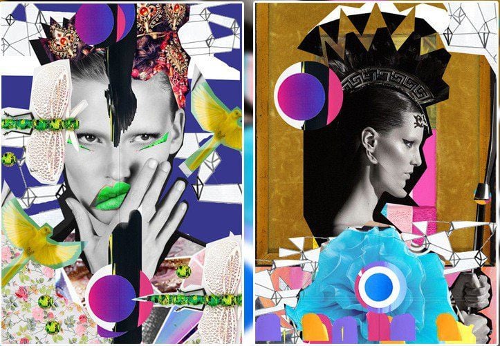
Another surge onto the scene this year is the New Wave design. What sets New Wave Design apart is its core principle, “deconstruction.” It’s the blended distortion on warped letterforms, dynamic layouts, and unconventional compositions where legibility takes a backseat and is replaced by impact and a challenge to the status quo.
It works at its best as brands like Spotify dive deeper with the quirky text designs for their Wrapped campaign. One listener pointed out the font being so narrow yet a genius optical illusion in disguise, where it appears normal when titled back but defies legibility in straight-on view. This playful subversion of expectation is the essence of the New Wave: it makes you think, it makes you talk, and it makes you remember. But not everyone can be a fan of it, as some see the text design in a different language and as a messy rebellion against established design norms. But that’s the beauty of the New Wave: it ignites conversation, pushes boundaries, and dares to be different.
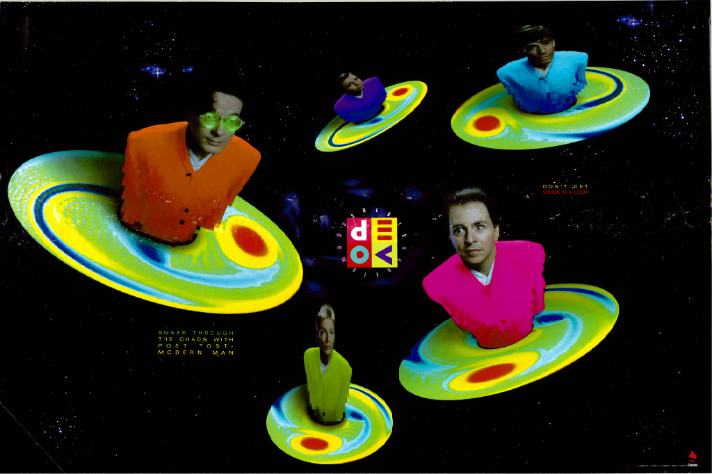
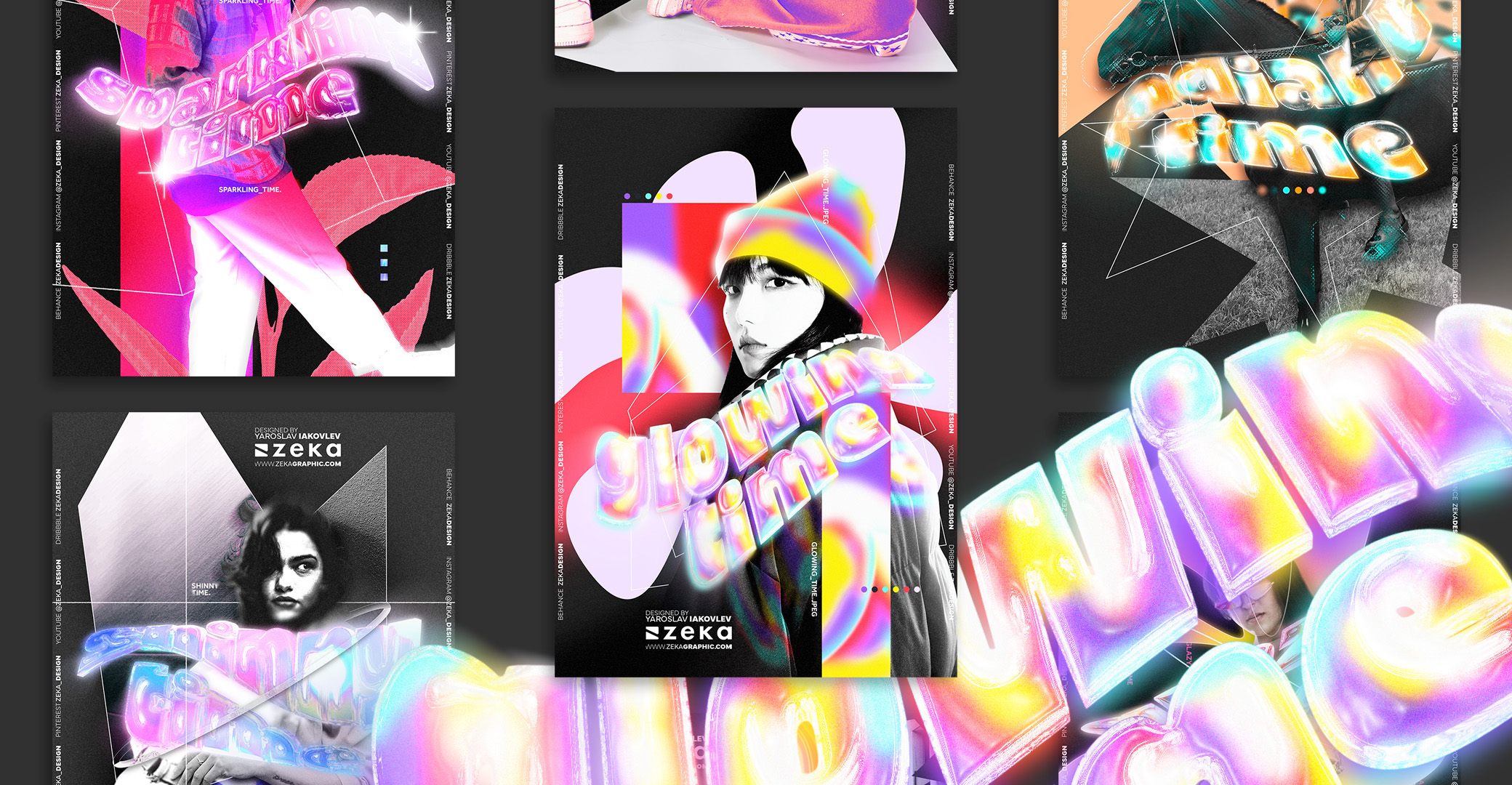
Lastly, we’ll see more 3D typography in marketing, adding a fun and textured twist to words that no longer stick to flat surfaces. Younger consumers, especially millennials, really like the cool illusions and immersive experiences that 3D typography brings. It’s not just about looking good; it’s about using visual interest and touch suggestions to connect better with the audience and market.
In a busy marketplace, standing out is crucial. Hence, 3D typography gives you the upper hand to be unique, bringing in a playful and innovative touch that catches people’s eyes and sticks in their minds. But it’s important to be smart about it. Using too many fancy elements can make things confusing and hard to read. The trick is to find the right balance between being artistic and having clarity. That way, the 3D elements make the whole experience better without getting in the way of the main point.
Nonetheless, in the ever-evolving landscape of design, 2024 brings forth a diverse array of trends that cater to the dynamic needs of the marketing industry. From embracing the blast of the past to leveraging new styles, brands have several ways to connect with people in genuine and unique ways. As designers continue to explore the avenues of creativity, marketers can stay informed and strategically use these trends to create impactful campaigns and visuals that will resonate with today’s consumers.


