When starting a business, first things first—we exactly realize how they put their brand visuals together, starting from the logo. Logos are important because they are a brand’s starting point, something that gives off a message to target your audience’s curiosity to check out your brand. Some of the best-known companies and brands have some of the most recognizable and famous logos in the world. They might not have the most intricate designs, but they frequently have hidden significance, impact, and memorability.
Design is a point of view. We can always agree that every brand builds their own logos according to how they want their consumers to see them. It all boils down to brand recognition.
Here are some of the brand giants and things we can learn from their logo design throughout the years:
FORMULA ONE (F1)
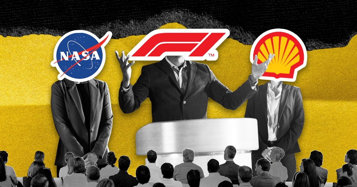
F1 is the highest class of international racing for open-wheel, single-seat formula racing cars. A season consists of a series of races known as Grand Prix. Grand Prix races are held on closed public roads or on purpose-built tracks throughout several nations and continents. F1 is very popular all around the globe. The original red, black, and white Formula One logo, now retired, was designed when the race began to achieve international recognition and notoriety.
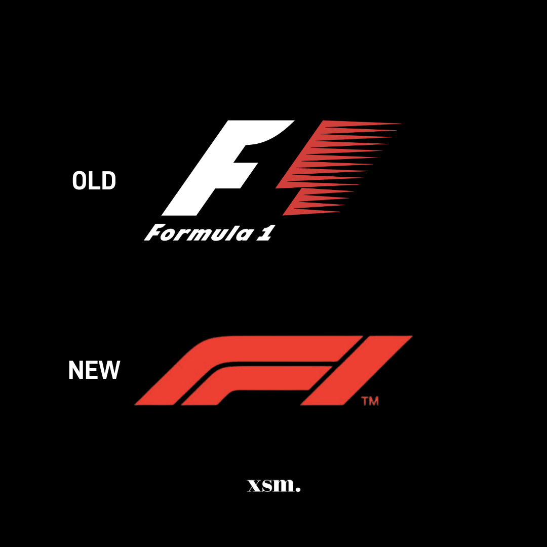
The logo was very noticeable, and you’ll know it at first glance, of course. The visible orientation of its famous logo creates a punchy vibe in italic. It suggests one idea: speed. And if you look closely, you will see that the “1” is created by negative space. To keep up with modern design trends of minimalist monogram logos, the update is a simplified version. Little updates usually go over better with devoted audiences; it’s subtle but powerful.
FEDEX
FedEx Corporation, formerly known as Federal Express Corporation and later as FDX Corporation, is a Memphis, Tennessee-based international conglomerate holding company with a specialization in transportation, e-commerce, and business services. And we see FedEx all over feeds and updates on movies or popular celebrities’ updates. The strike of their logo is extremely simple in appearance but has a very nifty design trick under its belt: using negative space to form an arrow between the “E” and “x”.

This arrow embodies quickness, a sure sense of direction, and a delivery process that is so seamless and carefree that you hardly even notice it happened. This well-known logo is a perfect illustration of the phrase “less is more,” since it shows how you can fit a lot into a design without overwhelming it.
UNIQLO
Uniqlo is a popular clothing company founded in Japan in 1949. Although not trendy, Uniqlo’s style is modern and stylish. It offers great and distinctive functional performance thanks to in-house design and innovative fabrics. Clothing from Uniqlo is “designed for anyone” and may be worn anytime and wherever. What makes Uniqlo stand out is that it has a brand identity that is very much rooted in Japanese culture. The logo says a lot too, in terms of culture and marketing. In keeping with the Japanese flag, vivid red and white were used.

It is available in two different languages—English and Japanese—and is designed to imitate a Japanese ink seal. It resembles a seal of approval for all consumers.
SHELL
Shell is a multinational oil and gas company headquartered in London, England. Over the years, this company has taken pride in supplying consumers with quality products and excellent customer service. In the Shell logo, you’ll really notice that it is that brand. The company’s distinctive symbol has evolved over time, but one element has remained constant: a single seashell. The logo is also known as “the pecten” because it is modeled after the Pecten maximus, a mollusk with a distinctive and large shell. The predominant red and yellow color scheme of the present design, which contrasts curves and points, relates to an art deco influence.
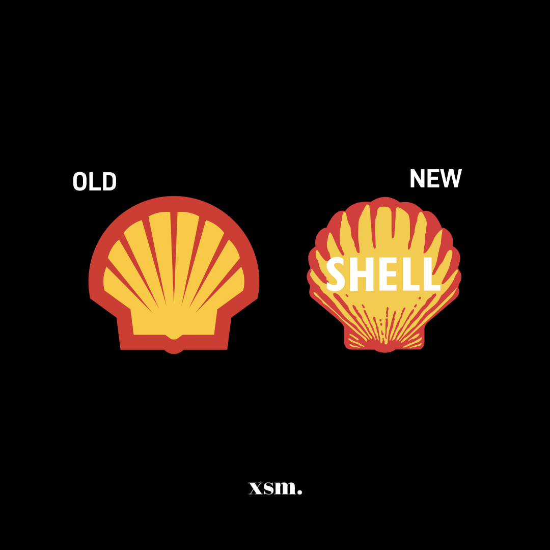
You don’t have to draw all of your visual inspiration from one field just because you work in that field. When creating their logo, Shell didn’t look to oil or garages for influence. They simply outdo themselves and are far more inventive, as we would like to recall it.
NASA
We can tell that NASA is extremely popular with all ages. Evocatively called “the meatball,” NASA’s present, spherical symbol was actually their first. The wholesome logo quite literally presents a planet-like silhouette with stars and orbits across it in the shades of the American flag. Between 1975 and 1992, the meatball was switched out for another logo called “the worm.” Well, curved letters that resemble the motions of a worm are used in this wordmark logo.

Now that we’ve seen it, we came across the likes of a vintage and Star Wars-like idea to Yet, when it was first made available, people thought it was modern, minimalist, and futuristic.
MARVEL
Marvel Comics is a comic book publishing house known for creating notable super heroes such as Spider-Man, Iron Man, Captain America, Daredevil, Hulk, Thor, the Avengers, the Guardians of the Galaxy, the X-Men, the Fantastic Four, and Deadpool. The brand is just amazing. The brand introduced its daring red and white logo in the early 2000s, noting the new face of legendary comics for a new millennium. The word “Marvel” is written in large, strong characters over a vivid red background. The letters are close together and occasionally overlap or interlock. This deliberate and hurried technique gives off a sense of force and urgency similar to that of a superhero being summoned to battle.
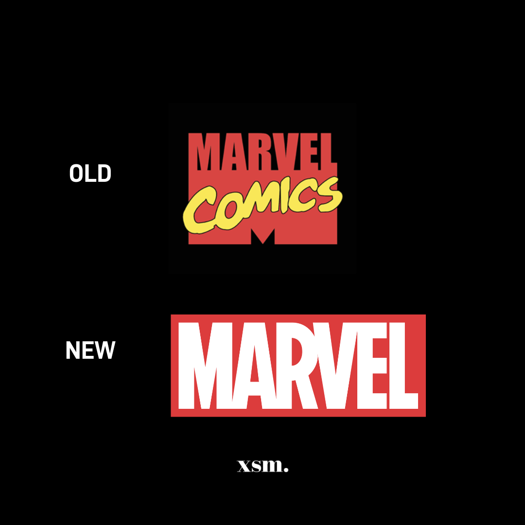
Some of the products, particularly the comic books, still bear the more vintage design with the words “Marvel Comics” in it that is seen above. This is an example of nostalgia marketing, a tactic that strengthens consumer confidence by capitalizing on the positive associations of familiarity.


