‘This font looks familiar…’ is a point at which you have been in the creative industry long enough to notice repetitive things. The fonts’ existence is impossible to not notice, from street signs, to the labels in our food, and to the articles we have encounter in our social media pages. Surely, if branding interests you, you may have noticed brands like Nike, FedEx, PayPal, Red Bull, and Louis Vuitton all have a similar font, FUTURA. This is the first step on having a knack for logos and design. It is also worth considering that these typefaces are an integral part of each brand’s visual identity, brand recognition and brand personality.

But what if I told you that, using similar fonts isn’t something new, That’s right – Even some brands in the same line of business use the same font. The secret to creating a distinctive visual identity isn’t always about using a totally unique typeface but rather, customizing existing fonts to align with their branding and stand out from the crowd.
So, what exactly is typography, and why is it so important in branding? Put simply, typography refers to the design and use of typefaces, or fonts, in visual communication. We see typography everywhere From logos to product packaging to social media posts to websites. It can play a significant role in shaping how we perceive and interact with brands.

Take a look at Coca-Cola’s script, for example. The swirly, cursive letters evoke a sense of nostalgia and timelessness, while the bright red color is bold and eye-catching. These design choices help to communicate Coca-Cola’s brand values – joy, happiness, and a sense of fun. Similarly, Google’s sans-serif font is clean, modern, and easy to read, reflecting the company’s commitment to simplicity and innovation. Its logo has been seen a lot in different places both online and offline so it’s impossible for one to not notice. Additionally, a local brand that uses Garamond for its logo and marketing materials is the Cebu Pacific. Cebu Pacific’s logo, which features a stylized bird, is set in bold Garamond letters with a red and yellow color scheme. The font’s clean lines and modern appearance help to convey a sense of efficiency and reliability, which are key qualities for an airline brand.

In this article, we’ll explore some examples of how brands use the same font but with different tweaks to align with their branding. We’ll look at how brands like Airbnb, Spotify, and Nike have customized existing fonts to create unique and memorable visual identities that stand out from the competition.
When it comes to branding, the choice of font can make a huge impact on how a brand is perceived. Here are five of the most commonly used fonts in branding, along with examples of brands that use them:
Helvetica

Since the 1950s, designers have been choosing Helvetica, because it is assumed to be a “neutral” design. Helvetica has become a successful font due to its distinctive features, including a tall x-height that enhances readability even from a distance. Furthermore, the typeface’s tight letter spacing creates a dense and solid appearance, making it the perfect choice for headlines that catch the reader’s attention. This clean and simple sans-serif font is a popular choice for modern and minimalist brands. Some examples of brands that use Helvetica in their branding include American Apparel, Crate & Barrel, and Toyota. Philippine brands that use Helvetica include BPI (Bank of the Philippine Islands), Globe Telecom, Philippine Airlines, Nestle, and Bench.
Times New Roman
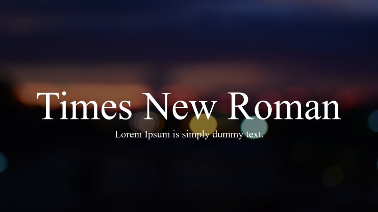
This classic serif font is often used for more traditional and professional brands, as it conveys a sense of history and stability. Times New Roman was introduced in 1932 by Stanley Morison for The Times newspaper in London. The font was designed to be efficient and readable for newspapers. The Times held exclusive rights for a year before it gained popularity in the US, with Woman’s Home Companion using it first in 1941 and the Chicago Sun-Times in 1953. Some examples of brands that use Times New Roman in their branding include The New York Times, Harvard University, and Rolex.
Futura
Futura is a geometric sans-serif typeface created by Paul Renner and released in 1927 as part of the New Frankfurt-project. The font is based on geometric shapes, primarily the circle, which aligns with the design principles of the Bauhaus movement from that time period. This
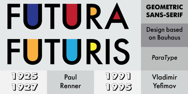
geometric sans-serif font is often used for futuristic and tech-focused brands, as its bold and clean design communicates innovation and progress. Examples of brands that use Futura in their branding include Volkswagen, Absolut Vodka, and Louis Vuitton. Some brand logos in the Philippines that use Futura include SM Supermalls, Shakey’s Pizza, and Globe Telecom.
Garamond
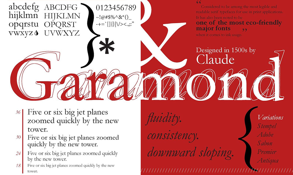
Garamond refers to a family of serif typefaces named after Claude Garamond, a 16th-century Parisian engraver (sometimes spelled as Garamont during his lifetime). The Garamond typeface is widely recognized for its use in book printing and is popularly chosen for body text This elegant serif font is often used for luxury brands, as it conveys a sense of sophistication and refinement. Some examples of brands that use Garamond in their branding include Tiffany & Co., Rolex, Vogue and Ayala Corporation.
Script
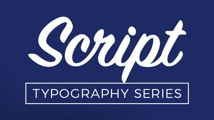
Script is a genre classification for typefaces that is heavily influenced from handwriting and calligraphy. Known to be slightly more formal in its composition, often used for elegant and feminine brands. Brands that use script fonts in their branding include Coca-Cola, Instagram, and Tiffany & Co. Locally, brand logos that use script fonts include Max’s Restaurant, Mary Grace, Rustans, and National Bookstore.
CONCLUSION
The fonts we’ve talked about are just a small sample of the many fonts used by brands. It’s clear that typography is a key element in brand recognition and identity. Although many brands use the same fonts, they often add their unique touch to make it their own. By carefully selecting and modifying typography, brands can effectively communicate their personality and values, making them stand out in a sea of competition. Whether it’s a classic serif font for a luxury brand, a sleek sans-serif for a modern tech company, or a fancy script font for an elegant feminine brand, typography can create a lasting visual identity for a brand. Therefore, designers and marketers should recognize the power of typography in branding and use it strategically to help their brands succeed.


