What do you get when you mix a painter and a graphic designer?
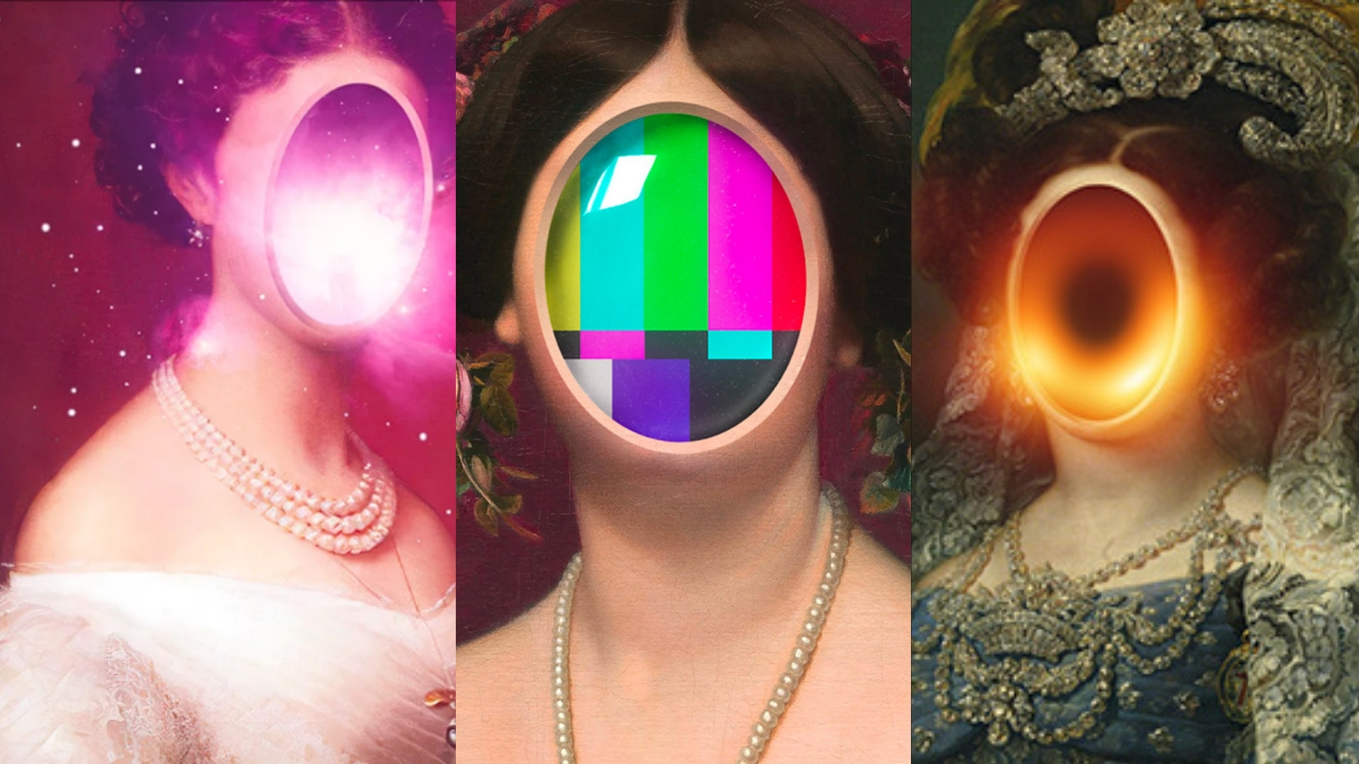
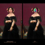
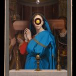
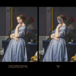
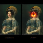
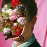
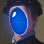
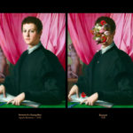
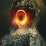
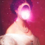
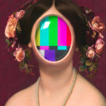
You get an out of this world marvel! Italian artist, Sigui Belletini creates a fusion of time periods through mixes of classical style and modern sophistication. The artworks are reminiscent of the paintings from 14th to 19th century with a remarkable application of 3d elements, faunas and opaque colored negative spaces in focal areas. It definitely creates an atmospheric vibe that will appeal to the younger generation.
Bellitini’s style is part vaporwave aesthetic that emerged during the early 2010s and part baroque, a classical art style that defined 17th century artistry. The visuals serve as a median of optic storage that blurs the line between obsolescent modern etchings and idealized neutral figures.
What makes it more interesting is the style resulted into being non anecdotal juxtaposition of genres by having a unique set of focal point in the artwork. Through Bellitini’s visual renders, you’ll see glows and geometry in a different light. The titles are highly profound giving it a narrative that the artist wants to convey.
Why we dig this aesthetic:
- Although we’ve seen classical styles with re-imagined takes, Bellitini’s eye for focal point is exceptional.
- It looks sophisticated.
- The style is captivating that may take into various forms in the years to come.
- The visual is applicable for commercial print adverts. We are looking at fashion brands like Off White, Versace and Gucci that can execute this type of campaign.
- Classical art is fundamental to all artists and by recreating it develops a certain kind of visual affinity.
- Perfect for editorials, magazine and book covers.
- We always love a dark undertone to artworks.
- It looks original and recognizable.
- It is conceptual without using too much elements.
Check out the artist’s Instagram for more of these eyecandies. The first three IG Posts are awesome!


