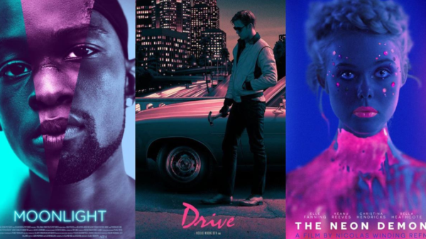


Wong Kar-Wai is a Chinese film director known for his films that speak about nonlinear narratives with atmospheric music, stories about longing and melancholia, and cinematography style involving bold and saturated colors.
Here are some topnotch captivating films of Wong Kar-Wai if you want to catch a glimpse of his style:
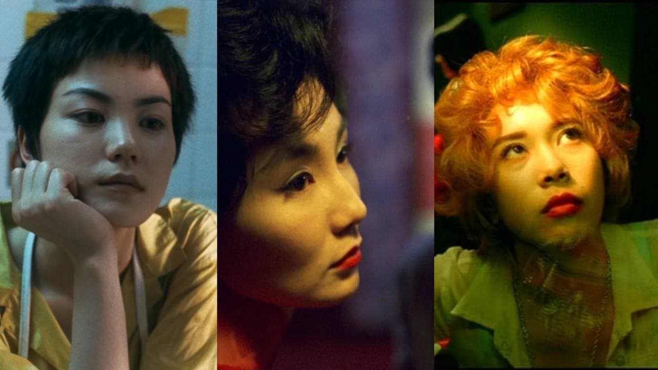
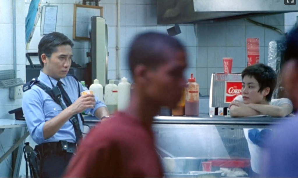
CHUNGKING EXPRESS
This tells the story about two Hongkong policemen struggling to move on. This is a complex story that will make you meditate on the visuals and love itself.
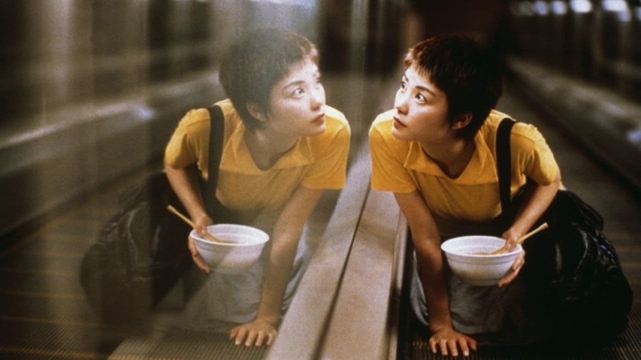
Wong Kar-Wai used natural and fluorescent lighting throughout the film for the viewers to feel the sense of separation.
You can relate and imagine the characters’ life and how daytime looks like through natural lights and the fluorescent lights all over the faces to maintain loneliness.
Saturated films were all over the scene to establish a strong emphasis on metaphors. He also used the color in deep blue to emphasize misery.
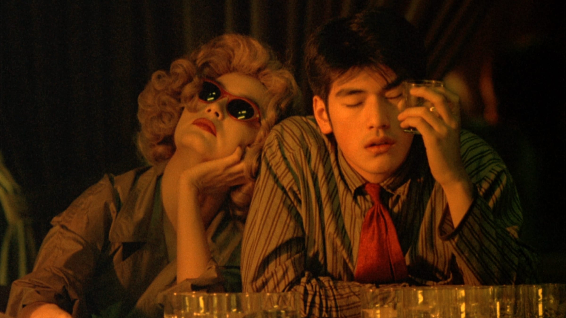
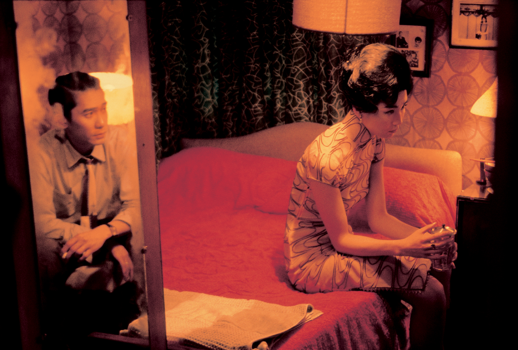
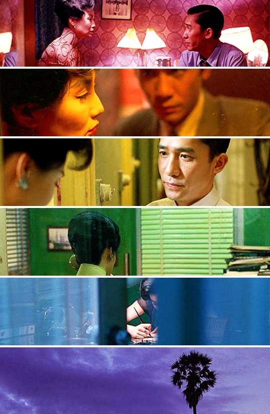
IN THE MOOD FOR LOVE
This is a story about a man and woman whose spouses have an affair together and who slowly develop feelings for each other.
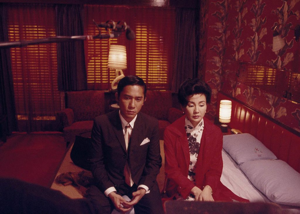
In here, there are wide-ranging moments teamed up with emotions and scenes in saturated colors.
This gives the viewers to invest more time on the atmosphere. The colors were in dark red and black—which expressed complexity, passion, and loneliness.
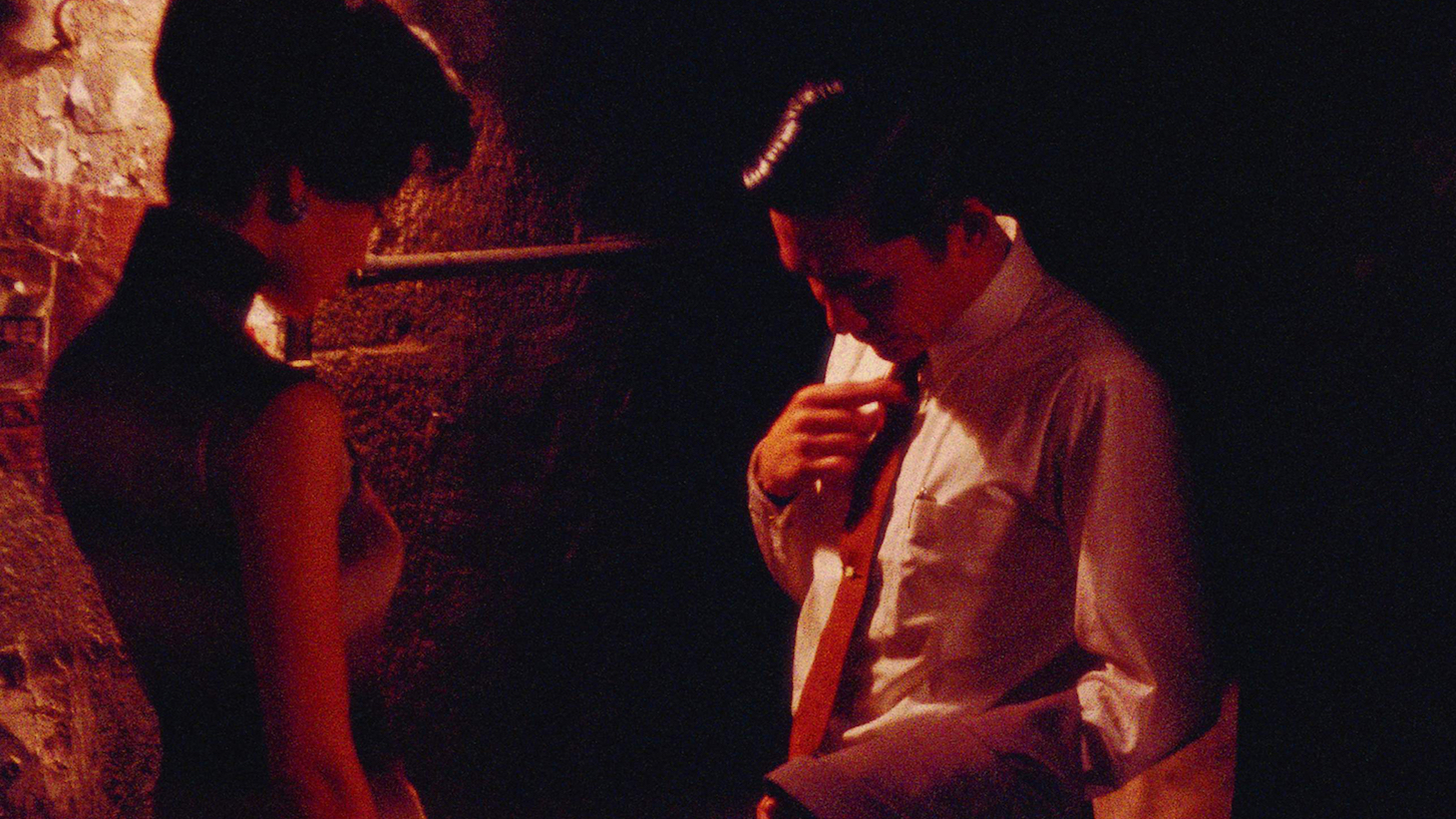
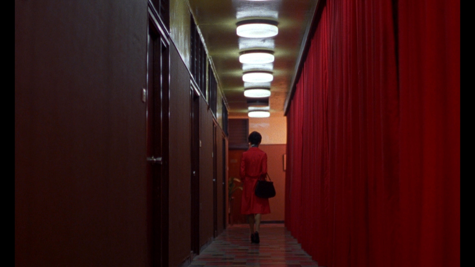
It was mixed with green and blues to describe marriage or new life.
The lights were also established in gray and it calculated a more depressing feeling with a sense of nostalgia.
Colors change depending on the mood of the characters and the atmosphere of silence really is a factor of getting the tone of this story.
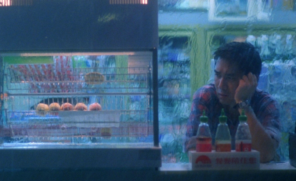
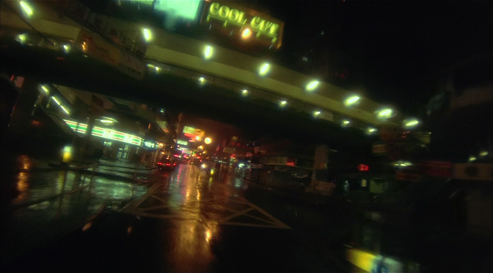
FALLEN ANGELS
This is a love story of a couple specifically a hit-man, his girlfriend, and a mute lady that he met on the store.
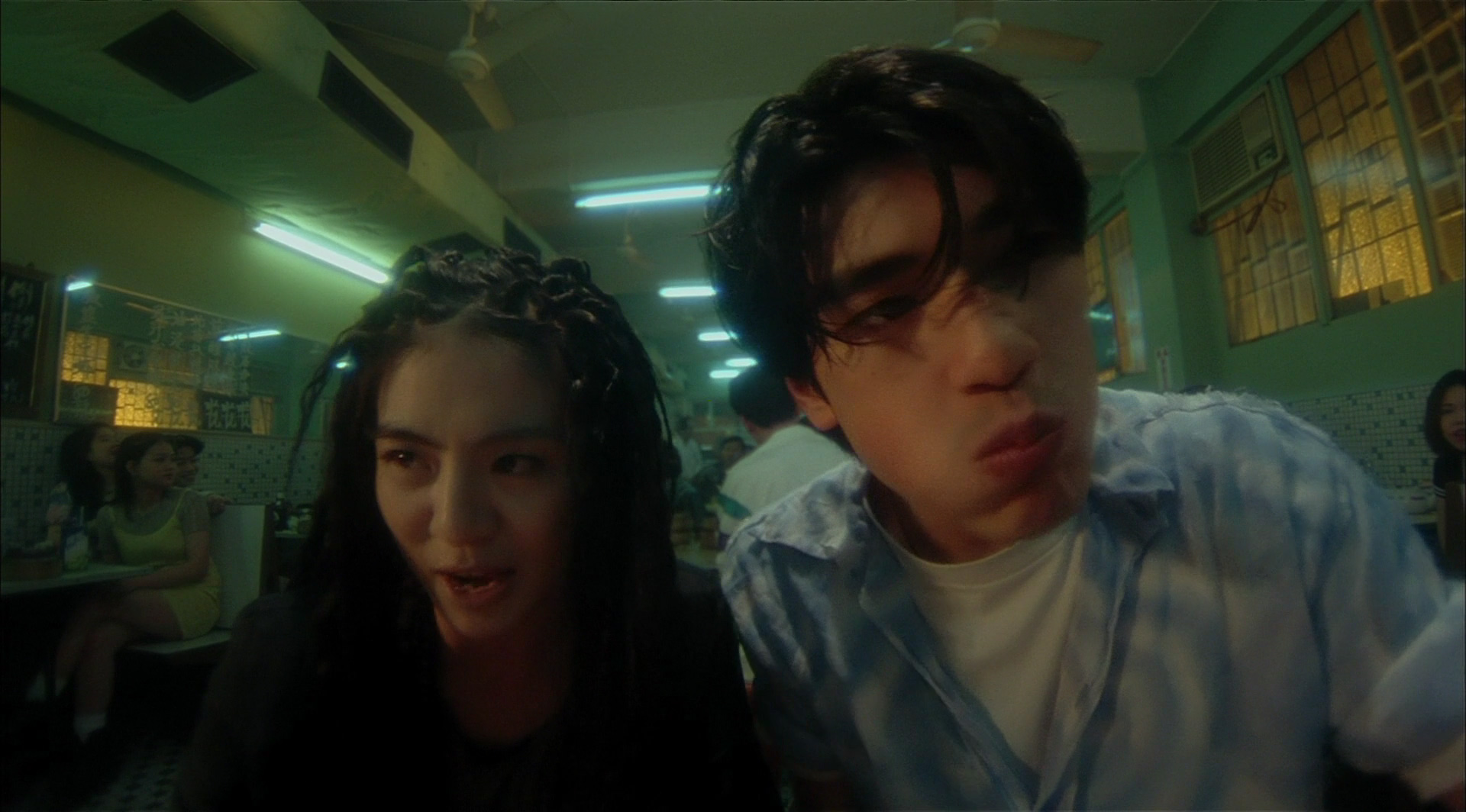
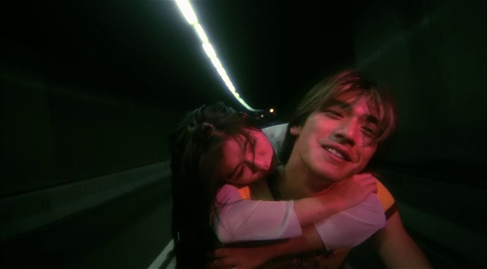
This film focused on shots of the city captured in wide-angle lenses, hand-held cameras, plain shots that also established a mood, and a shot that pauses.
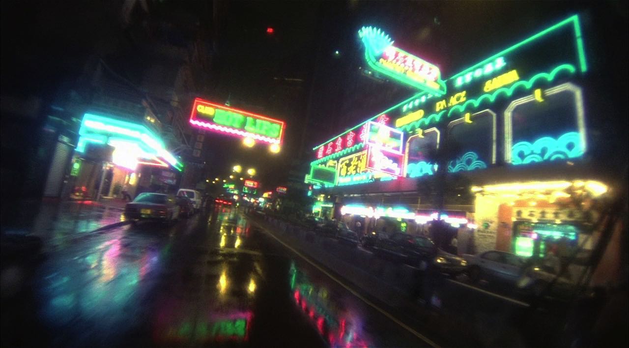
To establish a passage of time, the colors were in neon lights, almost disappearing. The approach was to make the viewers feel that the city itself is also the character since the scenes were mostly taken on streets.
He mixed all the colors green, with a touch of yellow, and matched them with wide and fisheye lenses.
CONCLUSION
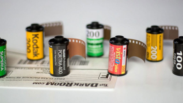
Today’s effects and color grading improved for the better but Wong Kar-Wai maintained his identity in manning cheap cameras, grainy shots from 16mm and 35mm films rolls, and lens warping. The colors were leaning more on to the blues and greens. A lot may mistake color grading from film’s color timing which is the sole process of Wong’s since he used film cameras.
It’s an actual and compound definition but its light source that is split into red, green, and blue, allow the amount of light to be changed.