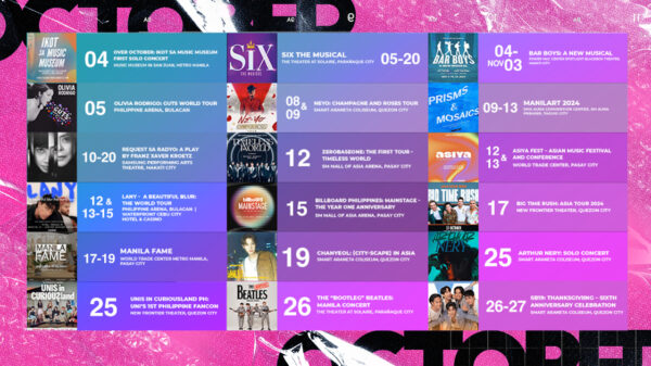
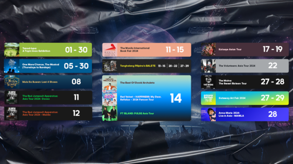
Years later, the gradient trend is still here. Gradients were very popular as an addition to colors and to add spice and depth in every design. We see them everywhere and they’re far away from slowing down.
One thing is for sure: gradient is very versatile—it can be everything you want in a design; bold or subtle.
WHAT ARE GRADIENTS?
Gradients are essentially color transitions—they’re a gradual blending from one color to another that can also be in transition to similar and contrasting colors. What’s great about this trend is how flexible it can be; meaning the gradient itself does not always have to be the focal point.
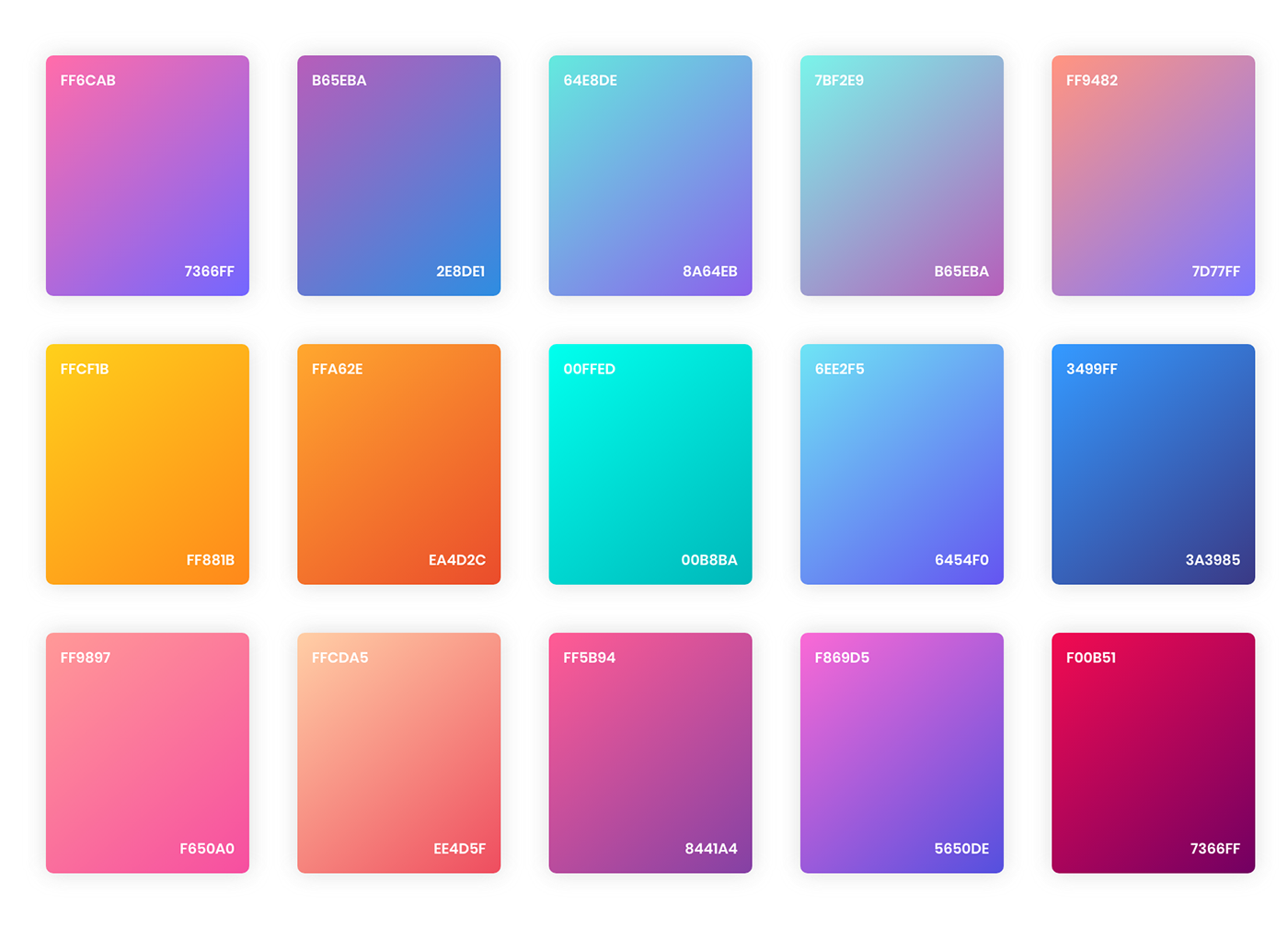
It can be used in the background, the main element or even in text. Gradients can be added in flat design to create an interesting texture or background.
WHERE CAN WE USE THE GRADIENT TREND?
Apart from the nostalgia factor that this gradient trend is bringing us, it is a powerful element to add flavors with whatever projects we have right now.
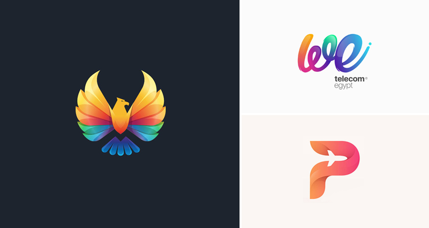
Logos: The best way to mix and match your colors in logos is to explore it the gradient way. It will appear as stylish as it can be and can also be used as a strong accent as part of the logo. A restaurant logo or a café logo with enhance its personality the moment you incorporate gradients.
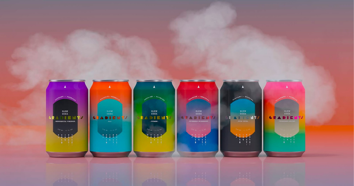
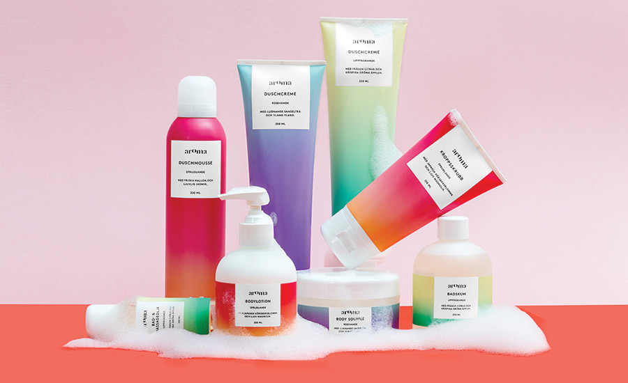
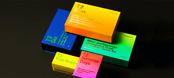
Packaging: They say, “don’t judge a book by its cover”—but sometimes the cover is the selling point. Packaging plays a vital role in business. It attracts people because external things excite them. Aside from getting a hint on what the product would look like, having a packaging that attracts the eye of customers is a sure win. Just make sure you mix the right colors and that the tone matches everything including your brand’s nature.
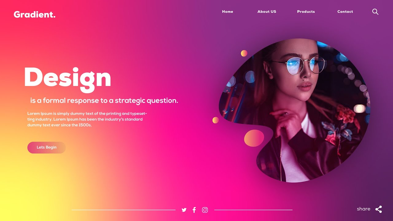
Web Design: We are all over the internet. Gradients in web design can make objects stand out that adds realism to the design. The overall appearance of a website will be much cooler when incorporated with gradients—along with these are the powerful additions of vector art, illustrations, and photographs.
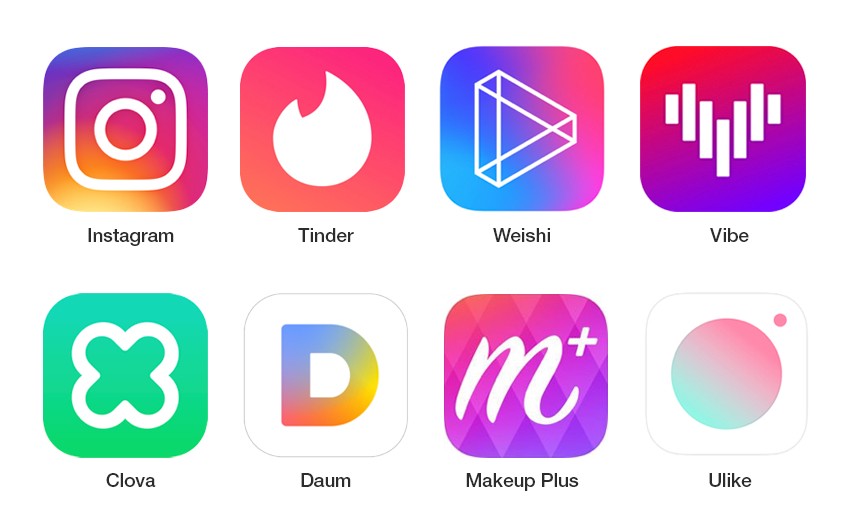
Apps: Some apps are currently channeling their inner style as a better way to hop on the trends. Gradients play a very impactful movement in this one. You can start by choosing your colors depending on the mood or approach of your app. You can go into a full blast bold or shower the all of it with pastels, you choose.
Print Materials: In every poster, album covers, tarpaulins set out on stage—gradients are there to give you a memorable backdrop idea or cover. It’s a fantastic opportunity bringing gradients on a more physical aspect without limit. A fantastic color combination can be the selling point and the most memorable part of things.
CONCLUSION
We can’t stop the undying trend to still boost its performance. Facebook, Twitter, and Instagram already adjusted to the fact that indeed—gradients bring strong charisma. It promotes having a realistic approach concerning brands, a creative tool and skill out for innovation, and a playful way of experimenting ideas. Just know that you can establish your own by learning what and how gradients really work because it’s not just color blending and all that. It also requires your passion and intention in building a solid design with appealing visual identity.


