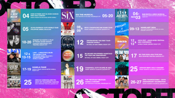
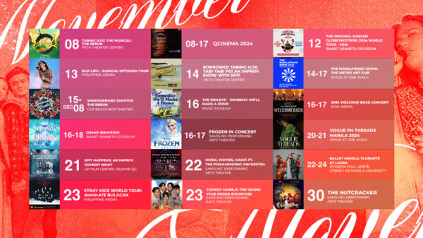
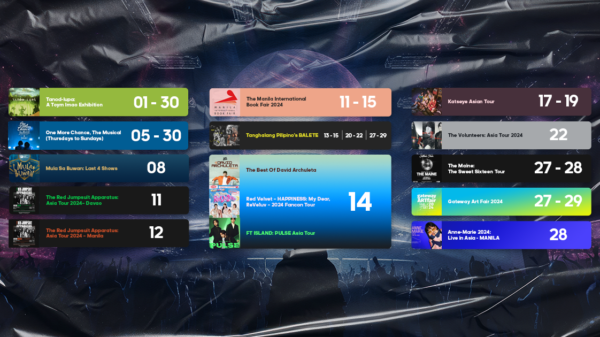
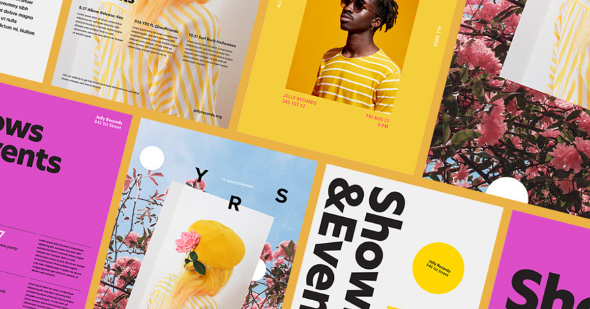
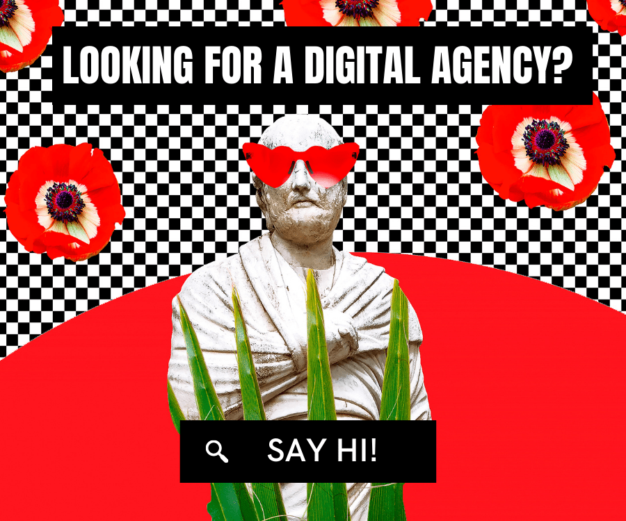
Grids and good layout make such a powerful tandem if you’re looking forward to achieve a better design. A better design also is an organized design whether in business or more particularly including web purposes.
The Grid System
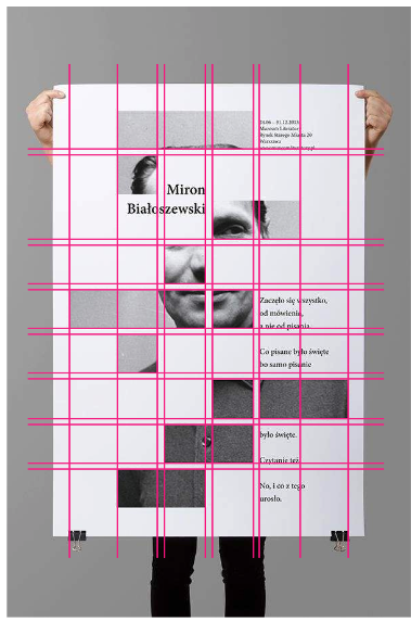
In order for you to achieve a very organized design, applying the grid system is such a move. It’s a technique that is tried and tested, also—grids in interactive design can also help provide a consistent experience across different devices in different screen sizes. Grid is an effective tool leading you to a powerful layout and design. It resolves problems including visual and organizational problems.
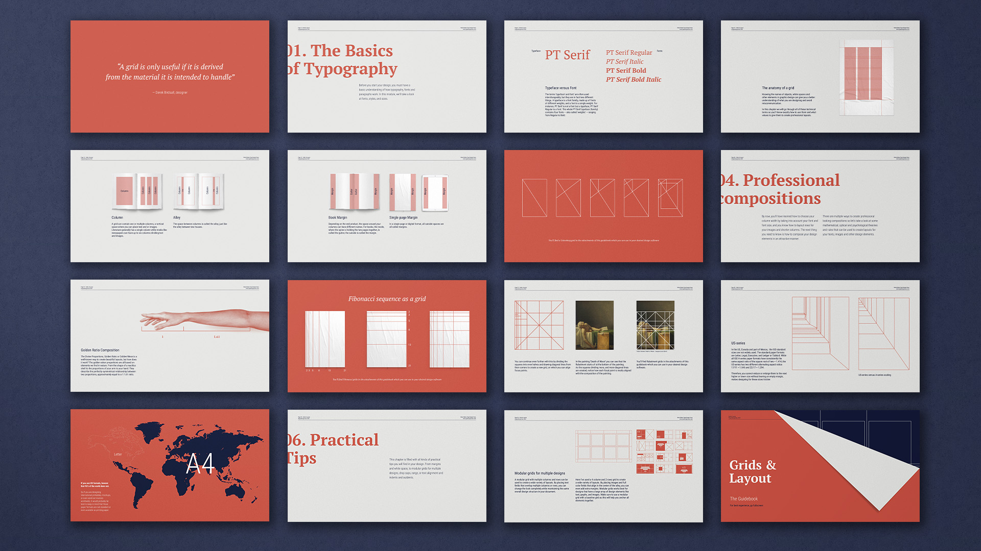
Grids can also speed up and improve your design time. They serve their purpose a guiding principle and signals you where to best position your elements and scale it nicely. Like, why should you scale it and position something on your page? A grid will help you find its natural place.
Apart from its convenience, it will also help you communicate with your clients, customers, and designers too. It lessens the stress and frustrations of miscommunication. If you have a solid foundation of grids set in your design, you co-designer will have an easy grasp on the taste that you want to pursue.
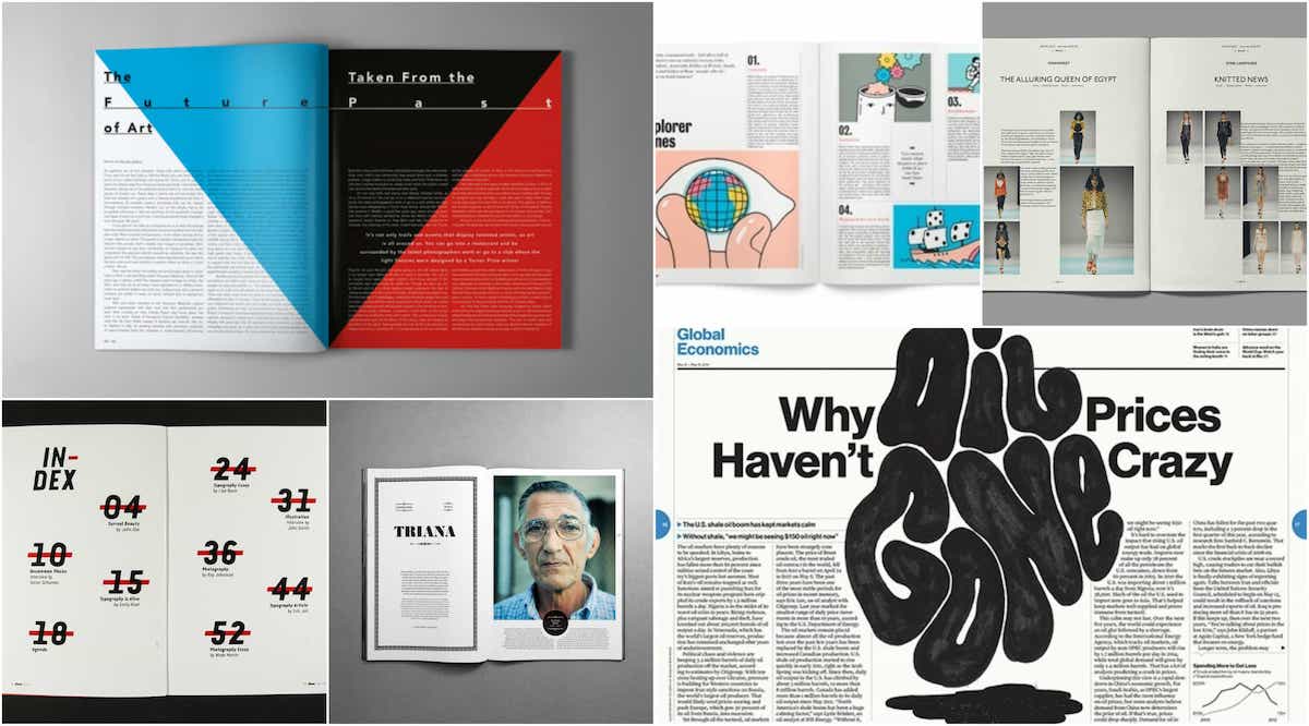
The beauty of grids is that they’re also consistent—it’s like when your designing something, things fall instantly from their place.
The Layout System
Layout has an effect on your audience visual perception. It can also be a creative way to tell your story because it covers all—presentation, proposals, aesthetic vision, and even the simplest things that need publication.
Here are some principles on how to communicate your layout to your clients:
Hierarchy
Hierarchy is essential in any document. We know this because behavioral economics suggests that the first thing we see about a brand or a product informs our overall opinion of it. You should know before you start what is the most crucial element of that page and what you want your client to remember from it. You should then apply the most appropriate ‘level’ to that element and build your layout around that.
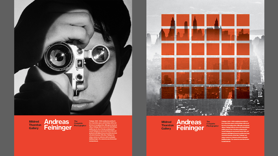
The key to great layouts is to box up all the individual eleme
The Use of Boxes
nts to form one whole and keep the amount of space between each one consistent. It will make your layouts much cleaner and easier on the eye, and you will avoid floating elements.
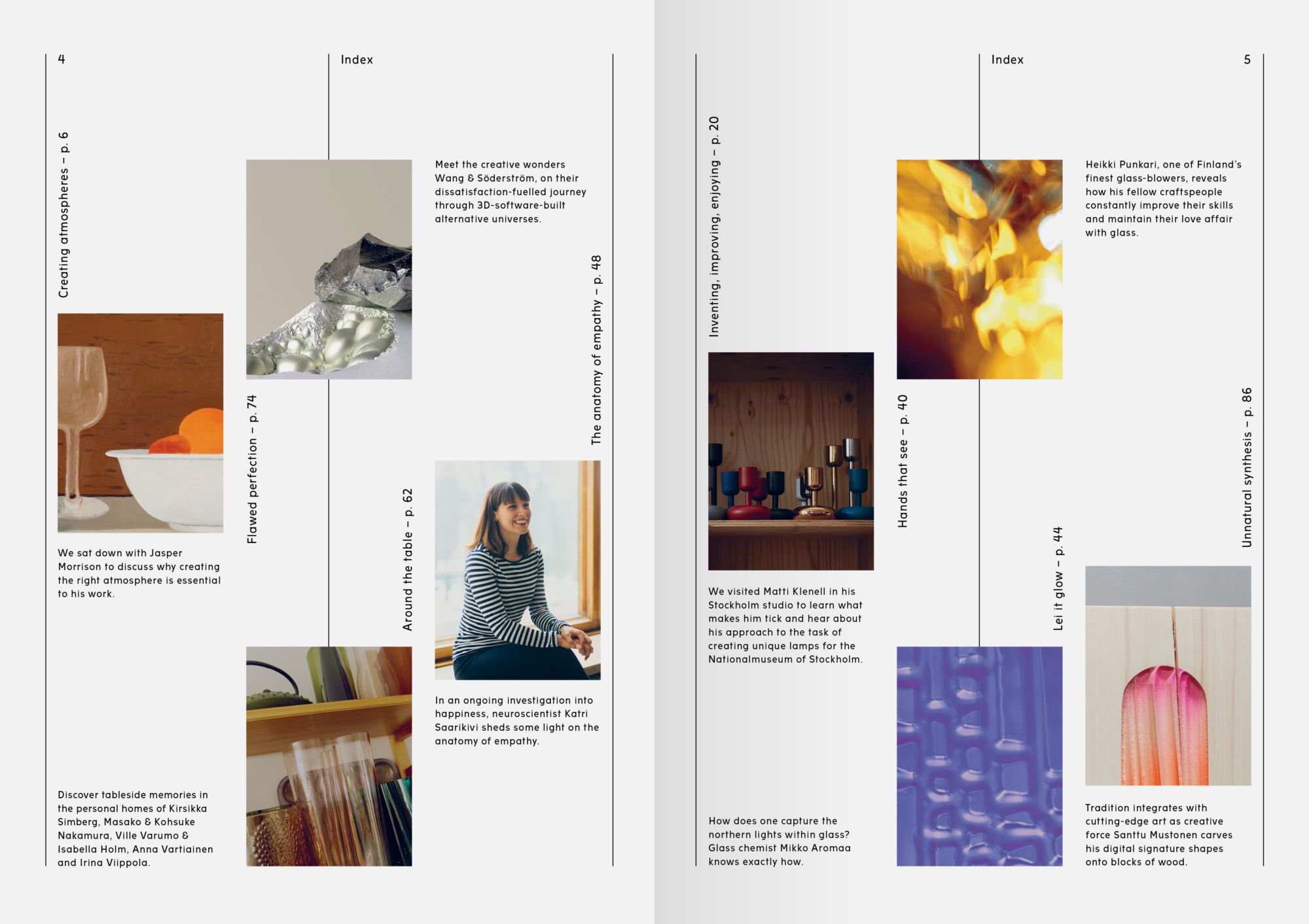
It doesn’t necessarily mean that you need to box them all, just group the elements that you can.
White Spaces
Give your layout space to breathe. To avoid being overwhelmed by the number of stories you want to put in one go, just put off the unnecessary elements that won’t be a huge benefit to your story.
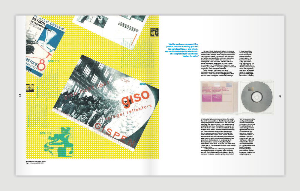
Visually interpret the page all the time.
Scale and Balance
A good way to direct your audience’s attention to particular areas of your data visualizations and make your layouts more diverse is to sensibly use scale.
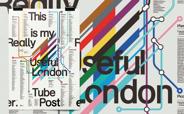
A good way to direct your audience’s attention to particular areas of your data visualizations and make your layouts more diverse is to sensibly use scale—like inputting quotations on a larger scale or having those key points on bold and italicized.


