Websites appeal to the eye that’s why it is very important to capture your audience through visuals. A visually appealing website is easy to digest, more functional, enjoyable, and inviting, retaining attention in that critical first 30 seconds where users need to be engaged.
Here are 7 of the most aesthetic websites you can get inspiration for this year (because it’s never too late!)
1. REBORN

Reborn is a one-page website featuring intriguing horizontal scrolling effects and attention-grabbing pagination. Apart from being 100% responsive, this aesthetic website is also easy to navigate with beautiful transition effects. Reborn proves that you can include multiple 3D animation effects on your website without the risk of distracting your visitors and users.
2. CYCLEMON
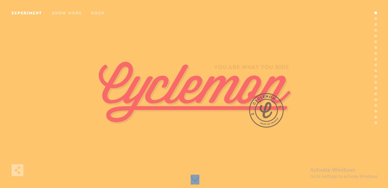
Cyclemon features a picture-infused website design. With a parallax scrolling effect, the image on each slide fades into each other, creating an amusing effect on visitors. This aesthetic website also features a trendy navigation button on the right of the page that makes it easy for users to quickly scroll through the website.
3. SENEP
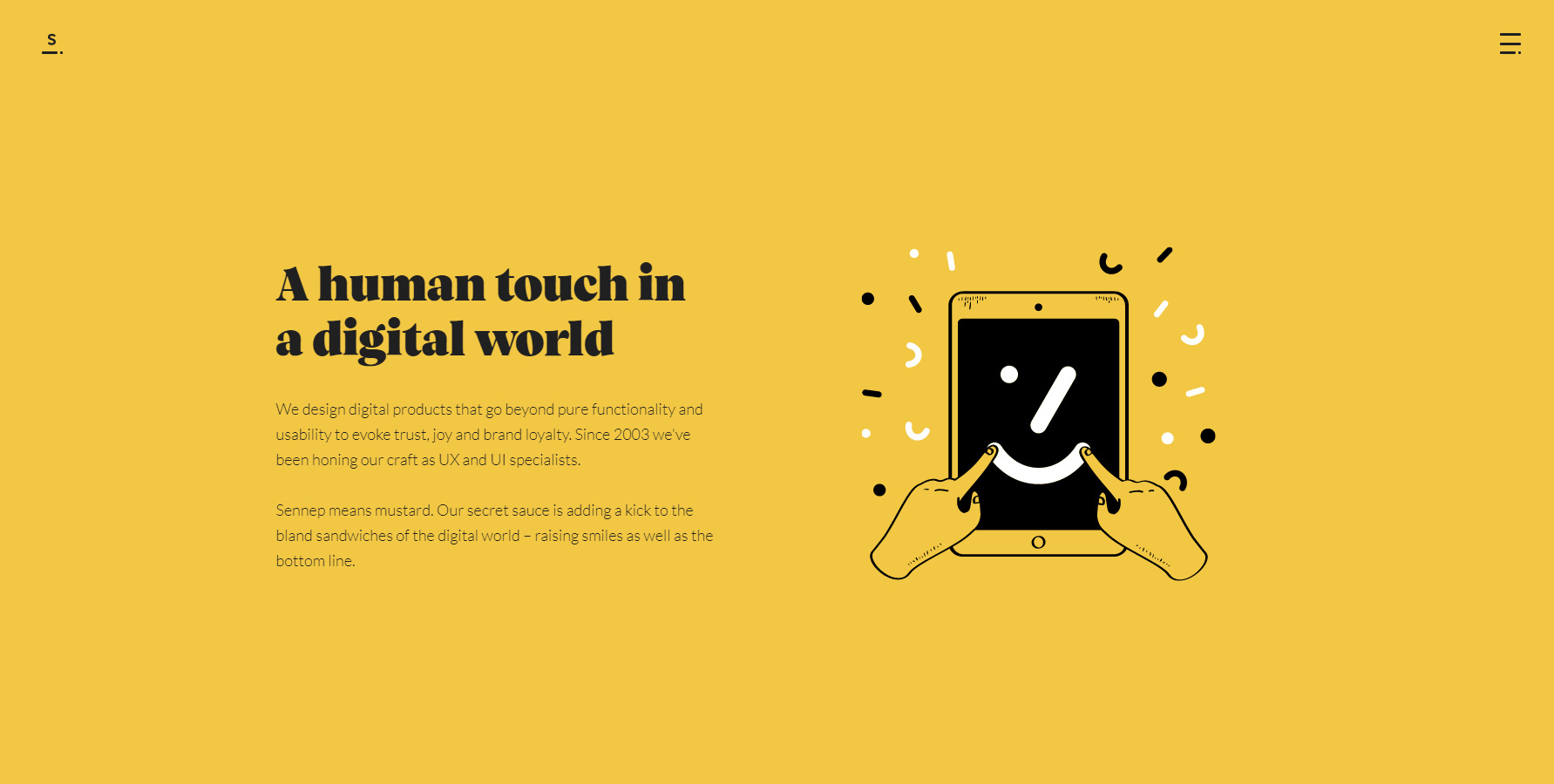
This aesthetic website features a perfect blend of multiple solid colors, changing as you scroll down the page. It is also capable of catching the attention of visitors, leading them even deeper into the page.
4. STUDIO BRAVE

The Studio Brave website features a powerful and asymmetrical website layout blending perfectly with a vibrant color pallet. This aesthetic website also includes exciting CSS full screen background video content and multiple 3D UI elements guaranteed to capture the users’ attention very quickly.
5. LETA SOBIERAJSKI
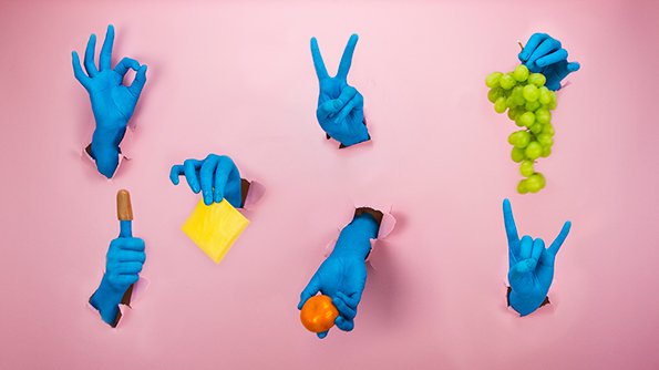
Leta combines graphic and traditional elements with art and photography on her website. This aesthetic website is filled with bold, colored content and pictorial visual expressions. Fun animation effects are also included to enhance the user experience on the site. It also includes three rotating UI elements, a square, circle, and triangle, on the screen, regardless of how far a user scroll. This website is fully responsive, retaining its visual appeal on all screen types and sizes.
6. AND WALSH
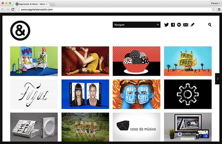
&Walsh website features bold and large typography and great use of white space. The interactive introduction video on the homepage is guaranteed to capture visitors’ attention quickly; the subtle on-scroll website animation effects are also just enough to ensure an excellent user experience. Although featuring multiple color palettes, they all blend beautifully, creating a considerable level of visual appeal.
7. PARSONS BRANDING
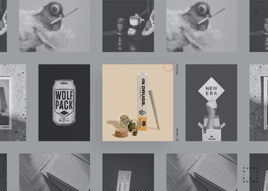
Parsons Branding homepage employs a horizontal scroll effect. This aesthetic website is easy to navigate using a click-and-drag action with your mouse. The minimal typography and interface design explored also blend perfectly with the pronounced animation effects. Interestingly the Parsons Branding website may look simple at first glance, but the well-laid-out design, user-friendly navigation, and brilliant UI effects make it even more beautiful.
The interactive hover effect also ensures user engagement with your website, in turn reducing the overall bounce rate.


