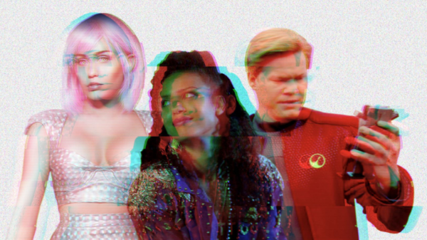
What’s the first thing in mind when you hear the word Dystopia?

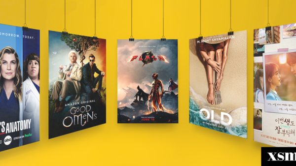
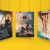
The world of dystopia is a perfect, imagined world. The design aesthetic is a very fascinating challenge. Ever wonder about the impact of Black Mirror? Love Death + Robots? Hunger Games? Blade Runner? Dune? These fiction films show a grim future. The fictional technologies depicted on the show have to be recognizably not a part the world we live in.
The Dystopian Aesthetic
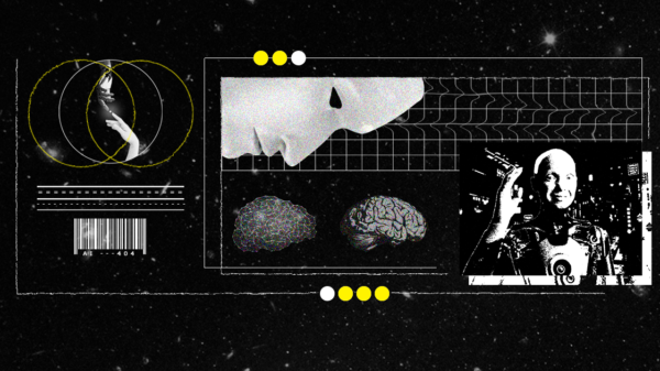
In dystopias, Key visual features include huge cities and a damaged natural world. We see giant fascist posters and brutalist buildings, parallel streets, and sometimes a very colorful one.

Many companies and agencies adapt to this new kind of design aesthetic because it’s new and refreshing. It makes people relate what they totally see online and on the big screens.
Technology and Metaverse
Our experience of virtual worlds is about to get even deeper as the metaverse gains steam. The increasing population of people using avatars, cryptocurrency and immersive tech like VR headsets to interact in worlds that mix the real and the virtual.

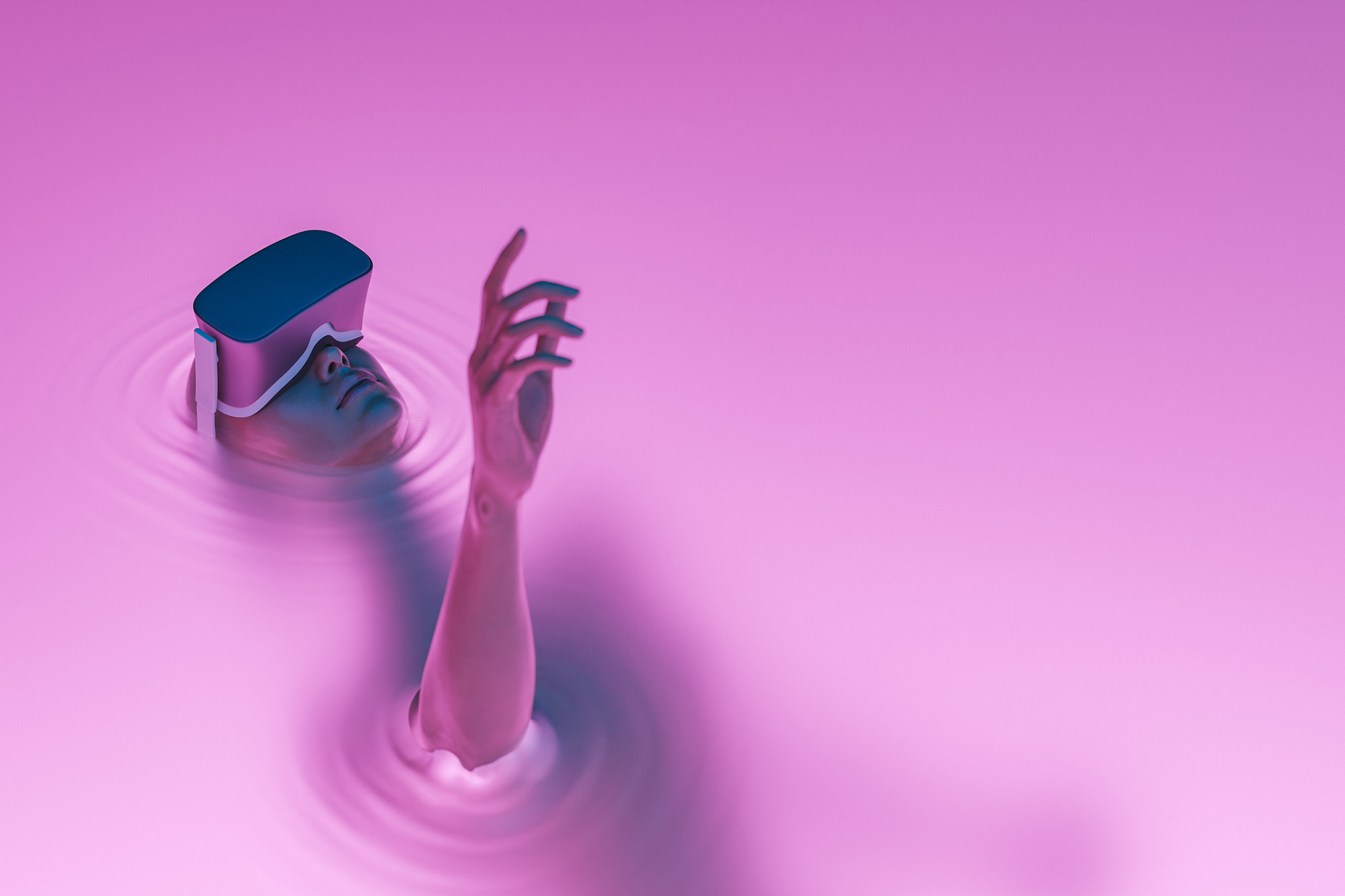
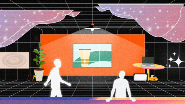
Parts of the metaverse, such as Horizons Workrooms’ virtual meeting spaces, the Sandbox’s create-your-own-worlds platform and NFT marketplaces are already here. We won’t go full multiverse until these worlds are widely used and linked together, but some would argue that our early metaverse is already dystopian.
The Dystopian Design
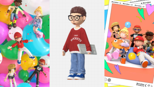
Design in the metaverse is varied and often unpredictable. Different avatars, skins and backgrounds can result in strange juxtapositions, and a step between platforms may transform everything.

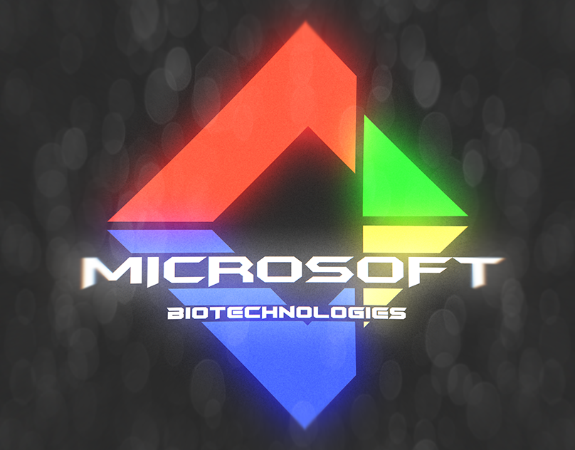
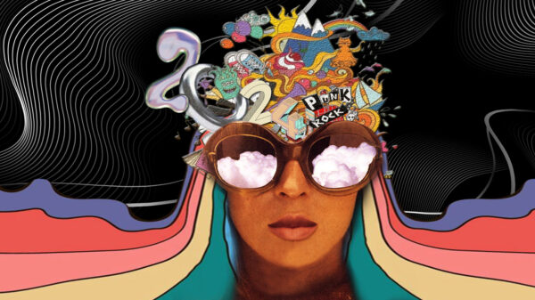
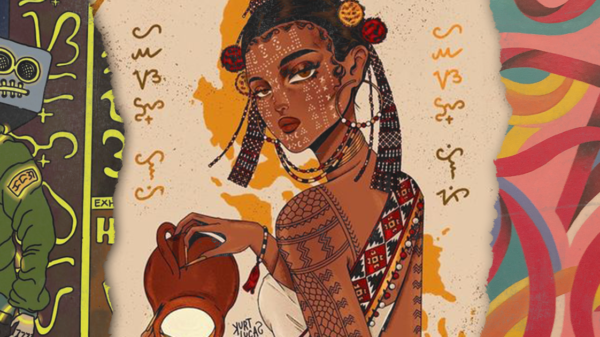
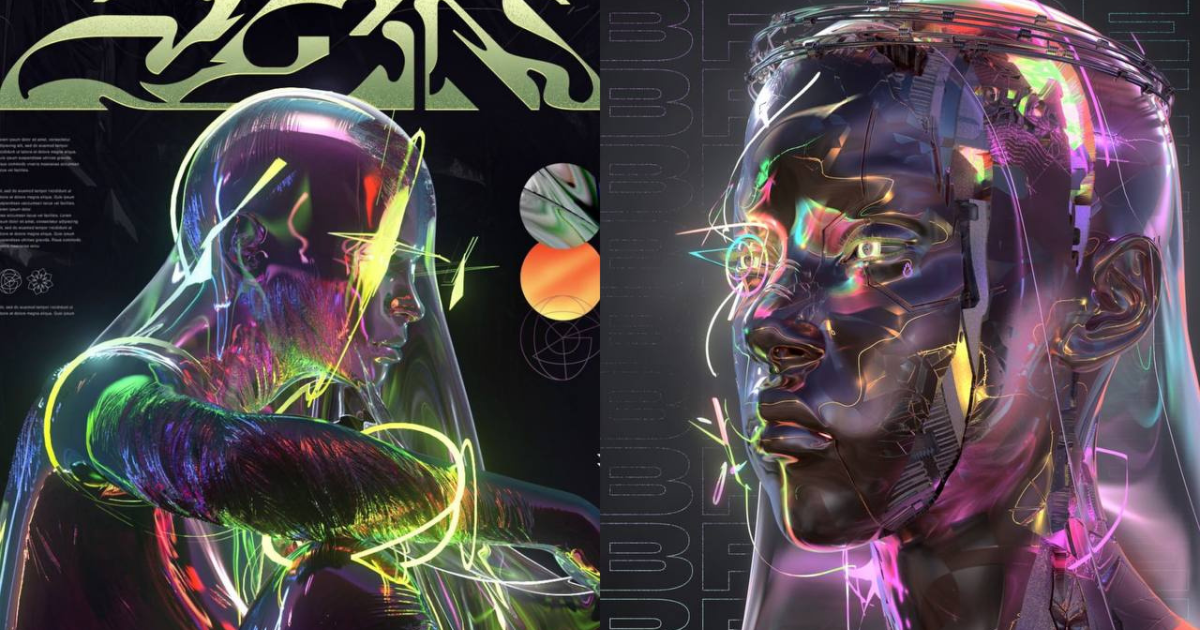
Some of these designs include dense collages, cartoonish avatars and strange molten overcoats. Many of these designs aren’t overtly dystopian, but their mix of the real and virtual taps into another key dystopian theme—that everything is far from real, that we are the pixels of our own.
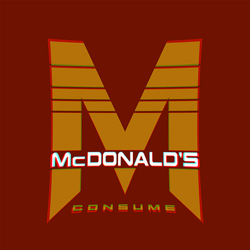
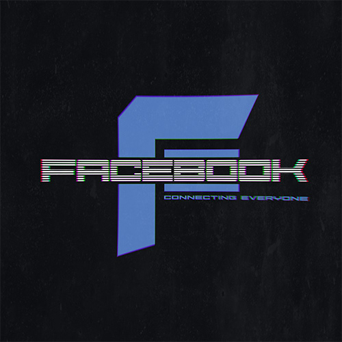
Images may literally show dystopias: think about crowds of people packed into monumental cities, workers being funneled into factories, neon signs, eerie lighting, and robots. But what really makes dystopian design is darkness. It might be literal, from shadows or pitch-black uniforms. But more often it’s a taint in the high-tech vision.
Dystopia: Today’s look and the future
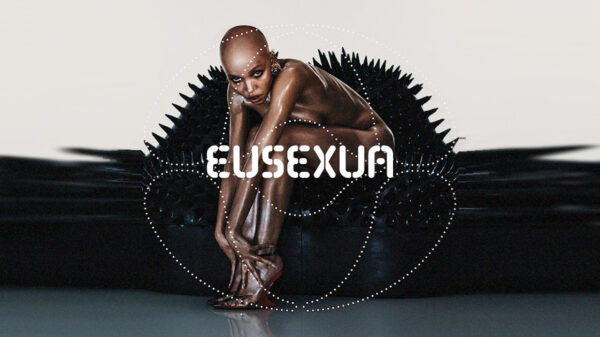
Dystopian style’s edge and urgency won’t be for everyone—and it’s worth thinking through the implications before you jump in—but will suit some brands down to the ground. In a dystopian design, visuals might mix pessimistic darker colors to other darker colors and landscapes may have a bleak, alien feel.
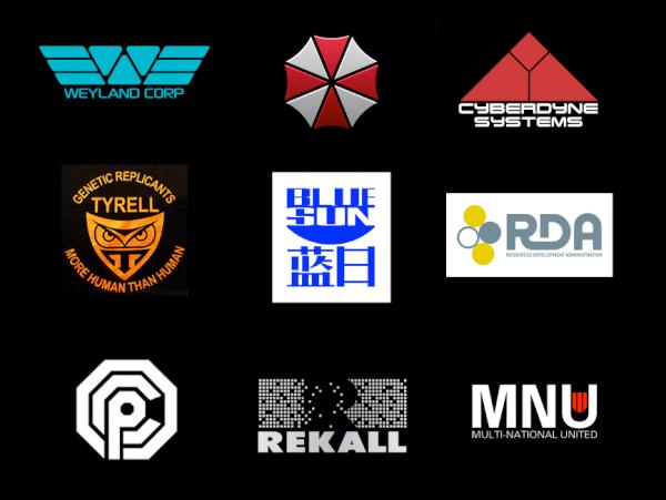
For text, if you want to be literal you can dive right into the symmetry of the Dystopian font family, or hint more at dystopias via futuristic (Eurostile Bold Extended) or fascistic (Fraktur is the classic) styles. Physical images and mood are the most important things: sophistication on display.
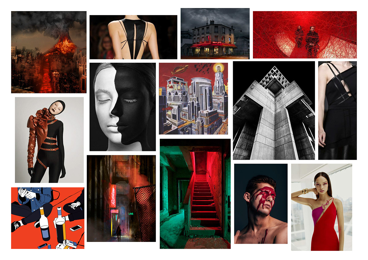
As we become increasingly plugged in and the dangers to our planet rise, it’s no surprise we’re seeing more and more dystopian design. Dystopian design can give products darkness and edge—and as some ongoing popularity shows in this era, these dark visions are as immersive as hell.


