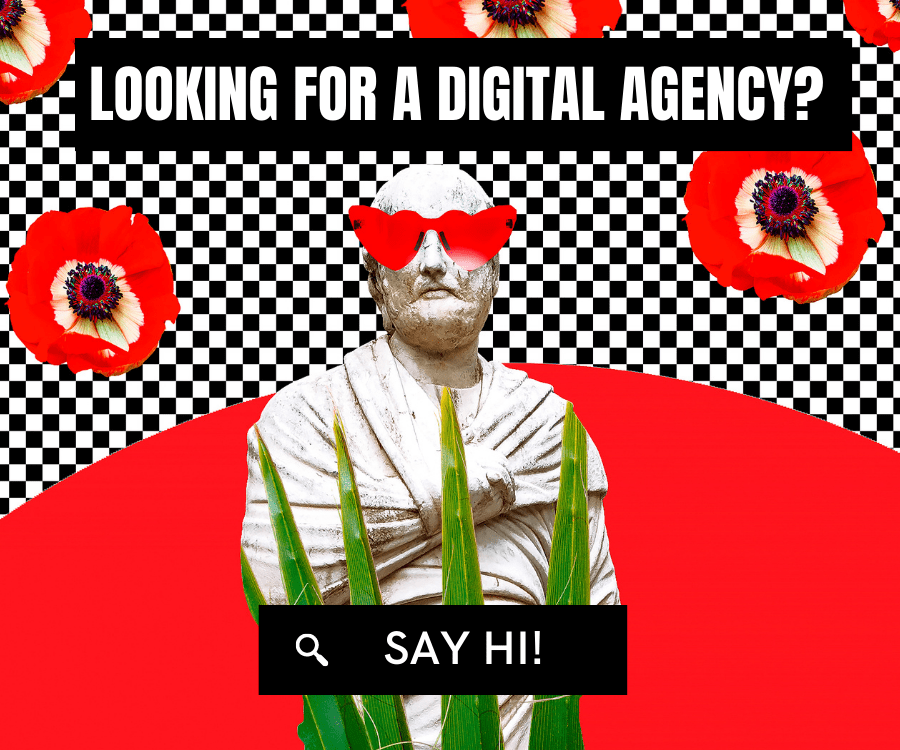

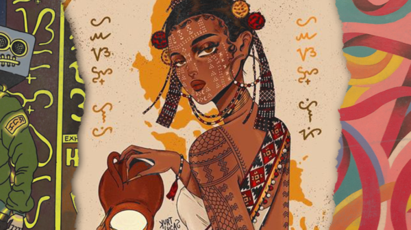

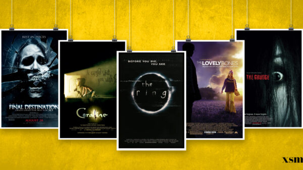
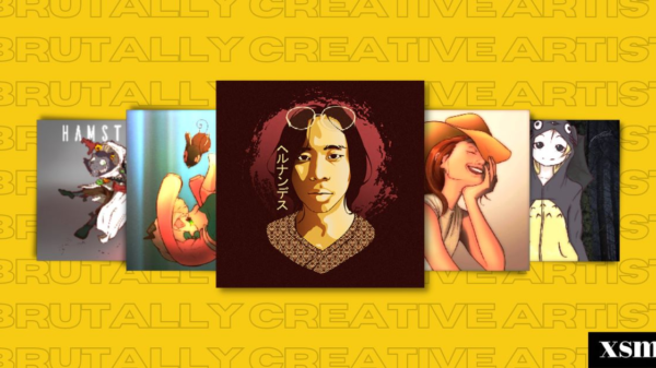

There are some trends from the past we can’t just ignore. After all, they’re still design trends which caught our eyes. The latest upgrade when it comes to design says a lot about the fast-changing industry we live in.

The idea is that we want something different than we have now, but not too different. But something about old trends just keep coming back—a gradual change from what was to what will be. And what we have now will soon be what was in the past, ready for re-analysis and adoption at a later point. In the end, design is cyclical—continuously pulling from the past.
Here are some designs trends from the past you thought you have forgotten:
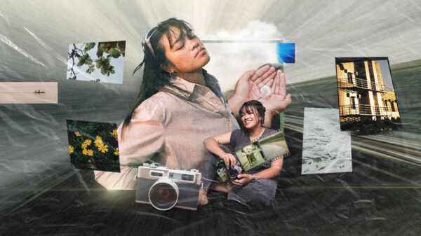
DOUBLE EXPOSURE
Double Exposure in photography is a technique where layers of two different exposures on a single image are combined into two photographs as one. It creates a surreal feeling that convey a different kind of symbolism.
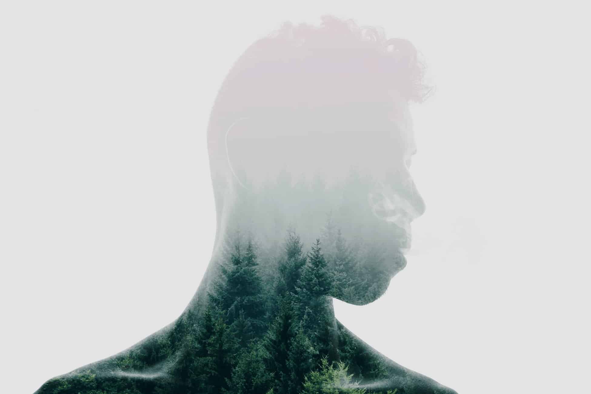
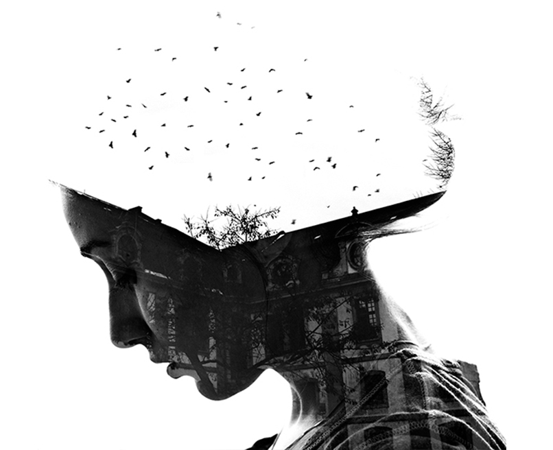
It was usually used in businesses where the most dominant type of business relies on tech and machineries. These types of design are also pioneering when it comes to camera business or photography.
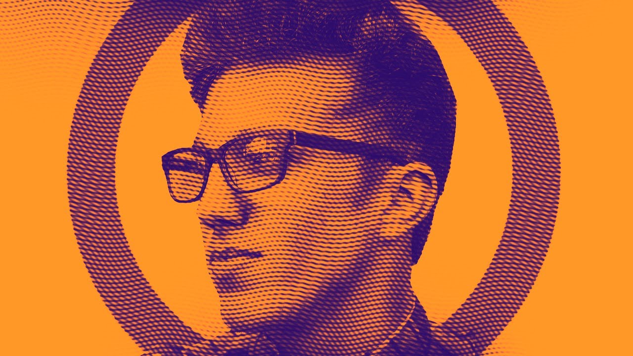
HALFTONE EFFECT
Halftone is a design technique used to reproduce image by using dots of varying length with one or more colors. Halftone was a way to create the appearance of colors and shapes when there was a time when printing processes were limited and scarce.
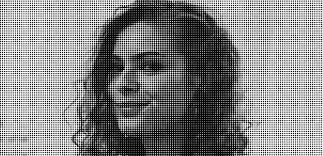
You can mix and match the latest trends and achieve a vintage look however you want with this design. Some fast food chains, retro bars, and other old-school shops use this type of designs in their posters, logos, and other pubmats.
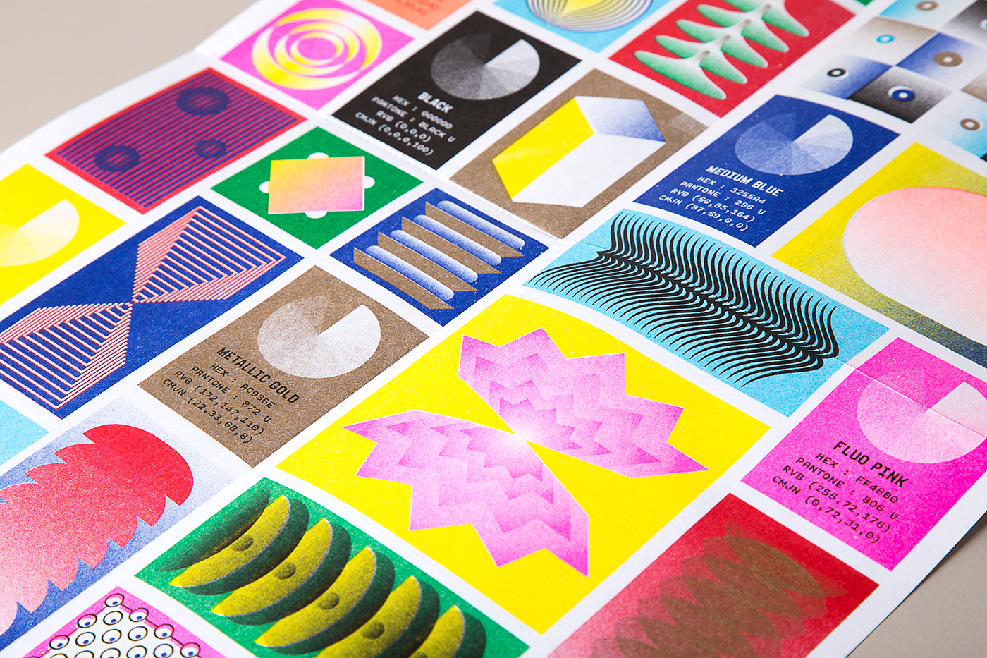
RISOGRAPH
Risograph is a kind of copy machine. This type of printing originated in Japan in 1946 and is defined by having vivid colors and limited color palettes. Risograph in Adobe Photoshop was made possible because of Asahi Nagata, a Japanese freelance illustrator.
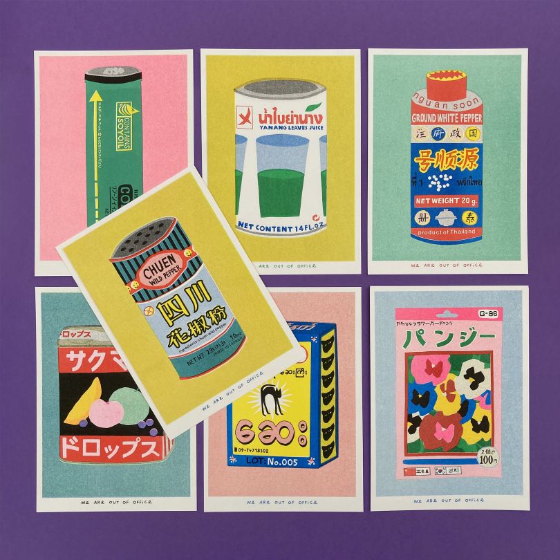
He instructed that you need to have a base doodle first, next is to get the analog for you to come up with digital color layers, the color arrangement depending on your style, the mixing process, and some texture and carving.
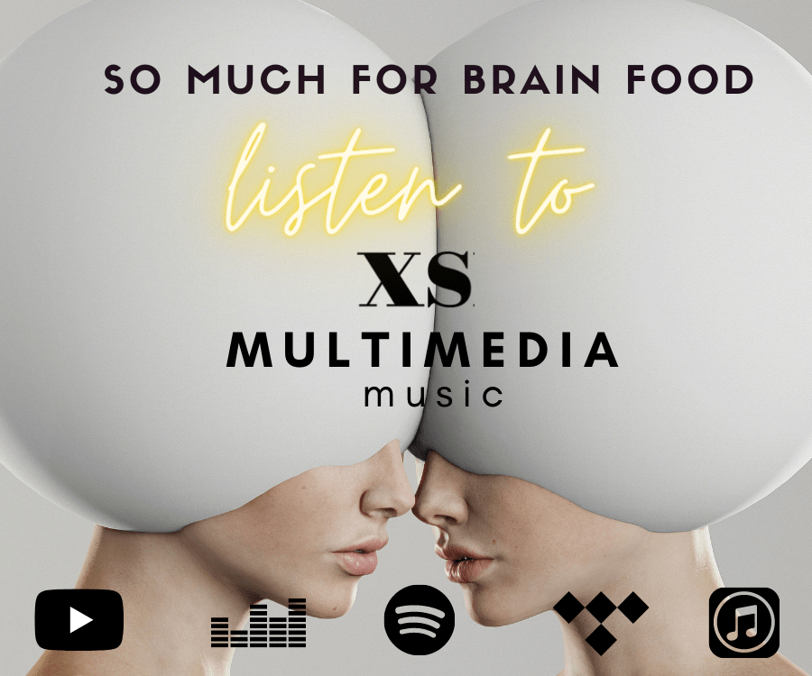
BLOB EFFECT
The Blob is an amorphous, pseudo-organic shape that’s commonly used to anchor landing pages visually. It usually serves as a mask or backdrop for an illustration. About 90% of the time the Blob is filled with a gradient and sits on the lowest layer of a design.

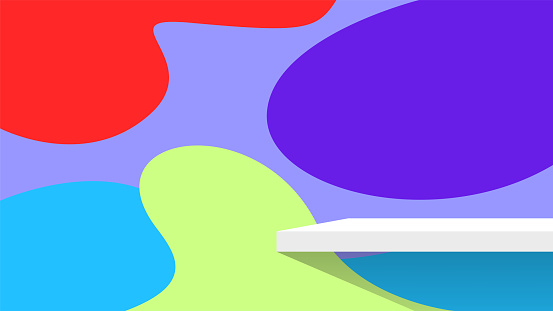
This type of design help you level up and incorporate a minimalist approach in both your page and brand. The striking colors are what’s make it amazing—it has a structure where you don’t need a lot of colors for it to be visually appealing. Sometimes you may only want a subtle bit of movement, almost like your app or page is breathing, and that’s where blob comes in.