


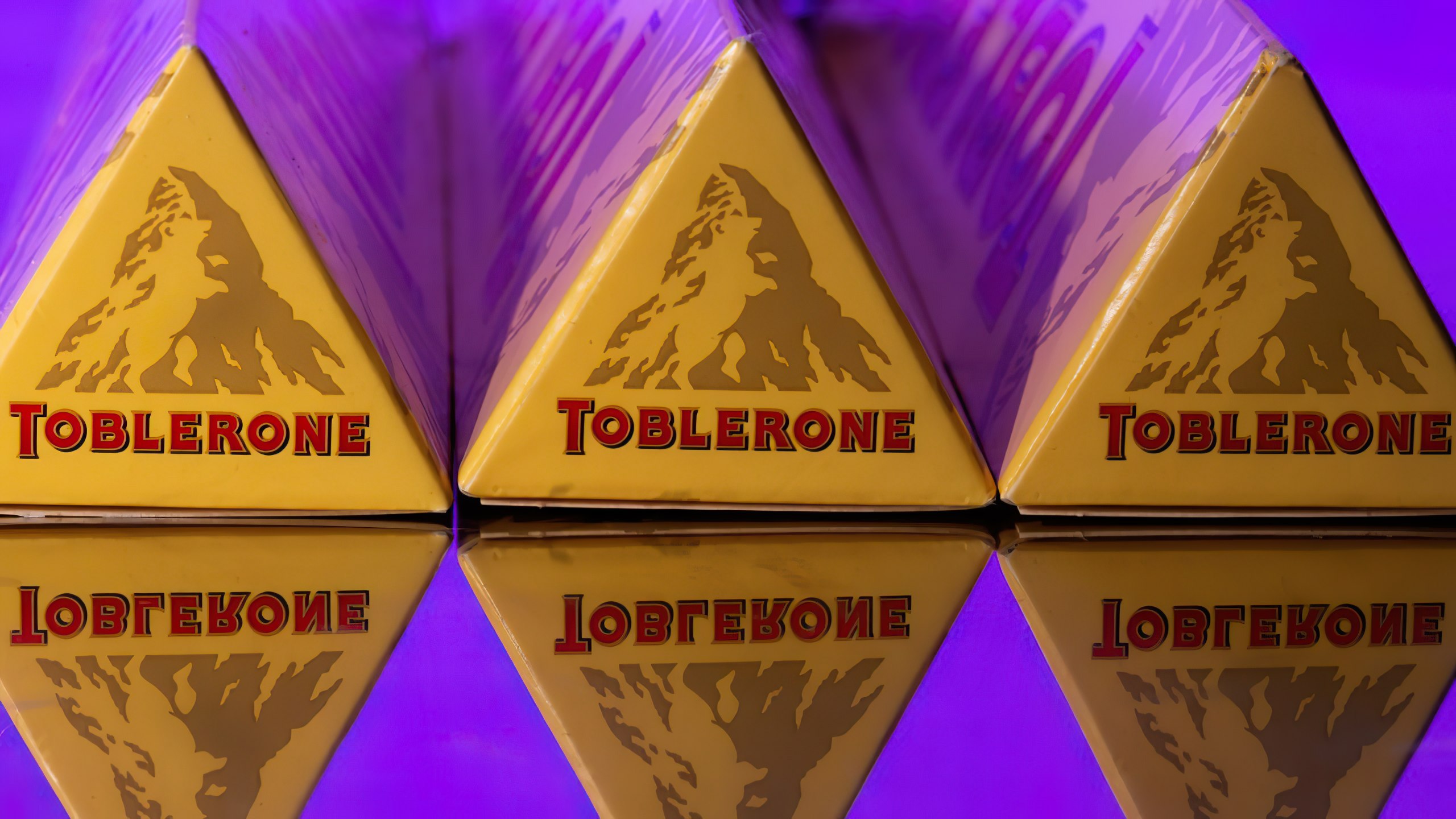
Toblerone is a Swiss chocolate brand famous for its triangular shape. With all the hype and surrounding news, the Matterhorn– the famous mountain in the Alps found in the logo, bids its goodbye to the brand.
The signature Swiss Matterhorn mountain from Toblerone is saying goodbye for now as its production is moving to Slovakia. According to the brand owner, Toblerone announced a new plant in Slovakia to meet the increased global demand. The company must adapt the packaging to the Swiss legislation.
TOBLERONE AS A NOTABLE BRAND
The name ‘Toblerone’ is a clever combination of the Tobler surname and the Italian word “torrone,” which refers to a variety of nougat. It’s a name that is both simple and memorable, and one that has become synonymous with high-quality chocolate.
But it’s not just the name that sets Toblerone apart. The distinctive triangular shape of the chocolate was inspired by a number of things, including the Matterhorn mountain, one of the most famous peaks in the Swiss Alps. Another theory suggests that the shape was inspired by the “triangular” pyramid of cabaret dancers, which had impressed its owner, Theodore Tobler.

How can we not forget about the iconic Toblerone logo, featuring a bold red and yellow shield with a bear standing on its hind legs? This image is a nod to the city of Bern, where the first Toblerone store was built, and where the bear is a symbol of the city.
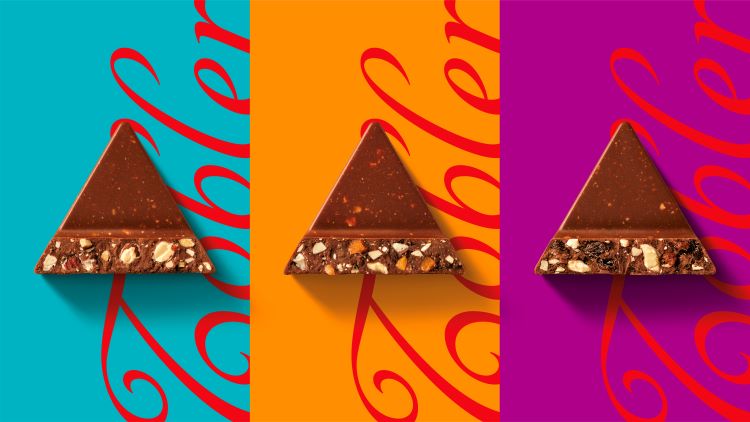
It continually proves its popularity throughout the years for its taste, a delicious combination of honey, nougat, almonds, milk, cocoa butter, grated cocoa, and sugar.
TOBLERONE’S BRANDING THROUGH THE YEARS
Hailed as one of the oldest chocolate brands in the world, Toblerone has always been so bold– sticking true to its beliefs. The brand has retained its popularity and identity. The brand has not been afraid to embrace technological and any forms of changes.
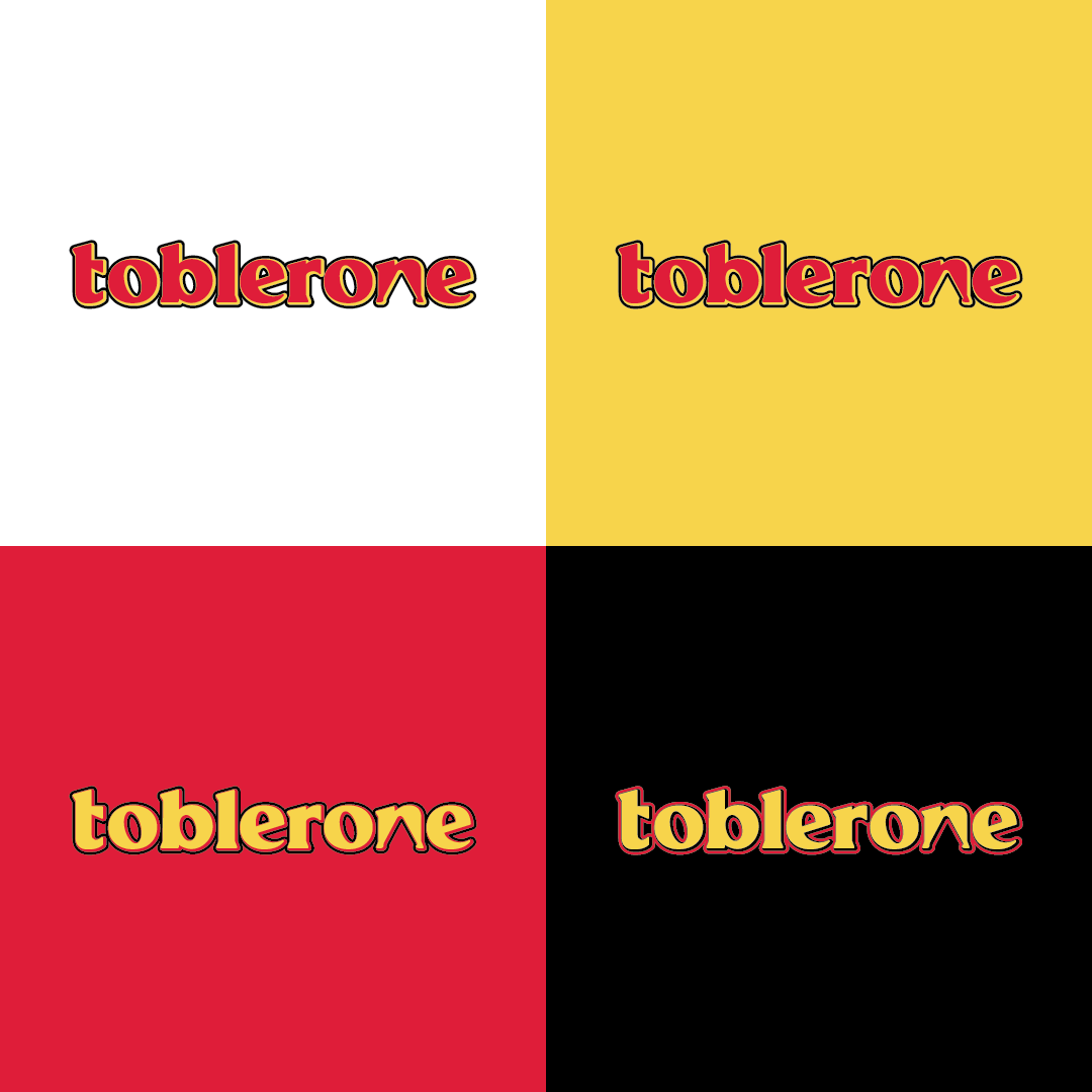
When it comes to its text logo, the staple look from 1908 to 2022 remained the same. The letters are clear and expressive backed with pointed ends instead of serifs. But for everyone to notice, the distance between the characters is wide but wide enough to understand. In addition, all signs are complemented by shadows, making the company’s name three-dimensional.

From 2022 up to present, the current logo of the Swiss company is less expressive. It is now colored brown – the color of the main product of Toblerone. At the same time, the style of the letters is very original. There’s a thin stripe that runs along the edge of the glyphs, but it is no longer yellow but beige. The shadows also shifted to a different color spectrum and became jet black. The designers removed the mountain.
REBRANDING IS REAL
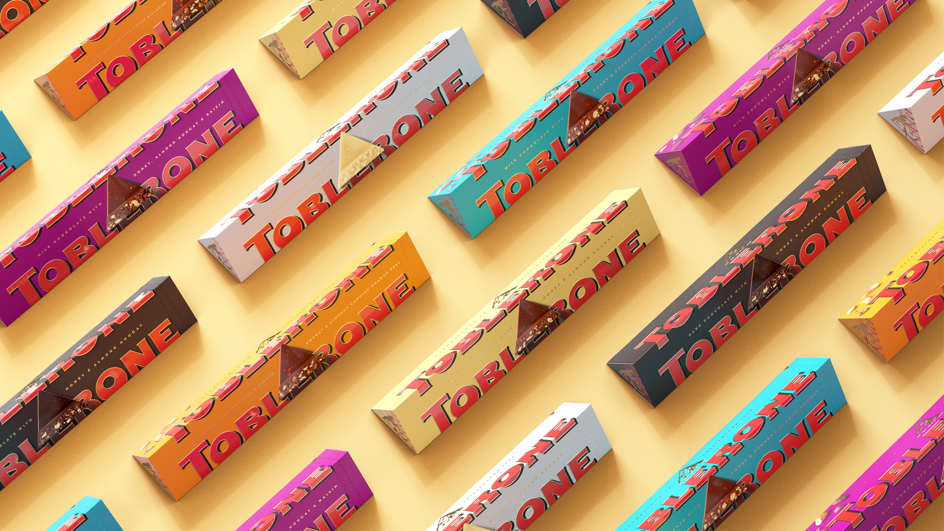
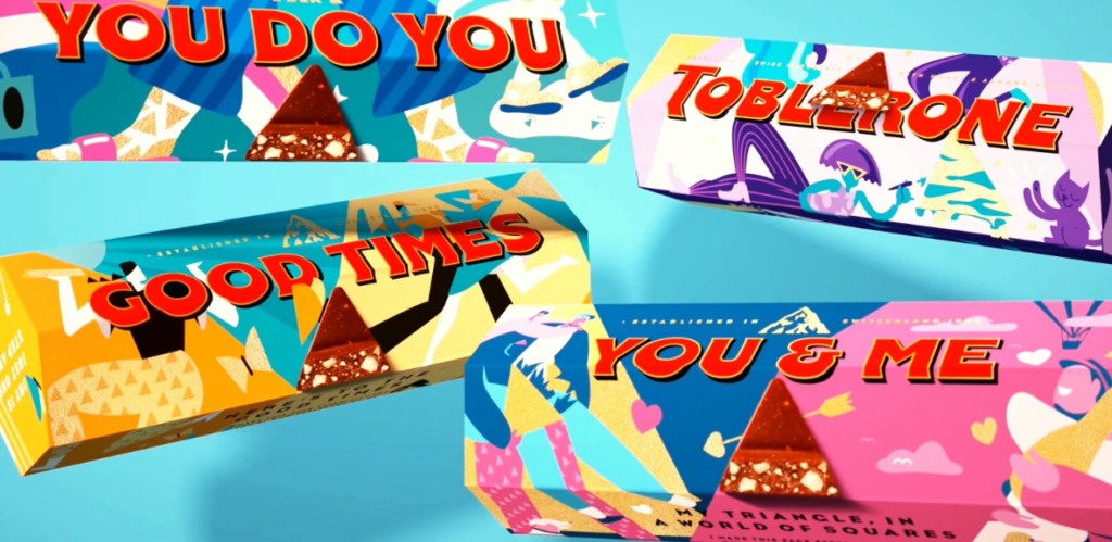
Last year, they changed their packaging to feature more vibrant colors and create emphasis on their iconic “triangle”. Their big idea? “Be more triangle”. Their branding encourages uniqueness in all its forms, empowers individuals, and pays tribute to the importance of being stubbornly triangle in a world of squares.
Its new packaging now features a signature of Tobler which signifies the brand’s tradition and mark of quality. Colors like teal, orange, and magenta are also utilized as to indicate modernity and change for the brand. Additionally the detail that the typography flows beyond the edge of the packaging, this is said to be an emphasis on the brand message and uniqueness of Toblerone, “defined by our borders”.
WE NEVER SEE THIS COMING
While Toblerone hasn’t yet revealed the new design, there have been different theories online from different designers. However, the brand never failed to forget about its core which is staying true to their vision which “introduces a modernized and streamlined mountain logo that aligns with the geometric and triangular aesthetic.”
The packaging will also be changed to read: “Established in Switzerland,” rather than “of Switzerland.”
Fun fact: In 2022, Toblerone worked with an agency to create a revamped brand story and visual identity that embraces the brand’s tradition.
How come we never see this coming? That even if the brand still continues to stick to its culture and values, it’s staple ‘mountain’ logo is slowly disappearing and we can’t question why. Arguments aside, the iconic triangular shape, which makes them unique, is still the very reason it is popular. This will carry on the brand’s distinct face in the next generations to come.
But one thing is for sure: the bear of Bern will still be part of the new mountain, hidden in its contours.
CONCLUSION
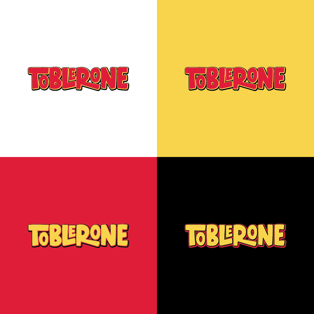
Toblerone hasn’t released the look, but if it was up to XSM, here is our take on what Toblerone’s text logo can look like: