


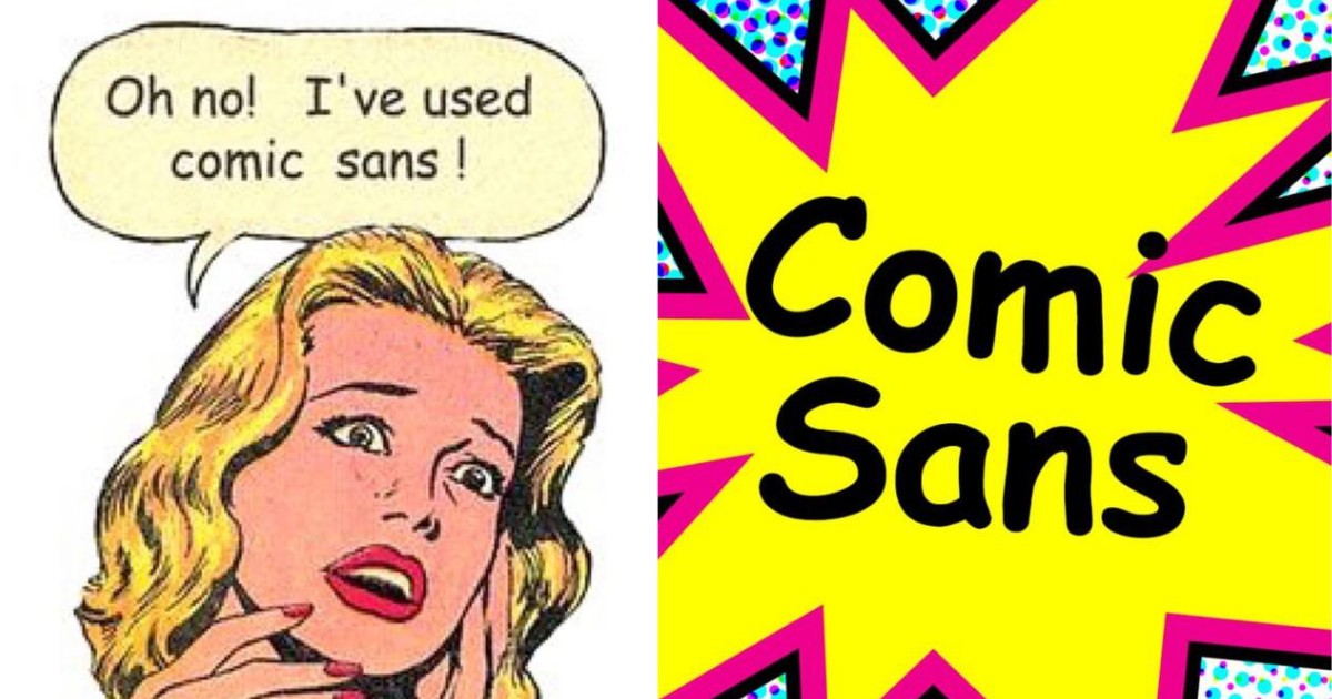
The hate for comic sans emerges from its inappropriate use, so it’s ironic how it was created to settle the same issue.

Curious about how a single font can mean so much hate to all people across the globe? What is behind this hate?
THE LIFE OF COMIC SANS
When Vincent Connare invented the typeface Comic Sans in 1994, he never set out to offend anybody. The typographer designed it for some of the first Microsoft home computers: it was intended for the speech bubbles of an animated cartoon dog that would help people navigate the Microsoft Windows interface for the first time.
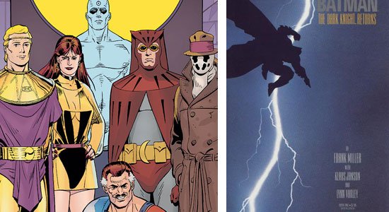
The inspiration for Comic Sans’ design has been hiding in plain sight all along. Upon seeing the ill-fitted Times New Roman in Bob, Connare pulled out two comic books that he had in his office, The Dark Knight Returns and Watchmen.
Connare based Comic Sans off of the lettering in these two comic books, and within a week, he had finished the font, having drawn it on his Mac computer. That’s right, Comic Sans was created on a Mac. Unfortunately, it wasn’t ready in time to be included with Microsoft Bob in August of 1995.
THE ORIGIN OF HATE
One of the main reasons Comic Sans became the target of such hatred was its widespread usage, particularly when dealing with serious or formal subjects. While Comic Sans was perfectly adequate in designs for children or designs related to comic books or cartoons, it had no place in business or professional work usage.

It’s also ill-suited in content body text – it’s best used as a headline/heading font or short quote.
THE CASE AGAINST COMIC SANS
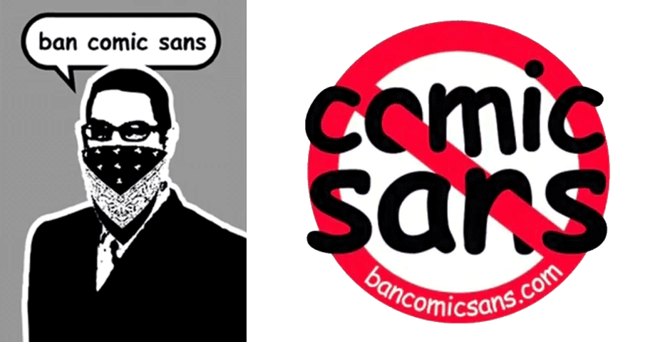
In 1999, still early on in the life of Comic Sans, two Indianapolis graphic designers, Dave and Holly Crumbs, created a website titled “Ban Comic Sans.” The movement was started when an employer insisted that they use Comic Sans on a museum exhibit.
They do point out one of the biggest problems in amateur graphic design: disregard for appropriate typography choices. Where a professional designer will consider the impact their font and typography choices have on the overall tone of a project, an amateur will often just pick a font they like, disregarding the font’s impact on the final design.

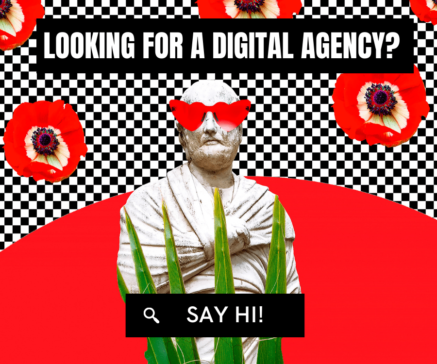
Font is a huge part of web design which is extremely important for user experience.
The duo’s main argument against Comic Sans is that the typeface often doesn’t convey the emotion of the message.
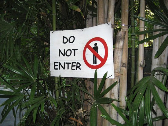
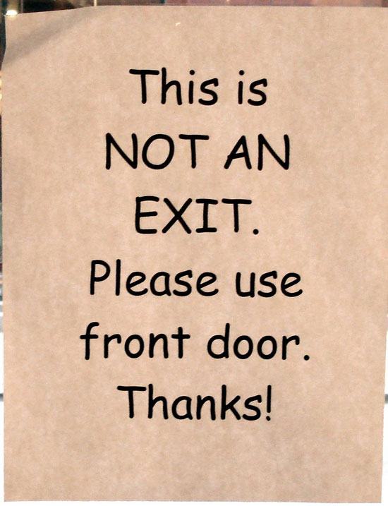
For example, a “Do Not Enter” sign in Comic Sans sends mixed signals. Another complaint against Comic Sans is that it portrays a very definite tone and feeling when it’s used; mainly, an immature, informal, and childish font.
THE MOST MISUNDERSTOOD FONT
Comic Sans was not created to be part of a handful of fonts available to every computer user on Earth. It was designed for a niche use-case, but it ended up being shoved into primetime.
Another problem is that there aren’t really any great alternatives to Comic Sans. Users use Comic Sans as their go-to font if they want to write something casual but not too formal. In the end, it doesn’t matter—for as long as it lives inside the computers, it will remain a popular font everyone knew.