


Do you judge products by their logos? The moment we wake up and open our phones, we can already see symbols representing different brands pop out of our screens as we select the first app we want to use to start our day. With that, let’s take a deep dive into the stories behind some of the famous brands we encounter and get to know how they represent the identity of the brand to stand out from the rest.

Aside from the blend of shapes and colors, another critical element brands consider in creating a logo is the use of human figures. As we come across them every day, have you ever gotten to know them? Ever wonder what makes them relevant to the brands they represent? Get to know the globally recognized individuals behind some of the iconic brands:
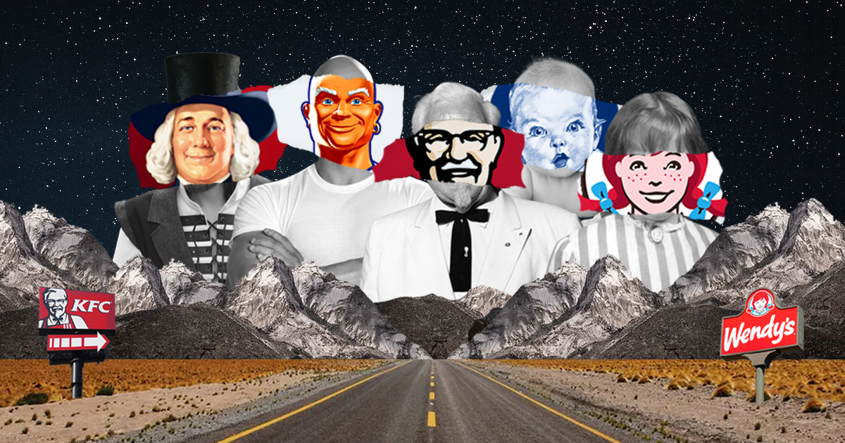
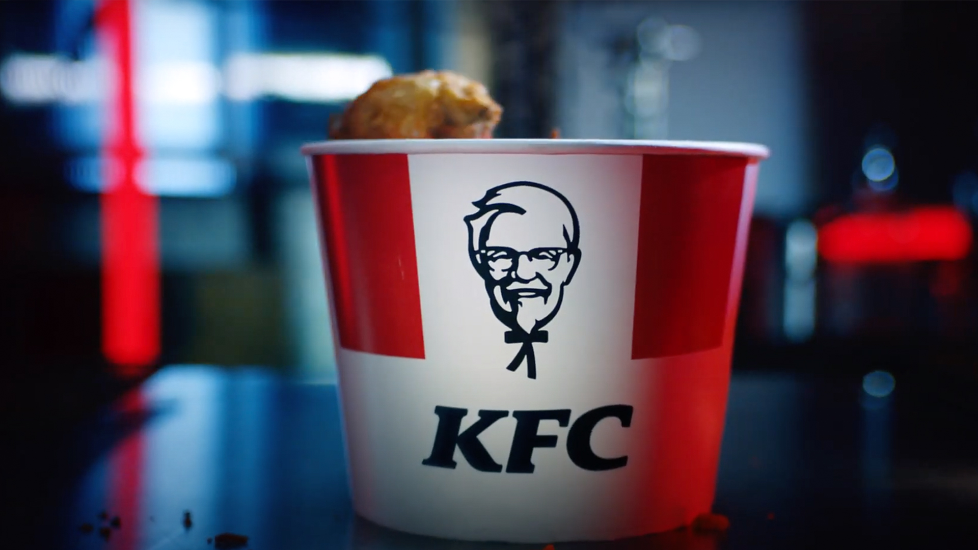
Kentucky Fried Chicken (KFC)
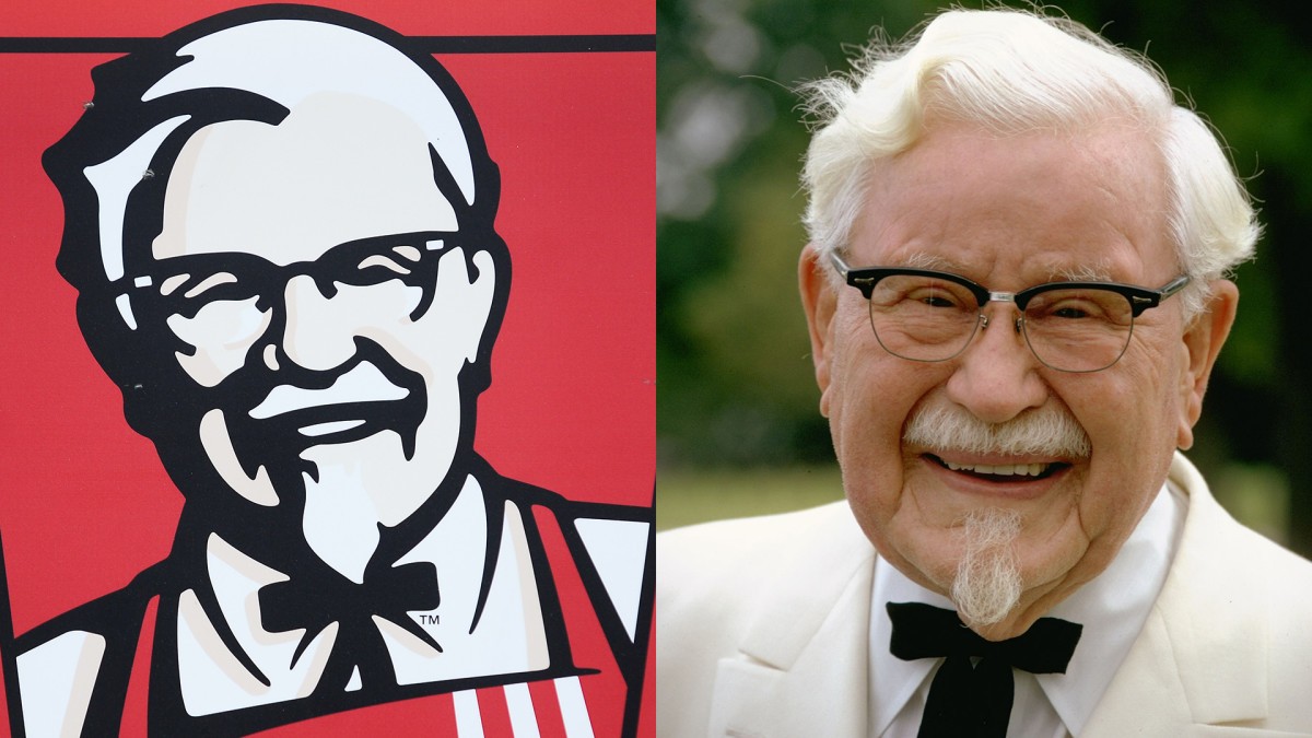
Known for its 11 herbs and spices, the founder of the world’s largest fast-food chicken chain, Colonel Sanders, is the man on the KFC logo. Hard work paid off for Sanders, as the first KFC bucket meal wasn’t sold until 1957, despite starting his chicken empire back in 1939. The people behind the logo are the marketing agency Lippincott & Margulies, which initially designed the logo. Originally, the first logo featured a handwritten font for Kentucky Fried Chicken with four chicks that had just hatched from their eggs.
Through the years, there have been several transformations to the logo. From a monochromatic color scheme to an addition of red, which makes the KFC we know today feel warm and welcoming.
Wendy’s
Wendy’s was founded by Dave Thomas. The name of the fast food chain and the logo were inspired by his daughter, Melinda “Wendy” Thomas, who was a third grader at the time.
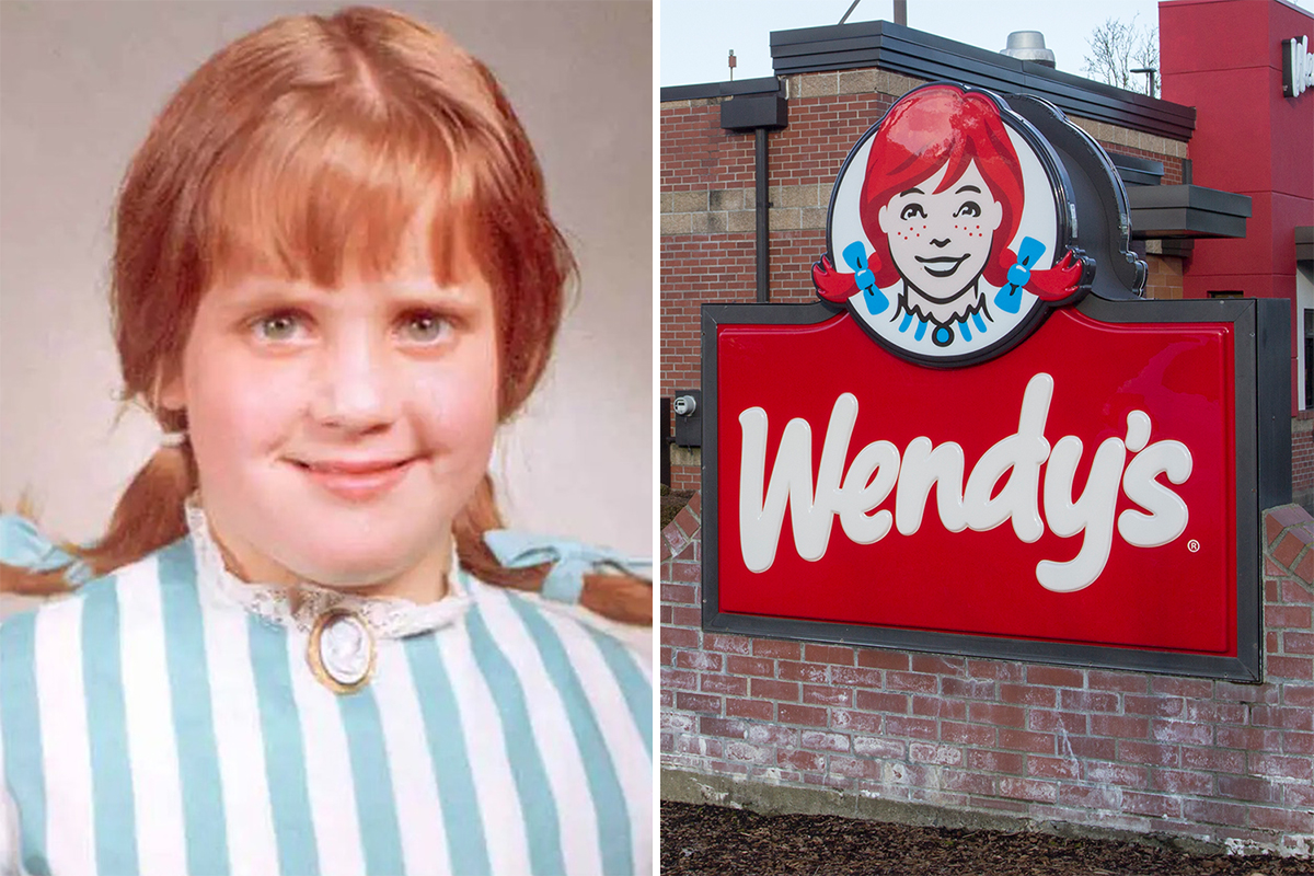
The minds behind the visual direction for the logo were Thomas himself and his wife, Lorraine, since he instructed Wendy to put on pigtails while Lorraine made her wear a blue and white dress. From then on, the freckled girl in Wendy’s logo has become an iconic staple. Despite brands adopting a more minimalist approach, it is here to stay.
Gerber
If you haven’t come across Gerber, would you have known that the brand sells baby food? The logo you’ve come to recognize was actually an entry for a contest that Gerber hosted. The contest aimed to find the best face to represent the brand, hence the baby. The American artist and painter Dorothy Hope Smith sketched a simple image of a bright-eyed baby with sweet pursed lips, where she noted that she would only complete the work if her entry won.
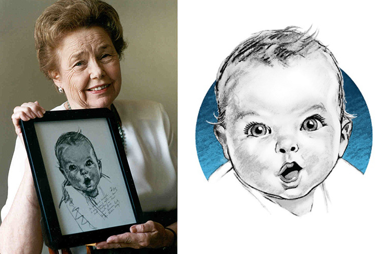
Despite her competitors using oil paintings, the judges fell in love with her work and were firm about using her simple sketch. The baby’s identity remained a secret for 40 years until a poll came out across the United States, where people had different speculations ranging from Elizabeth Taylor to Senator Bob Dole. The baby is a mystery novelist and English teacher, Ann Turner Cook, a neighbor of Dorothy Hope Smith. If given a chance to join, what would your entry be?
Quaker
Quaker oats are known as an American breakfast staple. Did you know that the Quaker man is not an actual person? The former owners, Henry Seymour and William Heston, chose an image of a man in Quaker garb as a trademark because it symbolizes honest value and pure goodness. The first-ever logo of the company was a full-body image of a Quaker man. However, Jim Nash was the creative mind behind redesigning it into the iconic headshot, which served as the basis for the upcoming versions.
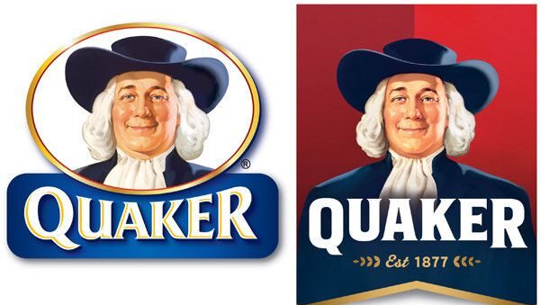
Another remarkable transformation was the first full-colored version of the logo that we all know today, creatd by Harold Sundblond, who was known for his iconic Santa Claus illustrations for Coca-Cola. Despite its next design having an all-blue monochromatic and minimalist approach, the brand eventually returned to the creation of Sunblond and made some modifications in the upcoming ones. What do you think—has the logo improved over the years?
Mr. Clean
If you think this is the Rock, then you are mistaken. The man in the Mr. Clean logo, Mr. Veritably Clean, is a product mascot designed by a Chicago-based advertising agency, Tatham-Laird & Kudner. They drew Mr. Clean as a tanned and muscular bald man who gets the cleaning job done.
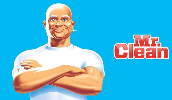
According to Procter & Gamble, their original vision of Mr. Clean was a genie who embodies the cleaning abilities of their product. The specifications for his physical appearance were similar to that of the final version, where they wanted a bald and muscular genie dressed all in white with a nose ring. Another tactic that gave life to the mascot was giving him his name through the promotion, “Give Mr. Clean a First Name”, where they gave the name “Veritably”.
CONCLUSION
Having humans represent the logos gives companies the opportunity to use these figures to speak for their core values and purpose. With its development, people witness history before their eyes. They grow alongside their chosen brands as these brands make an effort to stay relevant and competitive to keep up with the trends. How do you think these human figures will change in the upcoming years? Will they still be relevant or part of the logo in ten years?