


Over time, Penguin Books has established their name as one of the most recognizable in the print industry. Penguin Books wanted to offer excellent softcovers to the general public at a reasonable price, but in order to do that, they needed to stand out via design. Paperbacks at the time were frequently associated with gory pulp fiction, and their covers reflected this.
Penguin’s iconic flightless bird is still known up to this day, and it’s a setting standard as to how this company sold over a million copies of paperbacks, which people love.

Not speaking as an employee, but as a Penguin fan, they really do have this cool concept of putting things in their exceptional places that look so sleek and trendy, a perfect match for all ages. A young graphic designer by the name of Edward Young helped create a new format, carrying out the creator of Penguin Allen Lane’s idea.
PENGUIN BOOKS CLASSIFIED
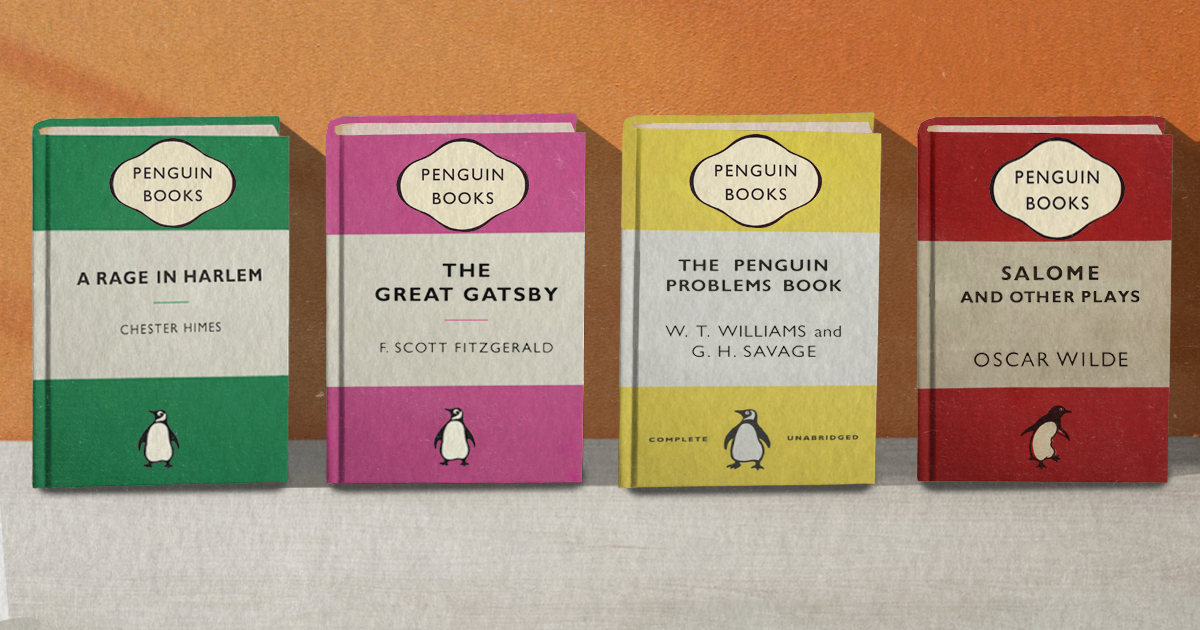
Penguin books had a straightforward three-band layout, with the middle band being white and the top and bottom bands being colored according to the book’s genre and author. Lane refused to include any cover illustrations at all, but some basic line drawings were gradually included. Orange indicated general fiction, green for crime fiction, pink for travel and adventure, red for drama, blue for biographies, purple for essays, gray with an elegant font for world affairs, and yellow for everything else.
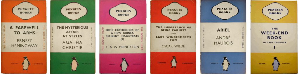
This strategy made Penguin publications look uniform, affordable to produce, and easily distinguishable from other volumes. Traditional book merchants were initially skeptical of this novel strategy, but Lane was able to work out an agreement to finance a trial run and demonstrate its feasibility. The publisher printed a million copies in a year and started to branch out into different subseries.
PENGUIN VERSIONS
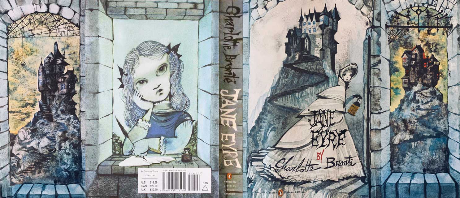
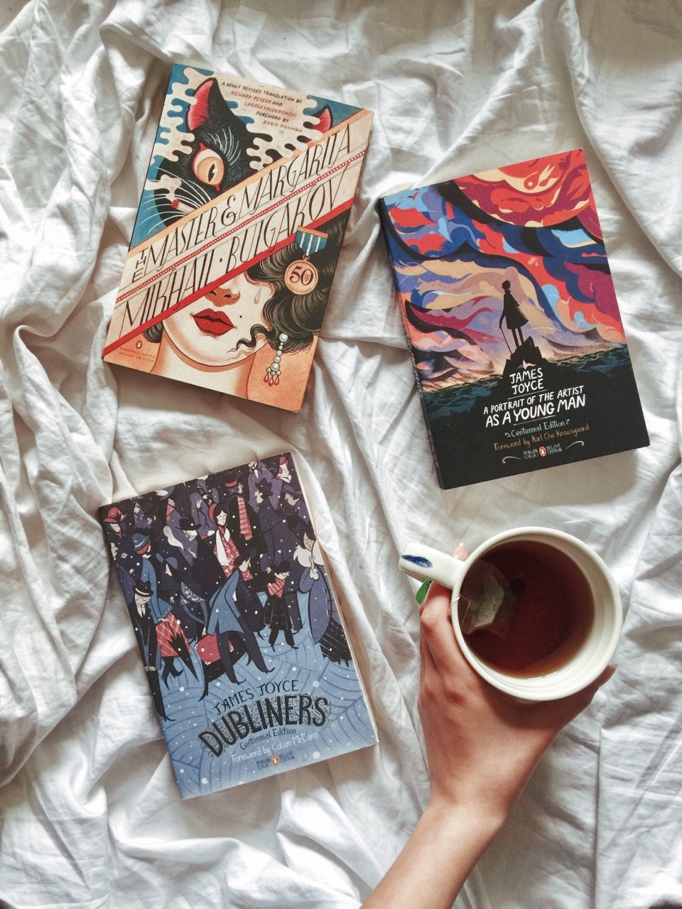
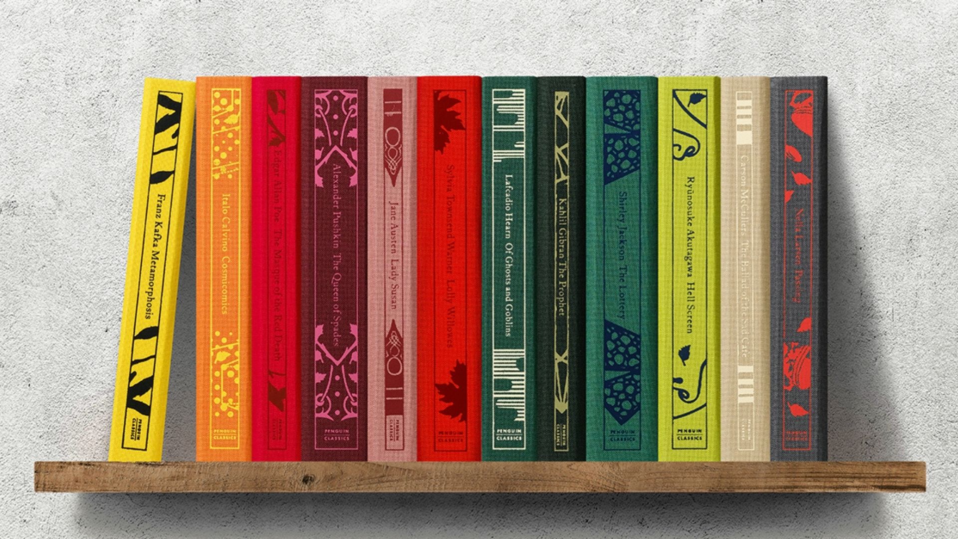
As a reader, Penguin Classics: Deluxe Edition stands out for many reasons. The fact that they are trade paperbacks, as opposed to the smaller mass market ones we had, makes them more accessible than hardcovers and easier to transport when you move.
Penguin Clothbound Classics are for people who prefer hardcover to paperback. The books are incredibly stunning and somewhat larger than a mass-market paperback. Although the print is somewhat small, this can be easily fixed with either young eyes or reading glasses.
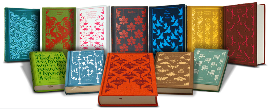
Even with limited shelf space, the smaller size of the books themselves makes them the ideal method for collecting clothbound editions.
In the Penguin Drop Caps series, there are 26 titles in this series of compact hardcover books, one for every letter of the alphabet.
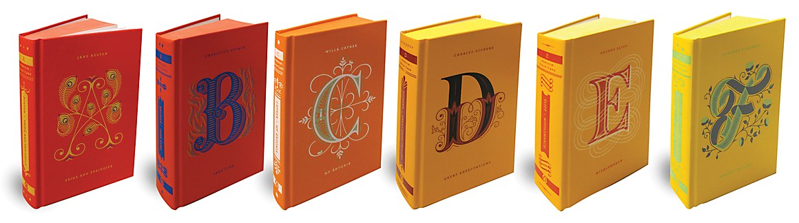

The series begins with Pride and Prejudice by Jane Austen and concludes with Carlos Ruiz Zafon’s The Shadow of the Wind. Each volume’s letter is determined by the author’s last name. Any series that uses those as the beginning and finale will be fantastic.
PENGUIN’S DESIGN OVER THE YEARS
While keeping it simple, Penguin also faced a lot of challenges that were unavoidable. Design continued to guide the growing company’s course. Jan Tschichold, a German type designer, joined the project and started creating woodcut images for a Penguin Classics spinoff series. Additionally, he developed the publisher’s first internal type guide for editors and composers and proposed a vertical grid method.
His design philosophy built on and improved Penguin’s current aesthetic methods, emphasizing the value of white space as well as a distinct typographic hierarchy. Penguin was able to fund new art in part because the Classics series featured many royalty-free works, including titles like Homer’s Odyssey.
AT PRESENT
In 2013, Penguin and Random House combined to create a global publishing house. In order to commemorate the company’s 80th birthday, a Penguin Classics series was re-released in 2015. This series included paperback classics with a traditional cover design for just 80p. In its first week, the promotion sold 70,000 copies. Penguin’s trusted imprints continue to stand out on the shelves, and some series bring to mind this classic appearance.

Even if these covers aren’t as interesting, they have become famous and serve as a blank canvas for countless interpretations.