


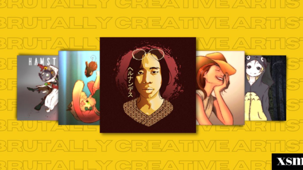
K-Pop is a global phenomenon for a reason. From their well-crafted music videos to choreographies that will dominate the TikTok algorithm to light sticks that increase interaction between the artist and the fans during concerts, there is a reason why these artists remain attractive and will be remembered by their dear fans for years to come.
It is important to know the behind-the-scenes details of how the group is formed.
K-POP FORMATION
Let’s break down how groups are formed. These K-Pop groups are carefully crafted through a rigorous audition and training process. Aspiring idols showcase their talent to talent scouts at auditions worldwide, and those with the right combination of talent, looks, and personality become trainees in South Korea. These trainees undergo intensive training in singing, dancing, acting, English, and more until the management team selects them for a K-pop group that fits their concept and image. Sometimes, a reality show or survival program is held to select the final members. After more training and preparation, the group debuts with a showcase or concert and releases their first album. From there, they promote their music, gain fans, and continue to release new music, growing in popularity.
HOW K-POP GROUPS ARE NAMED
K-pop groups are named in a variety of ways, and the process of naming a group can vary depending on the company that manages the group and the concept that the group is meant to embody. There is a lot of decision-making involved in the process of “naming” in the K-Pop industry, namely, group naming, concept naming, and fan naming. This is all relevant to making sure that the debut group is a well-crafted group.
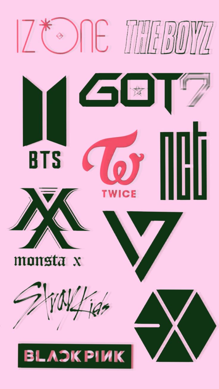
Many K-Pop groups are named by their management companies. In this case, the name of the group is chosen by the company based on various factors, such as the image or concept of the group, the potential marketability of the name, and the group’s intended target audience. For example, the groups EXO and NCT were both named by their management company, SM Entertainment. While BTS and TXT were both named by BigHit Entertainment.
Some K-pop groups are named based on a concept that the group is meant to embody. This can include a certain style of music, a particular image or aesthetic, or a cultural or historical reference. For example, the group BLACKPINK’s name is meant to represent the idea of a group that is both fierce and feminine. While XG is an acronym for “Xtraordinary Girls,” the group strives to empower young people all over the world with their fresh, inventive music and performance.
Some K-pop groups are named by their fans, especially when the group is still in its early stages and has not yet been officially named by their management company. In this case, fans may come up with potential names for the group and vote on their favorite, with the winning name being adopted as the group’s official fandom name. Examples include Army from BTS, MOA for TXT, Blinks for BlackPink, Carat for Seventeen, and many more.
WHY TYPOGRAPHY IS A NECESSARY ELEMENT IN THE VISUAL BRANDING OF KPOP GROUPS
Typography is an essential element in the visual branding of KPOP groups, and it plays a significant role in the design of group logos. A logo is the most recognizable element of a brand, and it’s often the first thing that fans associate with their favorite KPOP groups. A well-designed logo can help a group stand out from the crowd, and create a strong brand identity that fans can easily recognize and identify with.
K-Pop logos are typically designed with typography, the art and technique of arranging type to make written language legible, readable, and appealing when displayed. The typography used in a logo can convey a range of emotions and messages, depending on the style and design. For example, bold and edgy typography might be used to convey a sense of strength or power, while soft and delicate typography might be used to create a more romantic or whimsical image.
Many K-Pop groups have logos that feature stylized typography, which means that the letters are designed to look unique and distinct from standard fonts. These logos often incorporate elements of the group’s image or message, such as a symbol or graphic that represents the group’s concept. For example, the logo for the group BLACKPINK features the letters “BLΛƆKPIИK” stylized with a crown, which reflects the group’s image as powerful and confident queens.
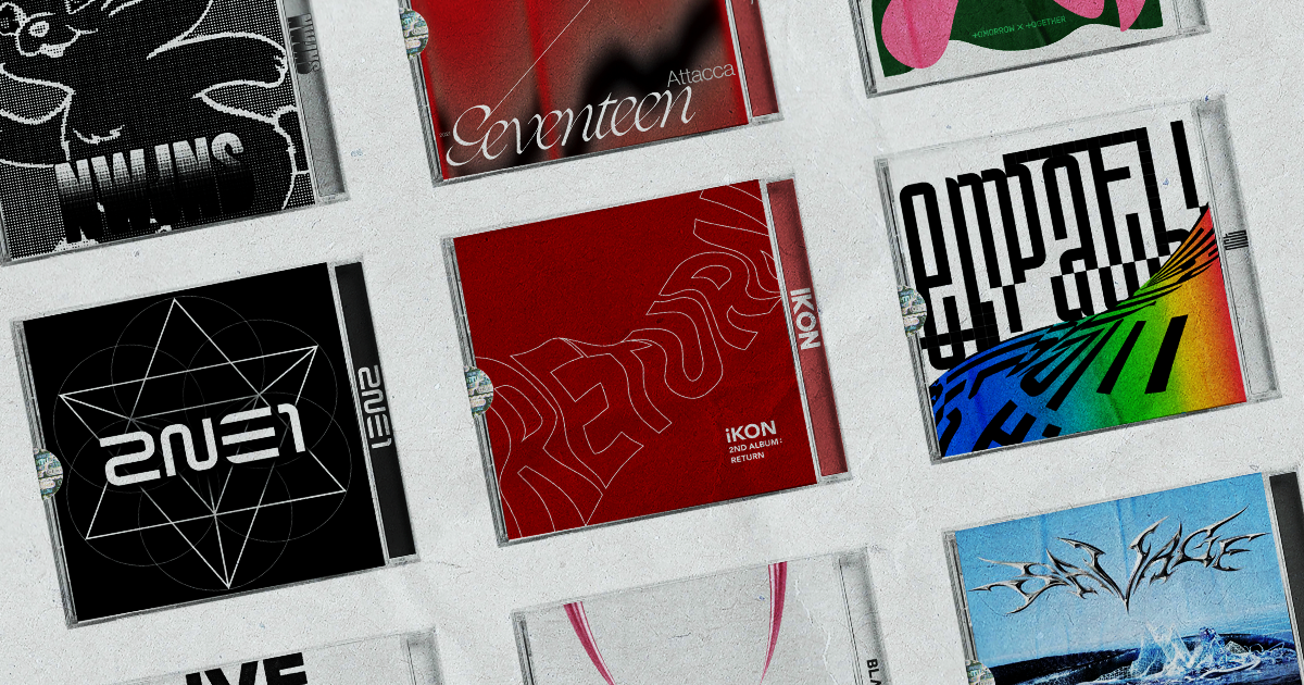
Typography is also essential in creating a cohesive and consistent visual brand for a K-pop group. The typography used in a group’s logo is often carried over into other elements of their branding, such as album covers, merchandise, and promotional materials. This helps to create a unified and recognizable image for the group across all of its media and marketing channels.
TYPOGRAPHY BREAKDOWN
AESPA
AESPA with its NEXT LEVEL and Futuristic Typography logo! The typography behind the Aespa logo features a sleek, futuristic font that complements the group’s high-tech concept. The name “Aespa” is stylized in all capital letters, with the “A” and “E” characters connected by a horizontal line. The letters are designed to appear three-dimensional, with sharp edges and angular shapes that give the logo a futuristic look.
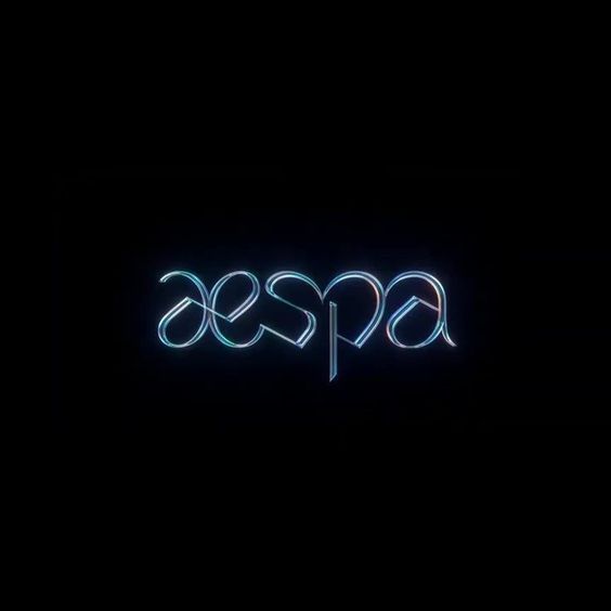
The typography and design elements of the Aespa logo were carefully crafted to reflect the group’s concept of “avatars” and their use of artificial intelligence in their music and performances. The use of sharp, angular shapes and the three-dimensional appearance of the letters are meant to evoke a sense of cutting-edge technology and innovation.
NCT
Let’s discuss how NCT is the boss. The typography behind the NCT (Neo Culture Technology) logo is a custom-designed font that was created specifically for the group. The NCT logo features bold, blocky letters with sharp angles, giving it a futuristic and edgy look. The font is unique in that it features a mix of uppercase and lowercase letters, and each letter has a distinctive shape that complements the overall design of the logo.
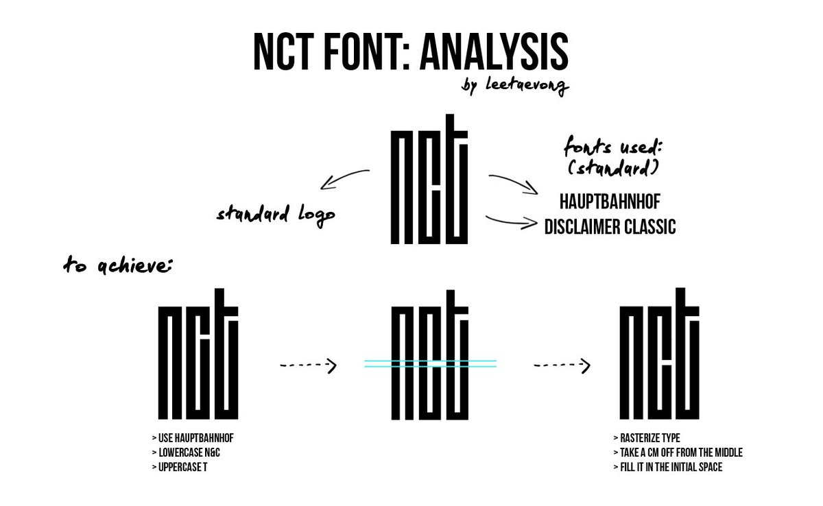
The design of the NCT logo was inspired by the concept of “limitless connections,” which reflects the group’s global identity and its goal of connecting with fans all over the world. The typography and design elements of the logo were carefully crafted to reflect this concept, with each letter connecting to form a cohesive and visually striking image.
BLACKPINK
Here are your TYPA girls who love black and pink! The typography behind the Blackpink logo features a bold, sleek font that complements the group’s edgy and powerful image. The name “Blackpink” is stylized in all capital letters, with the letters evenly spaced and the “P” and “I” characters slightly elongated to add a unique visual element.
![]()
The typography and design elements of the Blackpink logo were carefully crafted to reflect the group’s image as a fierce and confident all-female group. The use of bold, blocky letters and the black and pink color scheme are meant to evoke a sense of strength and femininity while also being visually striking and memorable. How do you like that?
SEVENTEEN
SEVENTEEN RIGHT HERE!
The typography behind the Seventeen logo features a modern, stylish font that complements the group’s youthful and energetic image. The name “Seventeen” is stylized in all capital letters, with the letters evenly spaced and the “S” and “T” characters slightly elongated to add a unique visual element.
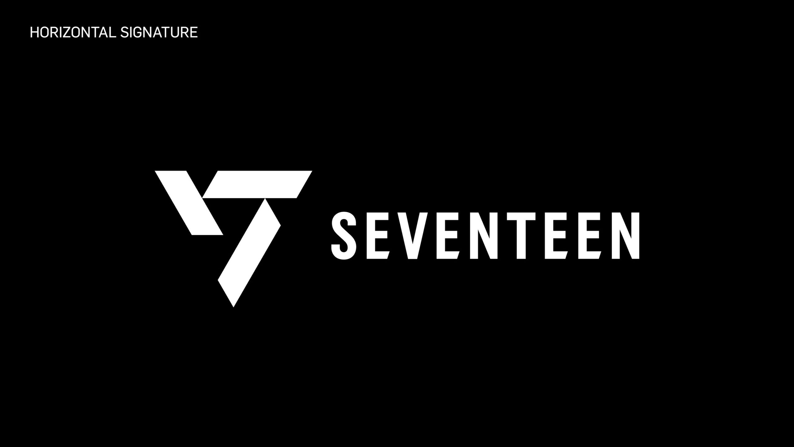
The typography and design elements of the Seventeen logos were carefully crafted to reflect the group’s image as a dynamic and talented K-pop group. The use of a sans-serif font and the white and black color scheme are meant to evoke a sense of modernity and sophistication while also being visually appealing and memorable.
2NE1
2ne1 Knows they are the best as their logo is as distinct as ever. The 2NE1 (pronounced “twenty-one”) logo features a bold, graffiti-inspired font that complements the group’s edgy and unconventional image. The name “2NE1” is stylized in all capital letters, with the letters unevenly spaced and the “E” character replaced by the number “2” to create a unique visual element.
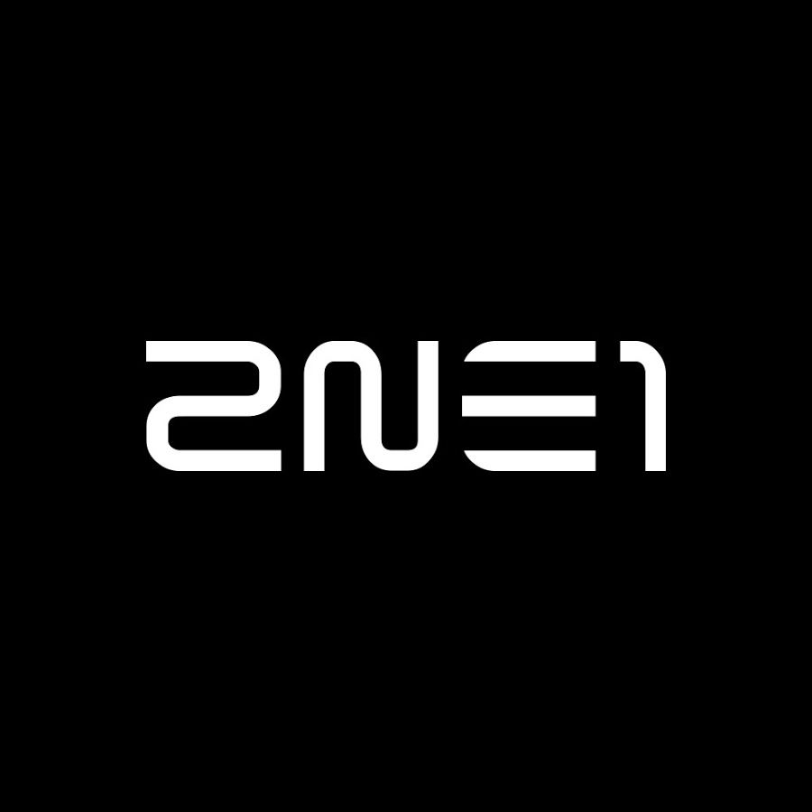
The typography and design elements of the 2NE1 logo were carefully crafted to reflect the group’s image as a rebellious and individualistic all-female group. The use of a graffiti-inspired font and the black and hot pink color scheme are meant to evoke a sense of street style and urban cool while also being visually striking and memorable.
iKON
This logo is Killing Me. YG did not disappoint, as the iKON logo features a clean and modern font that complements the group’s image as a hip-hop and R&B-influenced K-pop group. The name “iKON” is stylized in all capital letters, with the “K” character being larger than the other letters and featuring a unique design element where the top right corner of the letter is cut off at an angle.
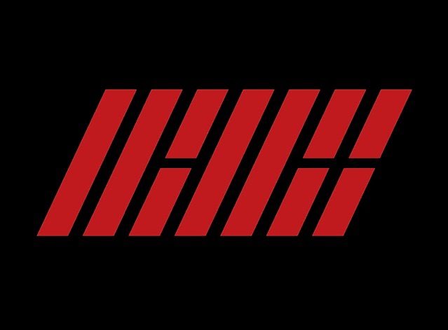
The typography and design elements of the iKON logo were carefully crafted to reflect the group’s image as a fresh and contemporary K-pop act. The use of a simple, sans-serif font and the white and black color scheme are meant to evoke a sense of minimalism and sophistication while also being visually appealing and memorable.
NEWJEANS
Did the New Jeans logo catch your attention?

NewJeans is a five-member K-pop girl group that debuted in July 2022 under the management of Min Hee-Jin, a South Korean art director and graphic designer. The group’s Y2K-inspired image extends to their use of typography in their promotional materials, which features flourishes and display types from the late 1990s and early 2000s. Multiple logos were created for New Jeans, with various styles from brands like Bratz and The Powerpuff Girls being incorporated. The official New Jeans logo is a hybrid of different fonts and is faux-condensed.
IVE
The logo screams 11/10! Ive is a K-pop girl group that debuted in October 2021 under the management of Starship Entertainment. The group’s name stands for “Innovation Visual Entertainment,” and their logo features a stylized “IVE” in a bold, sans-serif font. The letters are connected, with the “V” extending upwards and curving to form a circle above the “I” and “E”.
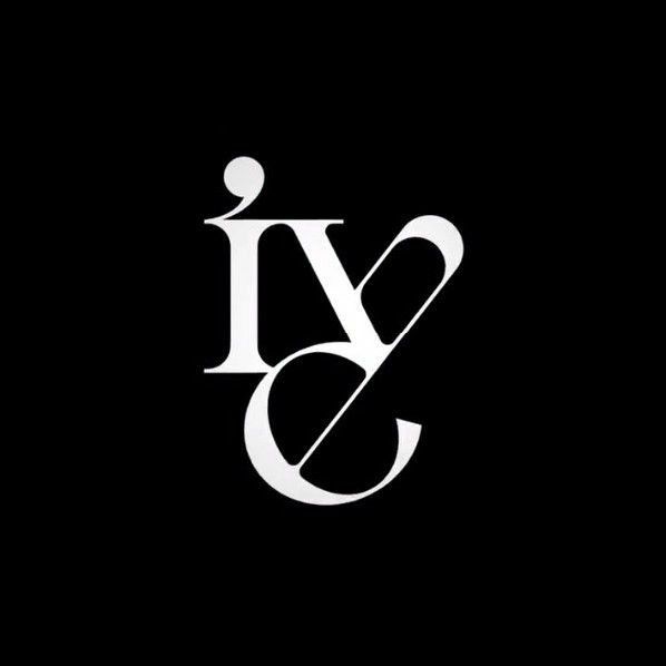
The color palette of the logo includes shades of pink and purple, giving it a fun and energetic feel that matches the group’s concept. The typography in Ive’s promotional materials, including album covers and social media graphics, often features a combination of bold sans-serif and script fonts, with a focus on legibility and visual impact.
TXT
Good boys Gone Bad? I don’t think so! The group’s logo says otherwise, as it features the acronym “TXT” in bold, all-caps lettering, with the letters “X” and “T” connected by a stylized, looping line. The typography is clean and modern, with a sans-serif font that reflects the group’s youthful and contemporary image.
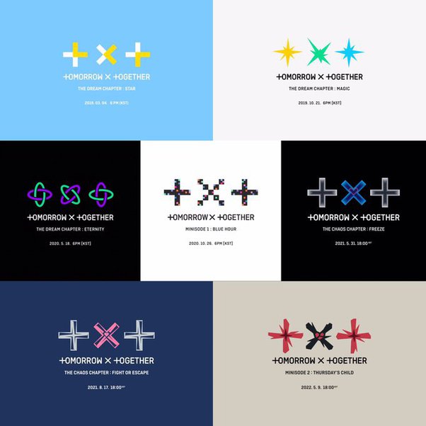
The logo is often accompanied by a unique symbol that incorporates a star and crown, which represents the group’s concept of “Dreams and Happiness.” The logo and symbol have been used consistently throughout the group’s promotional materials, album artwork, and merchandise, creating a strong and recognizable brand identity for TXT.
CONCLUSION
K-pop logos are an integral part of a group’s identity, representing their concept, style, and brand. From the bold typography of BLACKPINK to the playful and colorful designs of NCT, each logo tells a unique story about the group and their music. Some logos, like that of BTS, have become iconic symbols of the group’s massive success and global impact. Meanwhile, newer groups like AESPA and NewJeans are using typography to create a distinct and modern image. Basic or extravagant typography, as long as it ties to the overarching theme of the brand, is welcome. Regardless of the style or design, K-pop logos are a crucial element in building a strong fan base and establishing a lasting presence in the industry.