


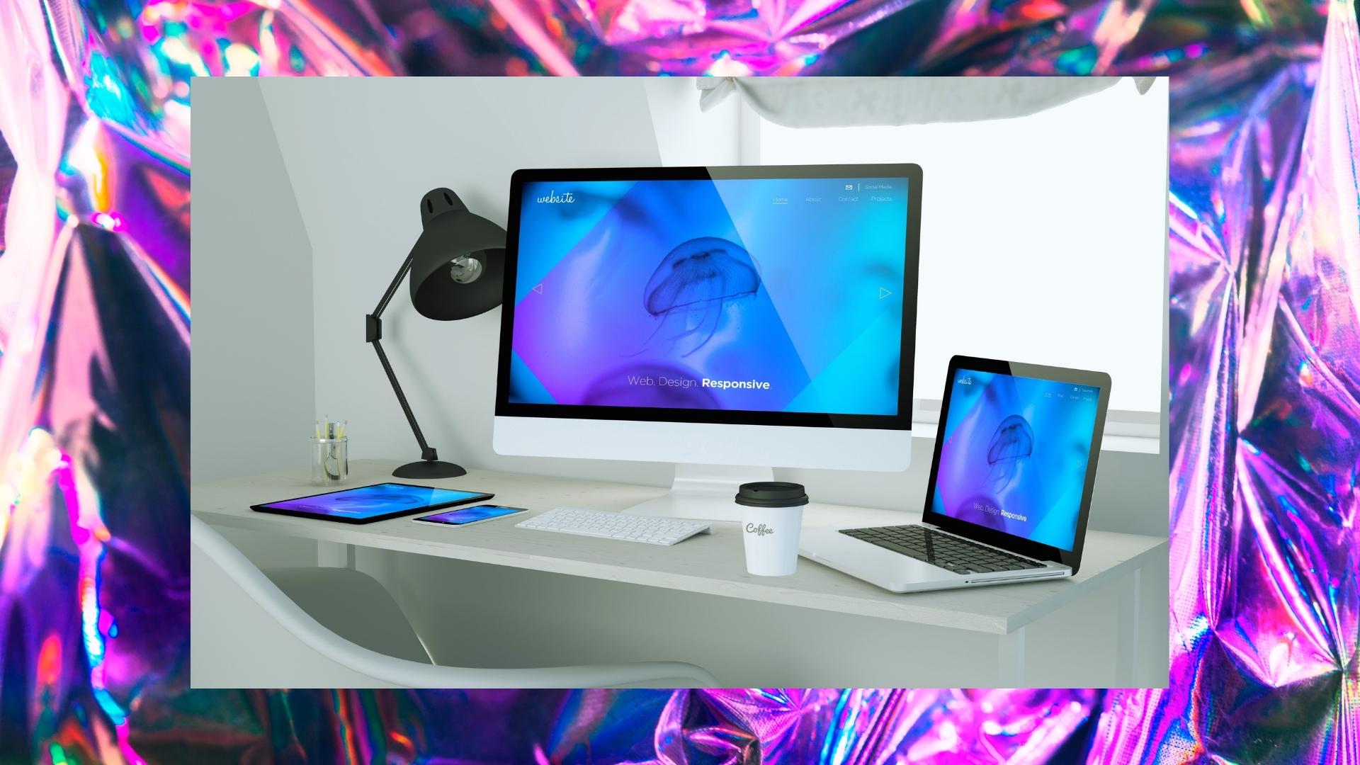
In this world of emerging technologies, every new website owner wants to capture their audience in any type of screen whether mobile, tablet or desktop.
Thus, in web design, we face the issue of being inadequate to keep up with the changing technology landscape including various plug-ins that renew year after year. 10 Years ago, creating a website account for each device would be impossible, or at least impractical.
Should you suffer the results of losing visitors of one device for the benefit of obtaining visitors from another? This shouldn’t be the case as we have a solution for this problem, which is responsive web design. This solution tells us how design and development should respond to the user’s behavior and environment based on screen size, platform, and orientation.

For better understanding, some of the best examples of websites that has excellent responsive web design are as follows:
Dribbble

This website is one of the best examples of responsive web design. It features different characteristics for cell phones, desktops, and tablets. Like it condenses five columns for desktops and laptops whereas two columns for cell phones and tablets.

As on many mobile phone versions of websites, the cluttered environment is the biggest issue faced by the viewers. So, to resolve this issue, Dribble has changed some features including:
- The options of counts, comments, and viewers are also not nested.
- The menu bar were also hidden.
GitHub

If we are talking about the websites that provide the best experiences to its users, GitHub is at the top of the list. This website contains different functional features.

While shifting the account from a desktop, the top bar changes from two folds to one fold and the signup option on the top remained noticeable. Also, it hides the menu option and some services too to prevent a cluttered environment.
Magic Leap
The experience for the users on magic leap is consistent across all devices. This means the structure and formation of this website are the same, just except for some points. The microcopy that indicates the user to scroll is absent on the mobile version as it can be possible to direct it through the screen.


Moreover, this site has a simple, mobile-first website that promotes its stunning illustration. The global average loading time of illustration sites is 22 seconds, and these websites load in 7 seconds with the 3G connection.
Smashing Magazine
This website is an ebook publisher that provides editorial content and professional sources for its users. To be honest, this site is much more than that. Their website highlights a two-column layout, full menu, and incorporation mark on desktop, converting to a one-column design and condensed list with letter marks on tablets and mobile gadgets.

It also contains an inclusive plan for web users. Digital natives should have no problem operating this website from handheld devices. For the desktop users, they show options in both icons and labels. Plus, they have provided a call to action service and search icon too. This site load just in 2 seconds when you have a 3G internet connection. This holds their bounce rate low and limits users from getting frustrated.
Slack


Are you looking for a site that is organic and simple? Then slack is just for you. The flexible grid adapts to all sorts of viewports. It facilitates all sizes and shapes. Moreover, the customer column layout consists of three columns for desktops and laptops and only a single column in hand-handled devices.
Wired

A website with dynamic and user-friendly layout that contains several columns and a sidebar with a menu option. On-hand handled devices; it changes to a single column feature for usability and simplicity. When shifting tablets to mobile devices, their list shrinks to cover only their logo, a menu icon, and a connection to subscribe. Search functionality and the capability to filter WIRED’s newsfeed by section aren’t available on mobile to keep things simple. Also, the crop on their feature images changes according to the type of device.


